U.S. Highway Administration orders return to vintage typeface

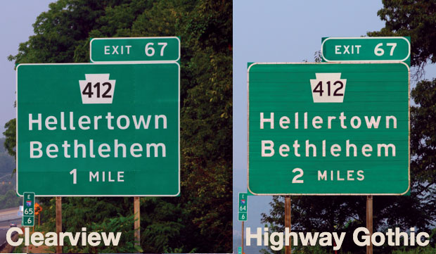
In 2004, a more legible typeface, Clearview, was approved to improve America's road signs. But after a decade of use, U.S. Federal Highway Administration has decided to return to the old typeface, publicly available as Highway Gothic.
The reasoning isn't clear-they claim that it's actually more legible than Clearview, but are yet to explain why or offer research to back up the decision. Highway Gothic, designed in the 1940s, has peculiarities held to compromise its legibility. Clearview's letter forms were designed to be visible at greater distances and under less favorable lighting and weather conditions.
"Helen Keller can tell you from the grave that Clearview looks better," (designer) Meeker says. At the time, the FHWA agreed. In its 2004 approval memo, the agency noted that Clearview boosted highway-sign legibility for drivers traveling at 45 miles per hour by 80 feet of reading distance-or 1.2 seconds of bonus reading time" From the start, Clearview was greeted as a civic, social, and design success. Around 30 states have adopted the font, making it arguably the dominant design paradigm on U.S. roads. Print magazine called it one of the 10 typefaces of the decade in 2010. The Clearview typeface family was the first digital font ever acquired by the Cooper-Hewitt, Smithsonian Design Museum. People behind the font spoke about it with swagger.
One possibility is that Clearview must be licensed on a per-user basis, making it too expensive. Also mentioned is its resemblance to other official signage typefaces such as Transport. It may, therefore, be insufficiently exceptional for official U.S. tastes.
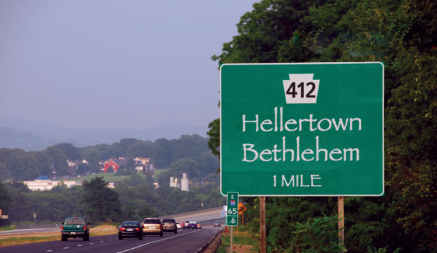
How about Papyrus, guys?