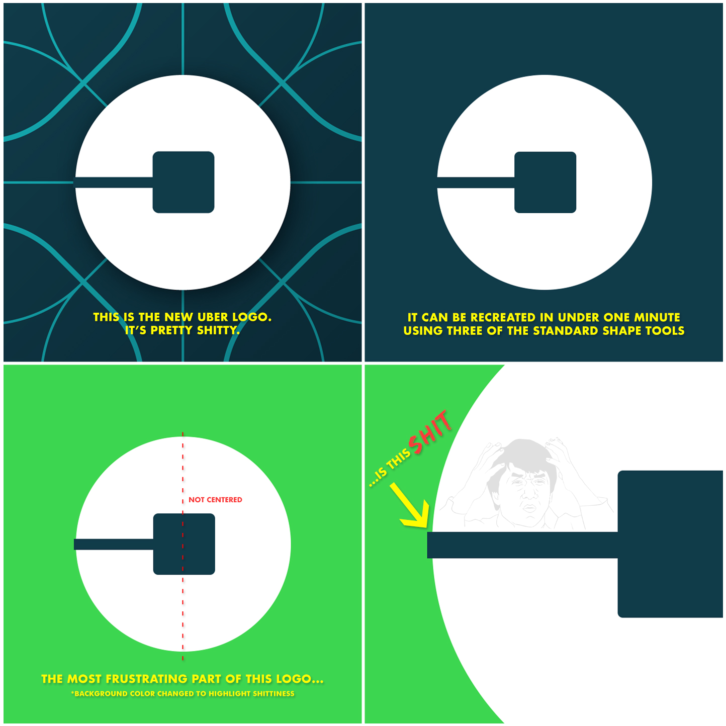
A close look at the new Uber logo reveals infuriatingly untidy details
by Mark Frauenfelder from on (#12XJF)

This person has three problems with the new Uber logo. The first problem ("It can be recreated in under one minute using three of the standard shape tools) does not bother me. I actually think that's cool. But the uncentered square and the overhanging line really do suck!