A Fascinating Map That Plots the Formation of New Cities Over the Course of the Last 6,000 Years
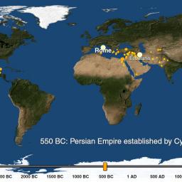
Max Galka of Metrocosm has created a fascinating interactive map that plots the astounding number cities that have been formed over the past 6,000 years, using data from "Spatializing 6,000 years of global urbanization from 3700 BC to AD 2000"
By 2030, 75 percent of the world's population is expected to be living in cities. Today, about 54 percent of us do. In 1960, only 34 percent of the world lived in cities. Urbanization didn't begin in the 1960's. But until recently, tracking its history much further back than that was a challenging task. The most comprehensive collection of urban population data available, U.N. World urbanization prospects, goes back only to 1950. But thanks to a report released last week by a team of Yale researchers, it's now possible to analyze the history of cities over a much longer time frame.
via Presurfer
Help Laughing Squid grow with a monthly pledge of support.