Grrl Power #462 – Seating arrangements
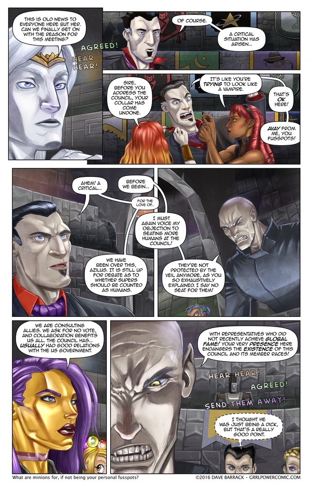
Azilus is being slightly melodramatic. Their presence doesn't endanger the Council, but their coming and going could. If they constantly broadcast a publicly available GPS signal, then their presence would be problematic. Still, there's a huge difference between working with clandestine agents, and someone who is the fame equivalent of the AAA actors who play those same agents in the just released summer blockbuster about clandestine agents.
This seems to be the "people peeking in from the bottom of a panel" page. I should have put Trilla, Valen's faerie companion doing the same in panel 1.
Yes I know I said no robots, but I couldn't help sneaking a Bastion into the background. Let's assume it's a race that can shapeshift who is just messing with people, because if you could shapshift, let's face it, your raison d'itre would probably be "messing with people."
#MakeComics So I've been experimenting with some different coloring over the last few pages, and it may be a bit more prominent on this one - mostly cause I decided to skip the inking and color over my pencils. This did not, as I had hoped, save a ton of time, as I spent a fair bit cleaning up my pencils. Really, when you're working digitally, cleaning up pencils and inking are basically the same thing. Anyway, I mostly colored this page using grisaille, which is just a fancy term for painting in all the tone work in grayscale, then doing a color wash over top of it. The benefit of this is that I can focus on the light/dark better, and I think it produces better subtle details. The disadvantage is there's a hard limit to how saturated the colors can be since the color layer is done in Soft Light mode. (Manga Studio doesn't currently have a Color layer mode, but I experimented with this in PhotoShop, and there seemed to be a similar limitation.) My solution was to duplicate the Soft Light layer and drop its opacity ~50% and merge that with the tone layer. Anyway this was my first attempt and even if I don't stick with it I think I learned some stuff, and it's always good to try new things. If nothing else I've always thought my skin tones were a bit monochromatic, so expect some slightly rosier noses and cheeks maybe. Hopefully characters won't suddenly look like they all have colds, but in all fairness I'll probably over correct a bit before reeling it back to a sensible level.
Oh and if you've ever wondered why I'm such a slow artist, it's because I often have to draw everything twice (at least) before it approaches acceptable.

Double res version will be posted over at Patreon as soon as I get up. $1 and up, but feel free to contribute as much as you like :)
Here's the link to the new comments highlighter for chrome, and the GitHub link which you can use to install on FireFox via Greasemonkey.
