Seattle’s new bike map much more legible, still needs to ditch the sharrows
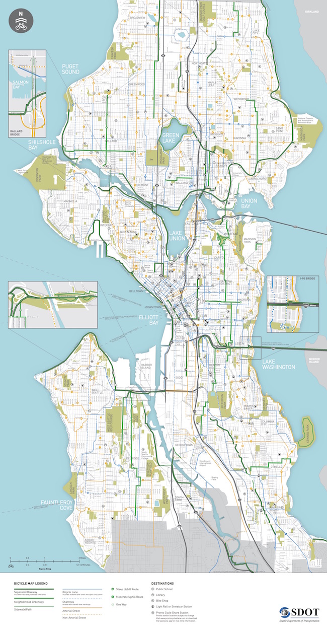
 The 2016 bike map is now out (a little late, yes), and it represents some quality steps towards a more usable routing tool.
You can download the PDF or even order a free physical copy via the SDOT bike map webpage.
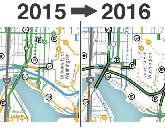
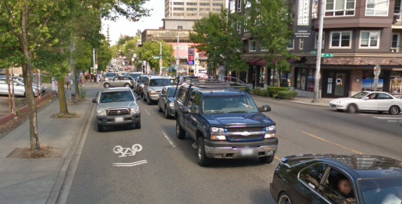
We were pretty critical of the 2015 map because it overstated the completeness and comfort of the city's actual bike network. Busy streets marked with sharrows were given nearly the same prominence as streets with bike lanes, for example. Neighborhood greenways were dotted, which downplayed their comfort level. Looking at the 2015 map above, you might think NE 45th Street is a good bike route. Then you'd end up biking here:

Sharrow on NE 45th Street in the U District. Image: Google Street View
But most importantly, it was hard to take a zoomed out look at the map and identify the most comfortable route between two places, which is pretty much the primary purpose of this thing.
The new map still marks busy streets with sharrows as blue, but they are significantly downplayed. Thick green lines now represent trails, protected bike lanes and neighborhood greenways. So if you glance at the map and find a solid green route connecting you and where you're going, that's the one you want. Easy!
 Of course I have nitpicks. Making a map is hard! Not all streets with sharrows are as stressful as NE 45th Street, and not all paint-only bike lines are equally comfortable (in the new map, the bike lanes on Dexter and the barely-existing bike lanes on MLK in the CD are given equal prominence, for example). But it's hard for a map to pull out that granular level of detail and still be legible.
I still urge the city to drop sharrows entirely in the next map. They are irrelevant for the purposes of routing and should simply be included with the yellow streets, which designate popular bike routes that do not have bike facilities.
Another change in this map is that streets with a bike lane in one direction and sharrows the other way (usually busy streets on hills) are marked the same as streets with bike lanes in both directions. Honestly, this is fine with me because they are clearly given a secondary designation from the high-quality green routes. This somewhat outdated style of on-street route still does a lot of the heavy lifting for bike routing in the city, at least for people somewhat comfortable with city riding near traffic.
And finally, SDOT and Parks have got to get together and figure out how to show bike routes that go through city park land. Many of my favorite and most-used bike routes are not on this map at all because they go through a park (Jefferson Park, for example, or cutting through Roanoke Park to get from Interlaken to the U Bridge).
What are your thoughts on the new map? Overall, it's great upgrade. Big ups to SDOT's Kyle Rowe for his work on it.
