The skeuomorphic hell of music-making apps
by Rob Beschizza from on (#30A5X)

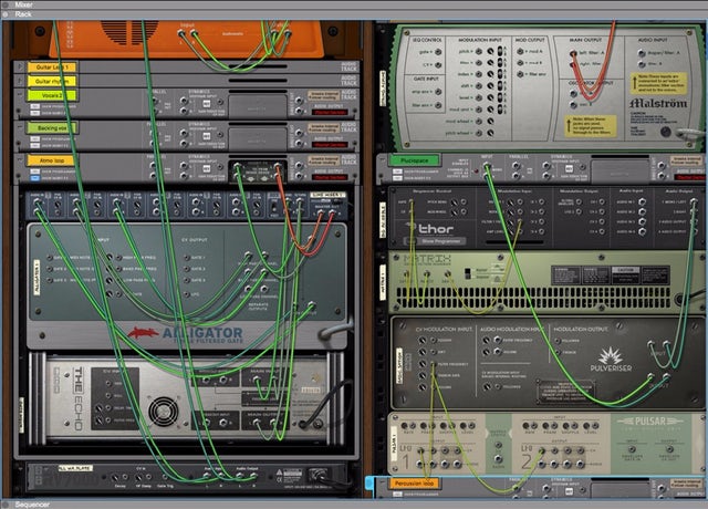
Audio plugins are renowned for their insane efforts to mimic real-life hardware UI, right down to 70s'-style dials and warped burl paneling. If they could smell of sweaty pleather, they would. John Lagomarsino takes us through his favorite ones and tries to figure out why on Earth all this is so.
Alone, each plugin is hideous in its own unique way. A panel of 3D knobs here, a pixelated oscilloscope there. But when a project really gets cooking, one can amass eight or ten of these interfaces overlapping each other on the screen at once, and that's when skeuomorph hell really comes into focus. I don't know why audio software has looked like this for the better part of two decades, but I'd like to honor these sins of UI with a tour of some of the most egregious examples.