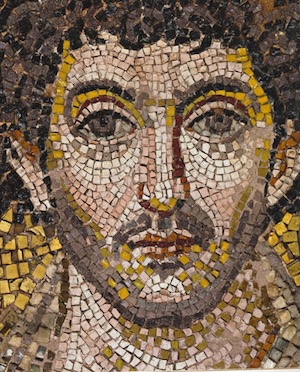
Mosaic face

I used to make my own Mac icons back in the 1990s, when pixels were bigger and the Finder was user-tweakable. You had 31 x 31 pixels to work with. I learned to respect the art of using jagged little squares of color to imply details when seen from a distance.
Byzantine mosaicists were masters of it. The image at right is from the Rotonda of Galerius aka Agios Georgios aka St. George's Rotunda in Thessaloniki.* It's remarkably sophisticated. Seen up close, the heavily underlined jaw, the bright yellow highlights, and the checkered colors on his eyes, throat, and chin, look harsh and unnatural: abstract decoration, not mimetic representation. But the more you blur its edges -- squinting through your eyelashes should work -- the more realistic it looks to your brain.*
It also has that odd characteristic of recognizably being the face of a real person. I don't know why people can spot that; I just know they do. The differences must be infinitesimal.
Byzantine mosaics thrived in the midst of physical limitations. Their palette was limited to the natural colors of rocks, plus a few colors of glass. The formal architecture of the time didn't admit a whole lot of light, many of the best decorative surfaces were located way up toward the ceiling, and eyeglasses hadn't been invented yet.
They still made them sing.