How Online Companies Employ Dark Pattern Designs to Trick Users Into Doing What They Want

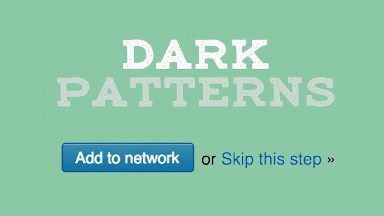
Video blogger and web producer Evan Puschak aka The Nerdwriter took a prescient look at the tactics used in interface design that are referred to as dark pattern. This can be done in a variety of ways - through a difficult un-subscription process ("roach motel"), color manipulation ("disguised ads"), spam, hidden costs and misdirection.
Dark patterns are features of interface design crafted to trick users into doing things that they might not want to do but which benefit the business in question. "our best defense against the dark patterns is to be aware of them and shame the companies who utilize them. Design is what mediates our interaction with the Internet it's the language we read it in. It's not too much to ask that the language be comprehensible and honest.
- Everbright, An Artistic Device Made up of Adjustable Color Dials That Let Users Create Abstract Patterns and Displays
- Argyle Fighters, A Classy 'Star Wars' Shirt Design Featuring a TIE Fighter Argyle Pattern
- Pinterest Introduces Intelligent Visual Discovery With 'Lens' an App That Identifies What It Sees
The post How Online Companies Employ Dark Pattern Designs to Trick Users Into Doing What They Want appeared first on Laughing Squid.