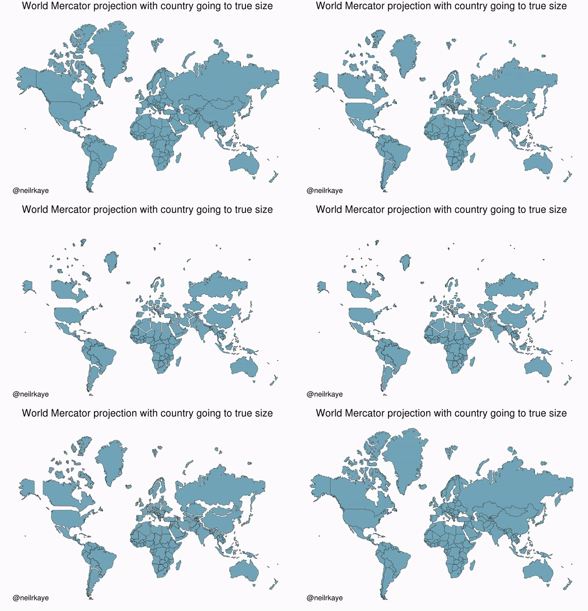
An Animated Mercator Projection That Reveals the Actual Size of Countries Around the World

Climate data scientist and interactive mapmaker Neil Kaye has brilliantly animated the difference between the size of countries represented on the Mercator Map and the true land layout of each country. Because the Mercator Map distorts land size in accordance with increased distance from the Equator, countries like Greenland, Russia, Canada and the United States look so much larger than much of the rest of the world.
The final state of the animation is associated to its correct square milage. I calculated this by taking the area of each country polygon in the Mercator projection (MA), and the the true area (TA), then I did: 1 / sqrt (MA/TA) So Greenland for example is scaled to be 0.25 the size of Mercator original, which makes it 16 times smaller than shown in Mercator projection! I then resized it at the centroid of each country" As has been pointed out for large countries like Russia, the top of the country should be shrunk more than the bottom, I have not done this. However, the true area of each country is correctly scaled. To give perspective, Greenland is actually the same size as Saudi Arabia.
Related Laughing Squid PostsAnimating the Mercator projection to the true size of each country in relation to all the others.
Focusing on a single country helps to see effect best.#dataviz #maps #GIS #projectionmapping #mapping pic.twitter.com/clpCiluS1z
- Neil Kaye (@neilrkaye) October 12, 2018
- Why a Flat Map Can't Represent the True Sizes and Shapes of Countries and Continents
- The True Size Of, An Interactive Map That Accurately Compares the Actual Size of Countries
- A Visualization of the True Distortion of the Standardized World Map
The post An Animated Mercator Projection That Reveals the Actual Size of Countries Around the World appeared first on Laughing Squid.
