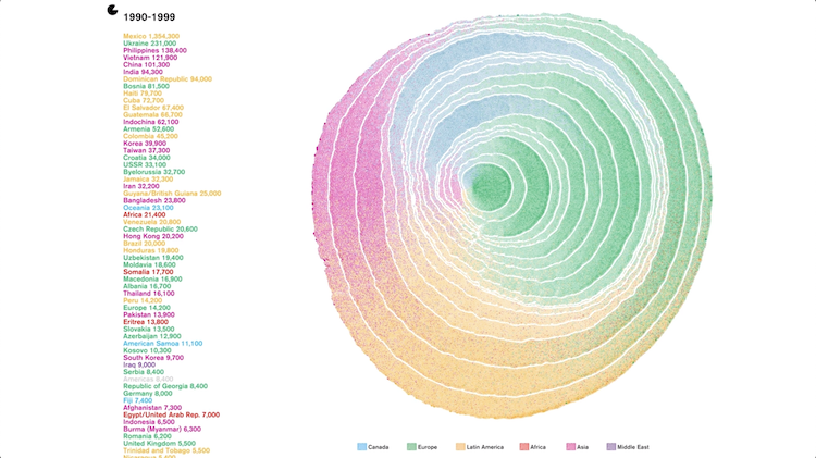
United States Immigration From 1830-2015 Beautifully Visualized as Color Coded Rings on a Growing Tree

Data designer Pedro M. Cruz (previously) created an absolutely inspiring, award-winning animation from raw data that visualizes immigration to the United States from 1830 - 2015 as rings seen on a cross-slice of a growing tree. Every 100 immigrants from a single country are represented by dashes that form together and add to the growing ring of each decade. Areas from where the immigrants came are color coded, creating a beautiful representation of how the population of the United States is comprised. The soundtrack of ocean waves fittingly represents the manner by which most of these immigrants arrived.
Trees can be hundreds, even thousands years old. The cells grow slowly, and their pattern of growth influences the shape of the tree's trunk. They are the result of a slow process that occurred a long time ago. This idea lends itself to the representation of history itself, as it shows a sequence of events that have left a mark and shaped the present. If cells leave a mark in the tree, so can incoming immigrants be seen as natural contributors to the growth of a trunk that is the U.S. It carries the idea that these marks in the past are immutable and that cannot be erased regardless how you read them.
Cruz explains his method for creating this stunning analogy of immigration as rings on a tree in a downloadable paper entitled "Process Of Simulating Tree Rings For Immigration In The U.S.".
This article presents the iterative design process of representing the growth of populations in the United States as tree rings. It explains why this metaphor was chosen, and how the iterative process went through several ideas and implementations in order to make the metaphor more visible. For that, several algorithmic approaches are discussed as their graphical results are presented.
A quintet of color, or immigration to five US states as tree rings #immigration #datavis #dataviz pic.twitter.com/RurV72ZO1S
- Pedro M. Cruz (@pmcruz) August 30, 2018
MOST BEAUTIFUL: Simulated Dendrochronology of U.S. Immigration 1790-2016 by @NatGeo @Northeastern @wihbey @pmcruz & Avni Ghael & Felipe Shibuya #IIBAwards https://t.co/M5mWK54zKe pic.twitter.com/o8XHxz6Rum
- Kantar IIB Awards (@infobeautyaward) December 5, 2018
via Fast Company
Related Laughing Squid Posts- Maps of Most Popular Names Given To Babies In the United States During 2013
- A Tiny Island In the Gulf of Maine That Remains a Disputed Gray Zone Between the U.S. and Canada
- An Interactive 2014 Fall Foliage Map That Tracks the Progression of Changing Leaves Across the United States
The post United States Immigration From 1830-2015 Beautifully Visualized as Color Coded Rings on a Growing Tree appeared first on Laughing Squid.