Entertainment Advertising Expert Explains What Movie Posters Communicate Through Their Color Schemes

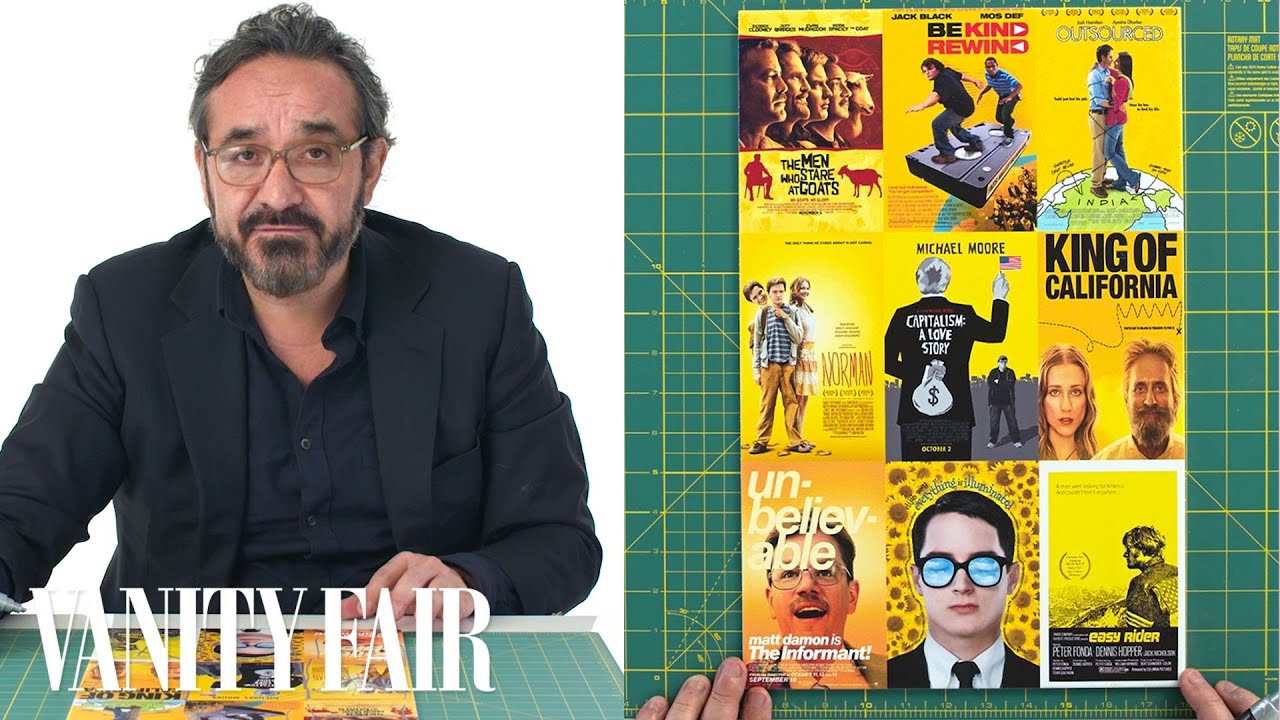
James Verdesoto of Indika Entertainment Advertising quite insightfully explained to Vanity Fair how movie posters communicate to the desired audience through the use of color. Verdesoto masterfully sections out the different colors schemes with the feeling evoked. This includes white background for comedy, blue for action thrillers, shadows for secondary characters, yellow for independent films and the use of complementary colors to address character, narrative, and the world within the film.
Related Laughing Squid PostsAn In-Depth Analysis of Every Marvel Film Movie PosterMovie Poster For Patton Oswalt's 'Star Wars: Episode VII' Plot ProposalMovie Posters Re-Imagined Using Toy Story CharactersJames Verdesoto, the movie poster artist behind iconic posters such as Pulp Fiction, Ocean's Eleven, Girl, Interrupted, and Training Day, explains how color schemes are used in movie posters.
Follow Laughing Squid on Facebook, Twitter, Flipboard and Subscribe by Email.
The post Entertainment Advertising Expert Explains What Movie Posters Communicate Through Their Color Schemes first appeared on Laughing Squid.