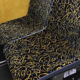
Public transit seating covers reviewed
by Rob Beschizza from on (#4B2CM)

Feargu O'Sullivan rounds up the good, the bad and the ugly of public transit seating options.
Seat cover designs, we believe, need to consider four things:
" Memorability. They need to be striking enough to create an instant impression.
" Freshness. Moquette needs to be bright enough in color to appear new(ish) after years of wear, but not so pale as to make stains or fade evident.
" Intricacy. Large empty monochrome spaces show wear more quickly, and provide too tempting a canvas for vandals.
" Anti-Dazzle. Moquette shouldn't be so bright and busy that it turns stomachs.
Above, behold Pittsburgh's "cosmic spaghetti" seating, as photographed by @CatsBlanchard.