The Economist's visual data journalist fixes magazine's "crimes against data visualisation"

Sarah Leo is a visual data journalist at The Economist. In this Medium piece, she gives some past examples of Economist charts and graphs that were confusing or misleading and shows her revisions.
Mistake: Truncating the scale
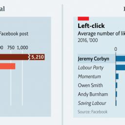
This chart shows the average number of Facebook likes on posts by pages of the political left. The point of this chart was to show the disparity between Mr Corbyn's posts and others.
The original chart not only downplays the number of Mr Corbyn's likes but also exaggerates those on other posts. In the redesigned version, we show Mr Corbyn's bar in its entirety. All other bars remain visible. (Avid followers of this blog will have seen another example of this bad practice.)
Another odd thing is the choice of colour. In an attempt to emulate Labour's colour scheme, we used three shades of orange/red to distinguish between Jeremy Corbyn, other MPs and parties/groups. We don't explain this. While the logic behind the colours might be obvious to a lot of readers, it perhaps makes little sense for those less familiar with British politics.
Image: Medium