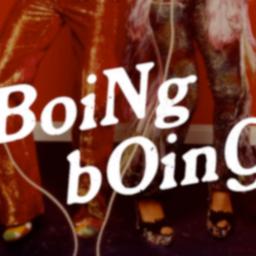
70s fonts back in fashion

Chobani's new custom typeface heralded a headlong return to swirly 1970s type.
It's not just nostalgia. Blame high DPI displays, too!
Today's movement toward fonts reminiscent of the '70s is partly a matter of advancing technology, Jen says: As phone and TV screens have improved, designers don't have to worry as much about pixelation when working with curves. But nostalgia is a powerful factor, too. Elizabeth Goodspeed, a graphic designer who works at the branding agency RoAndCo, believes that for many consumers, '70s-esque fonts represent a safe retreat into the past - a safer retreat, importantly, than the one currently offered by midcentury Swiss Style, which inspired all of those minimalist startup logos with its grid layouts and sans serif fonts.
The recent use of 70s type in corporate branding is showy in a way that suggests a fad rather than a sustained trend, but such a trend does exist toward more utilitarian typefaces from the era. You might be seeing a lot of Windsor, Souvenir and chunky Caslons in the next few years. However ugly and cheesy you might consider all this, it's a merciful antidote to 2010s tech culture anglegrinding every logo into the same sort of bland, soulless sans-serif font.
Off you go to the groovy section of dafonts for your new side-hustle logo!