Hate Twitter's new design? Fix it with your own stylesheet!

I'm not a fan of Twitter's new design: in addition to all the other complaints people have, I hate the fact that if you load a tab with your mentions in it, there's no easy way to refresh it to see new mentions; I also hate the fact that when you click on a tweet to see its context, hitting escape no longer brings you back to the feed (instead, you have to target a tiny on-screen back-arrow that my old eyes have a hard time making out).
But as Dylan points out, the web was designed to solve this kind of problem by allowing each user to design and apply their own stylesheet to any site they visit. That's harder today than it used to be, thanks to obfuscation and a heavy reliance on javascript, but it's still possible, as he demonstrates in his short essay "The Mutable Web."
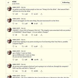
Dylan experiments with using plugins for this like Stylus, and also checks into the browsers' own tools for changing page layouts (Local Overrides in Firefox, Style Editor in Chrome). The design he comes up with for Twitter deletes the useless "who to follow" and "trending topics" bars, along with a color scheme that matches his blog.
I'm going to have a play with this. I'm not a big fan of yellow backgrounds (see above, re: old eyes), but I'm hoping that I can bash Twitter into something closer to my use-case.
However, one of the web's really revolutionary features is the ability of every user to easily inspect and modify a running system. Non-web applications normally function as black boxes to the user. They are totally opaque and incorrigible, offering very little in the way of customization. On the web, however, you have full access to all the code that makes up the user interface. I can't think of another platform that offers as much visibility and power to the end user. Maybe Smalltalk? I haven't used it much, but it's sort of a moot point anyway because it never really took off. Browsers' built-in developer tools make it very, very easy to poke around a website, see how it works, and change whatever you want. This is a fantastic feature, and even better is the deeper implication that the web is for everyone. Despite the growing centralization of power in a few giant corporations, we all still have the ability to craft our own our experience of the web.
Going back to the example of Twitter, I found myself getting sick of the massive sidebars so I opened up the element inspector, highlighted the sidebar, right clicked on it, and selected Delete Node. It's hard to say because I do know HTML, but I think that I could have managed this without knowing HTML. This kind of blurring the line between developers and non-developers is really inspiring to me and I wish these tools were called something less alienating to people who don't consider themselves to be web developers. I spent a while futzing around, changing colors, hiding this and that until I liked the look of it. When I was done, I realized that if I closed my tab, all my changes would be gone. After a little research, I found two solutions to this problem.
The Mutable Web [Dylan/Simulacrum Party]
(via Four Short Links)