Why hurricane maps do a terrible job of communicating the danger of a hurricane

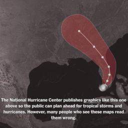
Hurricane maps, like the ones created by the National Hurricane Center, tend to show a cone that indicates the predicted path of the hurricane.
But it turns out those maps do a terrible job of communicating their intended info, because people -- myself included -- routinely misunderstand them. In this terrific little click-through interactive at the New York Times (if inaccessibly paywalled for you, my apologies), Albert Cairo and Tala Schlossberg break it all down.
As they note:
Studies show that some people misinterpret the map as indicating the hurricane getting bigger over time. Others think it shows areas under threat. Research by Hurakan, a University of Miami team I'm a part of, suggests 40 percent of people wouldn't feel threatened if they lived just outside of the cone.
People who are inside the cone, but far from the center, tend to prepare less than those closer to the central line. All of these interpretations of the map are incorrect.
In reality, the cone is a series of circles that predict where the center of the hurricane might be as it travels; the circles get bigger because uncertainty increases as time goes on.
So no, chart doesn't indicate the hurricane is getting bigger. And the cone doesn't even represent the boundaries of where the damage might happen; it only shows where the center of the hurricane might be, so the actual blast radius of water, wind, and hail can wreck cities that lie quite outside the cone.
As Cairoa and Schlossberg note, the cruddiness of this dataviz has real-life implications: People just outside the cone tend to downplay their risk and fail to prepare.
The upshot? First off, it's a terrific lesson in the importance of good databiz.
Bad ones can literally harm and kill people.
But secondly, wow, we need better ways of communicating the actual potential dangers of an oncoming hurricane. The upside is ... you'd imagine this is a problem that ought to eminently solvable, right? These days most of us are carrying handheld computers capable of displaying digital animation and/or graphics customized to within a few meters of our individual GPS locations.