Staples Dramatically Unbends Their Namesake ‘L’ in a Highly Theatrical Reveal of Their New Company Logo
by Lori Dorn from Laughing Squid on (#4QTKC)

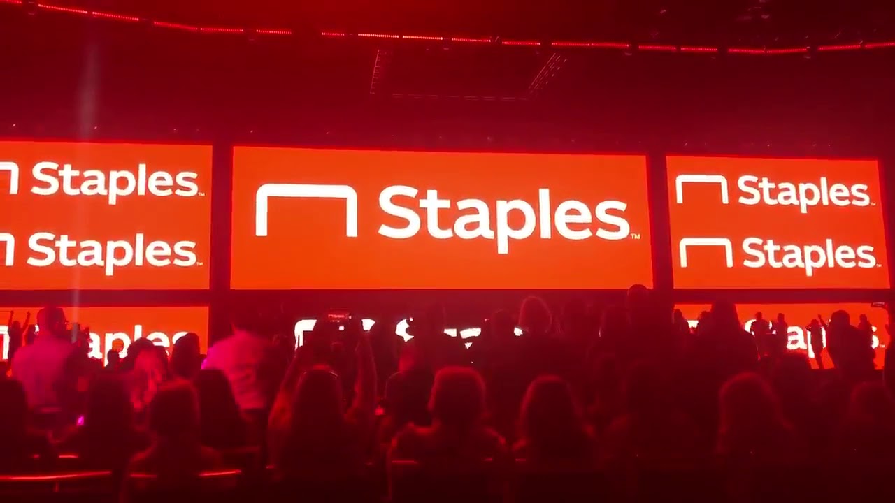
During what appears to be a company event, office supply company Staples dramatically unbent the namesake L staple in their old logo in a highly theatrical, slightly over the top visual reveal of the new company logo.
The old Staples logo:
The New Staples logo
via Boing Boing
Related Laughing Squid PostsOver 150 People Try to Draw 10 Iconic Company Logos From Memory As Accurately As PossibleNew York City Made Out of StaplesInstantly Make Your Words Look Like the New Yahoo LogoFollow Laughing Squid on Facebook, Twitter, Flipboard and Subscribe by Email.
The post Staples Dramatically Unbends Their Namesake 'L' in a Highly Theatrical Reveal of Their New Company Logo first appeared on Laughing Squid.


