Facebook’s new Portal increases privacy, but is still searching for a reason to exist
The timing of the original Portal's launch was less than ideal. The company reportedly pushed things back as the Cambridge Analytica scandal hit full broil, only to be hit with another data breach disclosure. If there's a lesson to be learned with this year's sequel, it's that there may just not be a good time for the company to release a camera-mounted piece of home hardware.
If nothing else, the seemingly endless parade of bad publicity has had the knock-on effect of making the company particularly proactive about privacy in a way the competition lacks. One of my main complaints about Google's Nest Hub Max is the lack of a physical camera shutter. The original Portal, meanwhile, came with a small piece of plastic that clipped over the camera.
"It was a nice thought, but, practically, users might lose that, and it's not always visible and available for users who want to cover the camera gracefully," Facebook Director, Product Management Micah Collins told TechCrunch. "So we wanted to make sure that was a very integral and communicative part of the design."

The new version of the device swaps that in-box piece of plastic for a three-position physical button. All the way to right is open and ready for business. The middle covers the camera with a built-in physical shutter while keeping the mic on. Going all the way to the left disconnects both the camera and microphone. That also turns on a red LED, letting you know definitely both are off. For my own purposes, that middle setting is getting the most use. I suspect I won't be alone on that front, either.
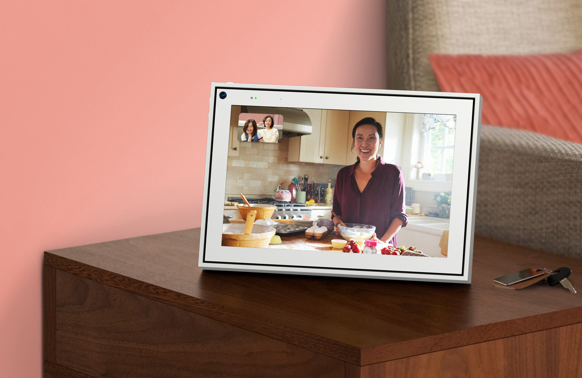
Of course, disabling the camera sort of defeats the primary purpose of the device. At its heart, the Portal is a home video conferencing product. The inclusion of things like Alexa smart display functionality and music services like Spotify and Pandora are nice, but they're kind of bonuses. No one is buying a Portal because it's a more compelling smart screen than an Echo Show or Google Nest Hub Max.
Facebook's value proposition is its own ecosystem. It's the implicit understanding that, if you're a person who is on the internet, odds are you've already opted in to Facebook, Facebook Messenger and now WhatsApp. That's where the device attempts to set itself apart.
The first generation did get a leg up with some very clever AI camera panning, zooming and framing. It was a great feature and one it would be nice to see incorporated into devices like the Echo Show, where the video chat experience leaves something to be desired. Google, meanwhile, adopted something similar for the Nest Hub Max (while the original, smaller device still lacks a camera), which surely has taken some of the wind out of Facebook's sails here.

"Nest has done a fine job," Collins says, diplomatically. "We're really happy they followed our lead in that sense of trying to deliver a richer calling experience."
One gets the feeling Facebook is very much trying to wrap its brain around what its differentiator is here, and the new version of the Portal doesn't do much to clarify that mission statement. While the company insisted to me that the growing family of devices are a play in and of themselves, it's hard to shake the notion that the Portal family operates better as a kind of reference design for how third-party hardware manufacturers might better integrate its services into their own designs.
I'm not suggesting, of course, that Facebook can't break away from this paradigm. The Microsoft Surface line presents a model for moving from reference to viable product. At the moment, however, there's not a lot to recommend Facebook's offerings, particularly with the external cloud of privacy offerings.
That said, there are things that can be taken away from this generation. The picture frame design, while far less interesting and aesthetically pleasing than its predecessor, does point to what is likely the future of these devices: a push to more seamlessly blend in with their surroundings. As the novelty of the category begins to wear off, more users are likely to choose function over form.
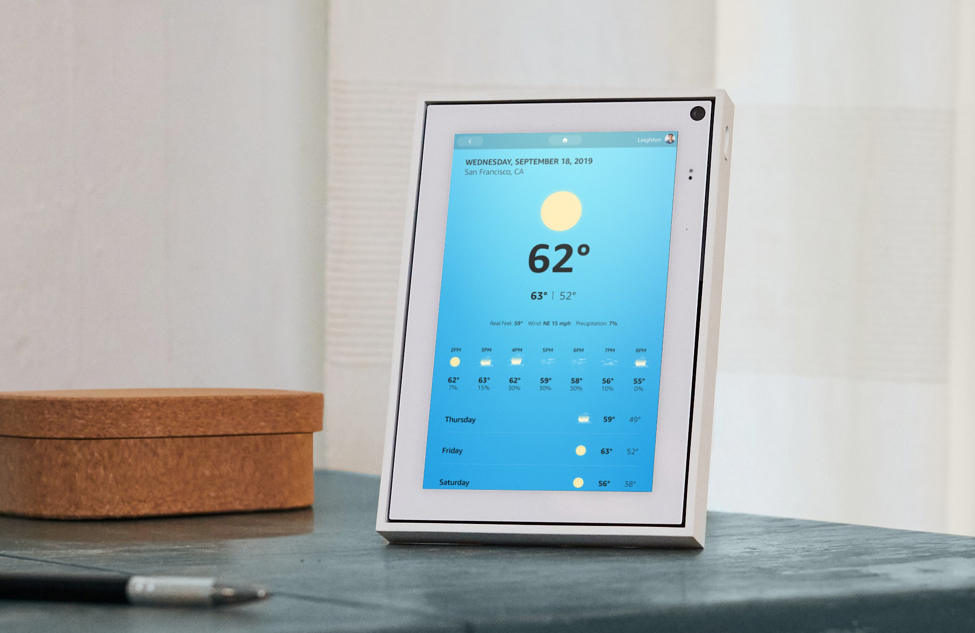
There's also the clever kickstand. I'll admit, I was a little baffled when I took the plug out of the box, but the rigid bit jutting from the back allows you to flip between portrait and landscape mode, depending on the source on the other end (mobile versus another Portal device), which would otherwise appear with letterboxing on the sides.

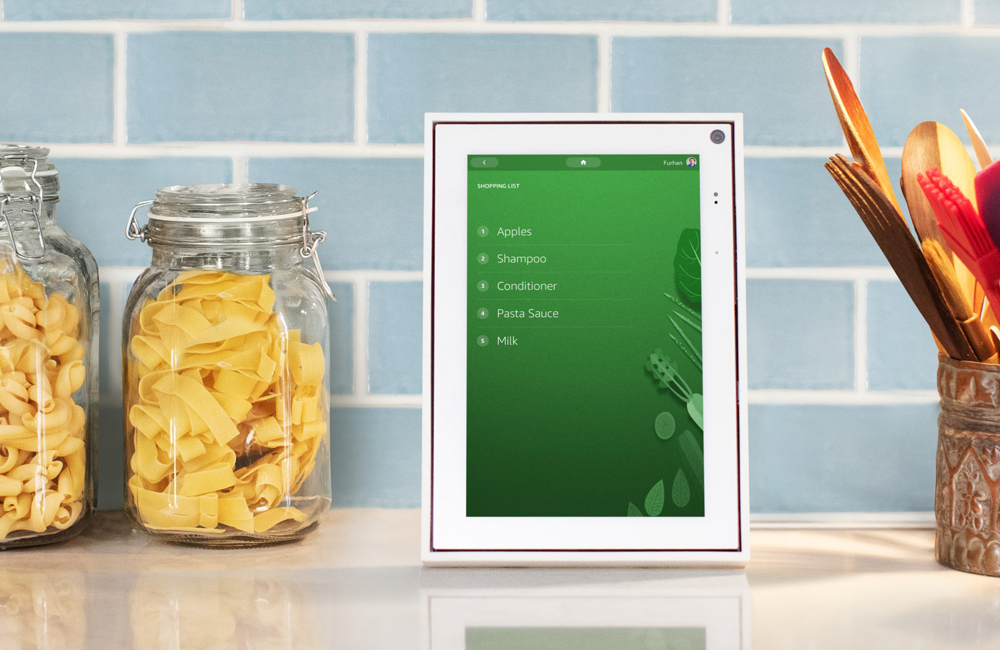
The Portal includes some other nice touches. The company's adding additional AR Effects and Story Time stories. Like the rest of the Alexa-powered smart displays, Portal lacks a YouTube app, though you can access that through the built-in browser. It's an inconvenient workaround, but good to have nonetheless, given how key a service like YouTube feels to a smart display like this.
Otherwise, the less universal Facebook Watch is your primary video source here. There are 14 apps currently listed in the onboard store, including those that are already pre-installed. The list includes big names like CNN, Food Network, Pandora, Spotify and iHeartRadio. Beyond that, you're going to be relying on the built-in browser, requiring a lot of typing on an upright screen.
The price is certainly decent. At $179, I can't imagine Facebook is making a ton of money on these. In fact, it's not entirely clear why Facebook is making the Portal at all, outside of the stock line of "want[ing] to connect the world." Perhaps once it figures out that, it will have a reason why the rest of us should get on board.