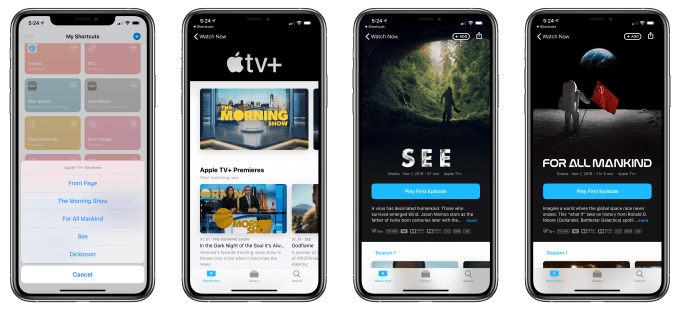
Can’t find the new Apple TV+ shows, like ‘Dickinson?’ This shortcut can help.
The Apple TV app is so bad, someone had to create a shortcut just to make it easier to navigate to the new Apple TV+ content. Apple may have invested billions in its Apple TV+ streaming service and hosted star-studded events to tout its new shows, but what it apparently didn't do is give much thought to designing its TV app to help direct users to its exclusive content.
Instead, the Apple TV+ shows were mixed in with everything else at launch - forcing users to scroll past What to Watch recommendations and more from the larger iTunes catalog just to find the Apple TV+ section.
And even if and when you found that Apple TV+ section, each individual show page is poorly organized, too. Instead of following the standard format where a season's episodes are listed in vertical order on an iPhone, Apple's TV app opts for a horizontal scroll instead. It's frustrating. It's confusing. No one likes it.
Apple's TV app needs so much work. It doesn't even tell you if and when there are more episodes coming to a TV+ show. It's a mistake to not capture sentiment data (
/
) from the get-go, as in a year or two, 80 shows down the road, personalized recommendations will be essential
- Steve Troughton-Smith (@stroughtonsmith) November 4, 2019
Apple TV+ may only include a handful of shows at launch, but it still deserves its own, dedicated tab - like Apple's very own Netflix within the larger construct of the TV app. Part of the problem, as detailed by 9to5Mac here, is that Apple's TV app has been designed to be a jack-of-all-trades. It connects you to your iTunes library of rentals and purchases, to your add-on premium subscriptions, to your TV Everywhere-authenticated apps, and to some - but not all - of your favorite streaming services.
But the end result is an app that's sort of a mess and one that failed to carve out a dedicated space for Apple TV+.
This problem also annoyed MacStories Editor-in-Chief Federico Viticci, who wanted an easier way to navigate directly to the Apple TV+ catalog content.
His solution? An iOS shortcut.
Viticci figured out a way to create URLs that will open any Apple TV+ section you want to get to in the TV app. Similar to how Apple Music web links can be edited to direct to content right in the Apple Music app, Apple TV+ web links can also be tweaked to launch the TV app - without redirecting you through Safari first. This is done by replacing the "https" part of the content URL with "com.apple.tv," he explains.
With this discovery, Viticci was then able to create a shortcut that lets you go directly to any Apple TV+ page - including the "front page" for Apple TV+ or the individual show pages for shows like The Morning Show, For All Mankind, See, and Dickinson.

Apple TV+'s catalog is a bit larger than that, of course, and will continue to grow. But you can continue to edit the shortcut to meet your needs.
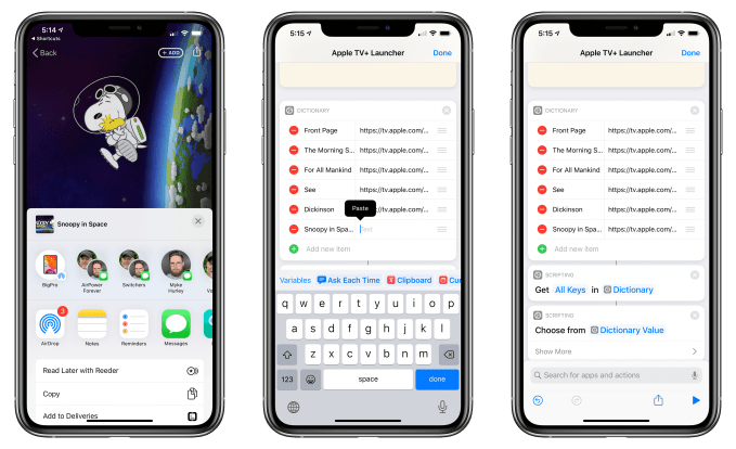
To add something new to the default list of shows, you'll first have to locate the show in the TV+ app - good luck! You'll then tap the "Share" button then choose "Copy" to copy the link to your clipboard. In the shortcut, you'll add a new "Text" item to the action that's at the beginning of the shortcut, and name it what you like. Finally, you'll paste in the link you had copied into the "Value" field.
Ta-da! You updated the shortcut!

Or if you just want to use the iOS shortcut as is, so you can get right to Dickinson, you can add it by clicking here.
Viticci tells TechCrunch he expects to keep adding sections as well as links for more shows, as these become available. The shortcut, which is called simply "Apple TV+ Launcher," will be updated in the MacStories Archive so people can re-download the latest version as needed, he says.
Of course, when people are building a shortcut to work around an app's poor navigation, there's a bigger problem that needs to be addressed.
Now, it's possible that Apple intentionally mixed in Apple TV+ content in such a way to not make it look like it was using its platform power to give its own service a boost, in light of the recent antitrust and anticompetitive investigations into its business practices. But Apple usually doesn't go so far as to offer a poor user experience - that's just not in its ethos.
Besides, Apple certainly wasn't shy about marketing the streaming service in other ways - as with the push notifications or the big Apple TV+ banner at the top of the Apple TV homescreen, for example.
Instead, this just looks like a case of needing to tweak the app's design.
Until then, we can just use the shortcut to help.
(Image credits: MacStories)