Results of the artwork contest 2019 – Places 1 to 10
Here they finally are, the top 10 of this year's Sandra and Woo and Gaia artwork contest! The submissions are ordered from place #10 to #1. Such an amazing display of talent! I will pay the prize money until the end of this week.
Show your support by visiting the artists' websites and/or writing a comment in the comment section of this blog post! Many thanks to all artists who participated! I love to see my characters in all these different styles and situations!
-

Place 10 goes to Oliver Barber
(Place 19 on Powree's list)
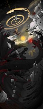
[Artist's comment: This year, I offered Larisa the chance to participate, while dreaming of that coveted number 1 spot. Unfortunately, she turned the paper upside down causing Sandra and Woo to fall to the ceiling!]
Oliver Barber does it again! Making it into the top 10 of our artwork contests, that is. With his best drawing so far, he manages to reach #10 of this year's special contest. I love the details such as the raccoon mug and the different drawing style used for the drawing shown in the top right corner. It's such a lively drawing without looking too busy!
-

Place 9 goes to renless
(Place 44 on Powree's list)
The format of this artwork is certainly not optimal for looking at it on a computer monitor. It would look even better as an oversized poster hanging on a wall. It's also a rather free interpretation of the character designs of Viviana and Lilith who are certainly the weakest parts of the drawing. But the impressive composition and the extremely well drawn Bahamut make more than up for that. That's the kind of creativity I want to see in contest entries! Powree had a very different opinion about this piece, though.
-

Place 8 goes to Thamuz Martu (website)
(Place 38 on Powree's list)
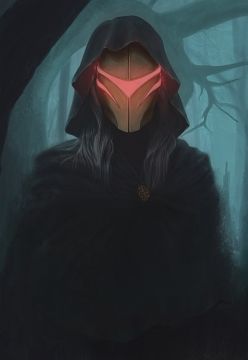
[Artist's comment: I wanted to make a simple, but cool-looking artwork. Usually, I make complicated setups with too many tiny details that will be lost in the picture as a whole.
Eldor. I love his mask from early in the comic. He is in some kind of magical forest at night.]
Just like the previous artwork, this one also has a rather dark atmosphere, but in a completely different way. I love the haunting look of Eldor in this drawing that is drawn in a style that resembles old oil paintings. There's not that much in this drawing, but adding anything more would ruin it. Just like the previous submission, Powree also didn't like this one quite as much. I wonder why"
-

Place 7 goes to Mahsira (website)
(Place 7 on Powree's list)
[Artist's comment: My entry was inspired by your 13th page A Trip to the Forest, which has been a major source of artistic inspiration for me ever since I started reading your webcomic! I wanted to draw a reimagining of the scene to honor the spirit of that drawing and give it a new sense of wonder and to show my love to the long history, as well as the early days of your comic.
The coloration of this piece is truly breathtaking. Mahsira made perfect use of his limited color palette. The landscape looks just wonderful, including the lovely tree behind Sandra. The composition is also top-notch. Note how the shapes and placement of the clouds draw the eyes towards Seeoahtlahmakaskay. I'm very fond of Seeoahtlahmakaskay's design as well. Sandra's head, however, is clearly the weakest part of the drawing. I made some suggestions how to improve it, but Mahsira didn't provide an adjusted version.
-

(MP4, 69 MB)
Place 6 goes to Karolina Zimny (website)
(Place 40 on Powree's list)
Karolina submitted this elaborate animation. It's a true celebration of the first ten years of Sandra and Woo! I'm also particularly fond of the background drawing. I really have no idea why Powree only placed it on #40 in her list. Some of the individual drawings shown in the picture book alone would have made it close to the top 50 in my eyes.
You can also look at the individual drawings shown in the picture book: [1], [2], [3], [4], [5], [6], [7], [8], [9], [10], [11], [12].
-

Place 5 goes to idim Bedrossian (website)
(Place n/a on Powree's list)
Everybody who has ever worked with Blender knows how much work went into this 3D scene featuring Charlie's Demons, namely Larisa, Yuna and Sandra. The light effect turned out great and the character models are done professionally. Note the different shapes on Yuna's glasses and the smooth curve of Larisa's tail. The background also works very well. Only Woo didn't turn out that great since his model is lacking fur which is especially noticeable on his tail.
There are also three alternative versions with slightly different backgrounds: [1], [2], [3].
The download package for our Patreon patrons will also contain some interesting work-in-progress pieces.
-

Place 4 goes to Audia Pahlevi (website)
(Place 2 on Powree's list)
[Artist's comment: I'm trying to capture the bond between Sandra and Woo in this picture. Sandra is having a holiday trip with Woo in a train. The train is passing the seaside and she's enjoying the view very much.]
Now this is an amazingly well drawn picture! Just look at the reflections on the floor, the smooth shading of the seats and the transparent umbrella! The tranquil atmosphere of the drawing is so thick that you can almost cut it. Sandra also looks wonderful. Woo can't completely keep up with the super high standard set by the rest of the picture, though, so I decided to put Florencio's submission on position #3.
-

Place 3 goes to Florencio Duyar III (website)
(Place 9 on Powree's list)
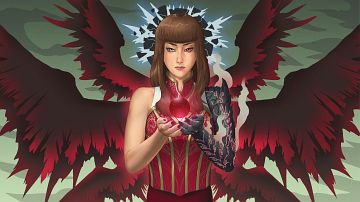
[Artist's comment: Corruption - What is this? A possible alternate reality? A vision of the future? What if Lilith became a conduit for the Redstream? The talented mage's form slowly turns into that of a shadow creature.]
Florencio submitted this truly outstanding portrait of Lilith that is the result of dozens of drawing layers in the original PSD file working perfectly together. I'm particularly fond of the haunting look of Lilith and the design of the breaking sphere behind Lilith's head and the coloration of the red sphere she's holding. You really have to look at this drawing for a while to give all the details enough attention.
-

Place 2 goes to Gatekid3 (website)
(Place 3 on Powree's list)
[Artist's comment: I felt like I had backed myself into a corner with last year's entry. I wasn't sure how I could top it, and I still don't fully know If I have, but I wanted to do something kind of simple with as many characters as I had the time to put in because of the anniversary. Unfortunately, certain characters didn't end up making it such as Zoey who I just couldn't get right and Ye Thuza who would have been with Yuna, but felt out of place without any other of the adults.]
Like last year, Gatekid3 reaches position #2 with an elaborate GIF animation. This year's turned out even better (and longer) with multiple characters from Sandra and Woo in different situations. One should not only marvel at the animation itself, though, but also note how well-drawn the individual characters are.
There is also the original version with a significantly higher animation speed. I think the speed of the current version is not optimal yet in some parts, and I will try to produce an ultimate version in the next weeks.
-

Place 1 goes to Audia Pahlevi (website)
(Place 1 on Powree's list)
[Artist's comment: The Gaia group in the middle of a quest being ambushed by monsters and a few enemies.]
The clear winner of this year's artwork contest is Audia Pahlevi with this outstanding group picture of the Gaia characters! This is exactly the type of submission that I was hoping for when I increased the prize money for this year's contest so much. Everything is brilliant! The characters, the coloration, the light effects, the composition, and the sheer scope of the artwork! Viviana turned out particularly lovely in my opinion.