Countries That Are Far Larger Than Portrayed on Maps

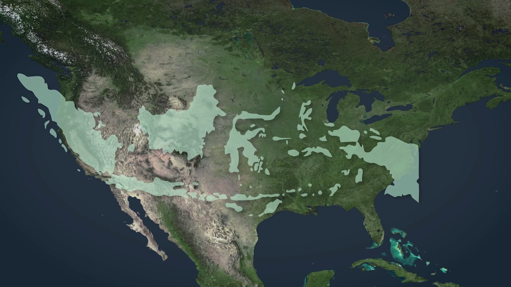
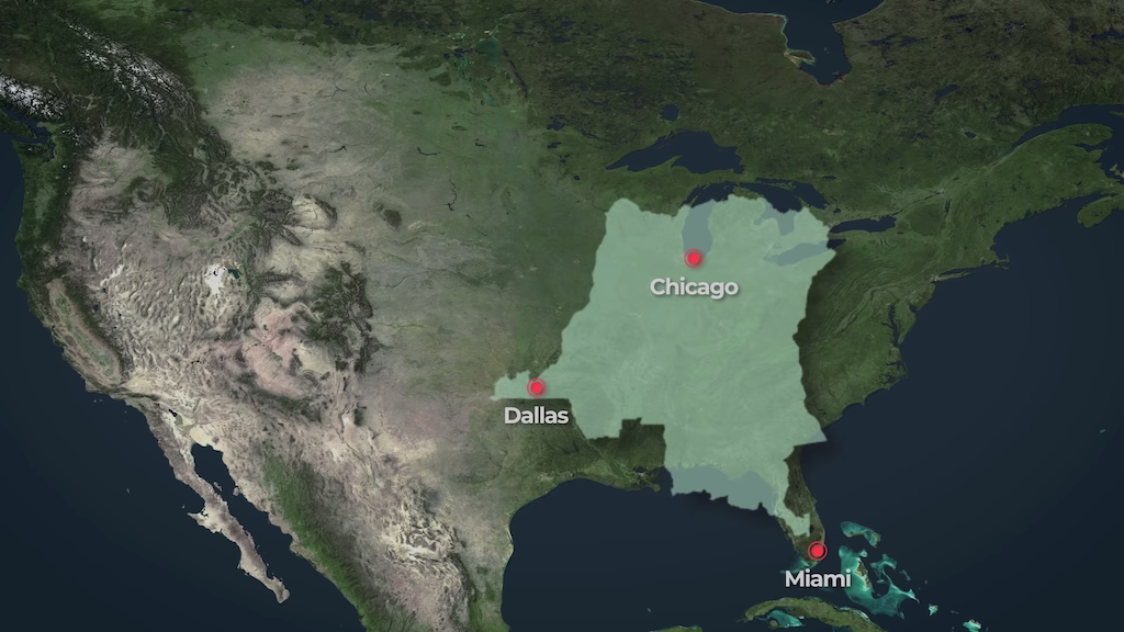
Joseph Pisenti of RealLifeLore (previously) explains visually and verbally how some countries are much larger than have been portrayed on maps due to the perspective of those who make the maps. Pisenti uses graphic overlays to show, for example, the incredibly long span of Indonesia, Japan, and Chile and the size of Brazil, D.R.C., Somalia, and China against the respective sizes of North America and Europe.
They are indeed much larger than previously thought.
From a European/Western perspective the world is sometimes shown to us from our point of view which makes our countries or our continents seem much bigger than they actually are. The fact is the world is a huge place and the West is just a small part of it.

The Democratic Republic of Congo (D.R.C.) over United States
Follow Laughing Squid on Facebook, Twitter, and Subscribe by Email.
The post Countries That Are Far Larger Than Portrayed on Maps first appeared on Laughing Squid.