Apple’s Magic Keyboard Review: Laptop class typing comes to iPad Pro
Over the past two years, I've typed nearly every word I've written while traveling on the iPad Pro's Smart Keyboard Folio. For more on why you can see my iPad Pro review here.
For the purposes of this look at the new Magic Keyboard, though, you should probably just know two things:
- It was reliable, incredibly durable and never once failed me.
- It kind of stunk in every other way.
The Keyboard Folio's plastic coated surface made it impervious to spills, but it also made the keys much less responsive. It rendered them unable to give your fingers the feedback necessary to confirm that a key had been struck, leading me to adopt a technique where I just hit every key with maximum strength at all times.
The new Magic Keyboard is as different from that device as the new MacBook Pro keyboards are from the low profile ones that dominated headlines over the last couple of years. It's a huge jump forward in usability for the iPad Pro - and for last year's model too.
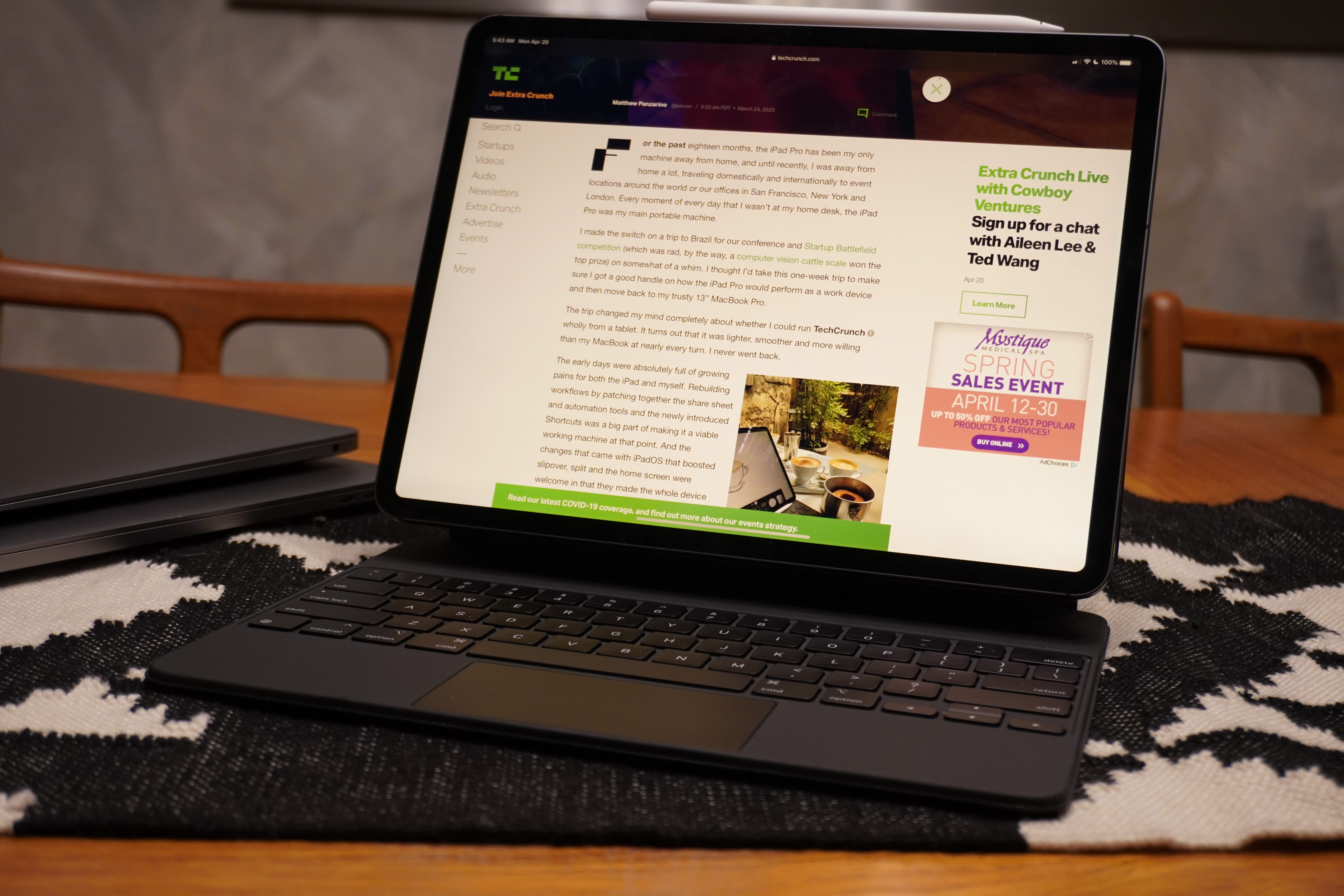
I am very relieved I don't have to slam my fingers onto the plastic keyboard anymore, because over long and fast typing sessions I could feel a numbness that would begin to radiate from the tips of my fingers a bit. An enervation of sorts. It wasn't precisely painful but it was noticeable.
The Magic Keyboard offers a lovely, backlit deck that holds its own against the 16" MacBook Pro and the new MacBook Air for best portable keyboards. The key travel is excellent - in between the two laptops in my opinion - and the feel is tight, responsive and precise. This is a first class typing experience, full stop.
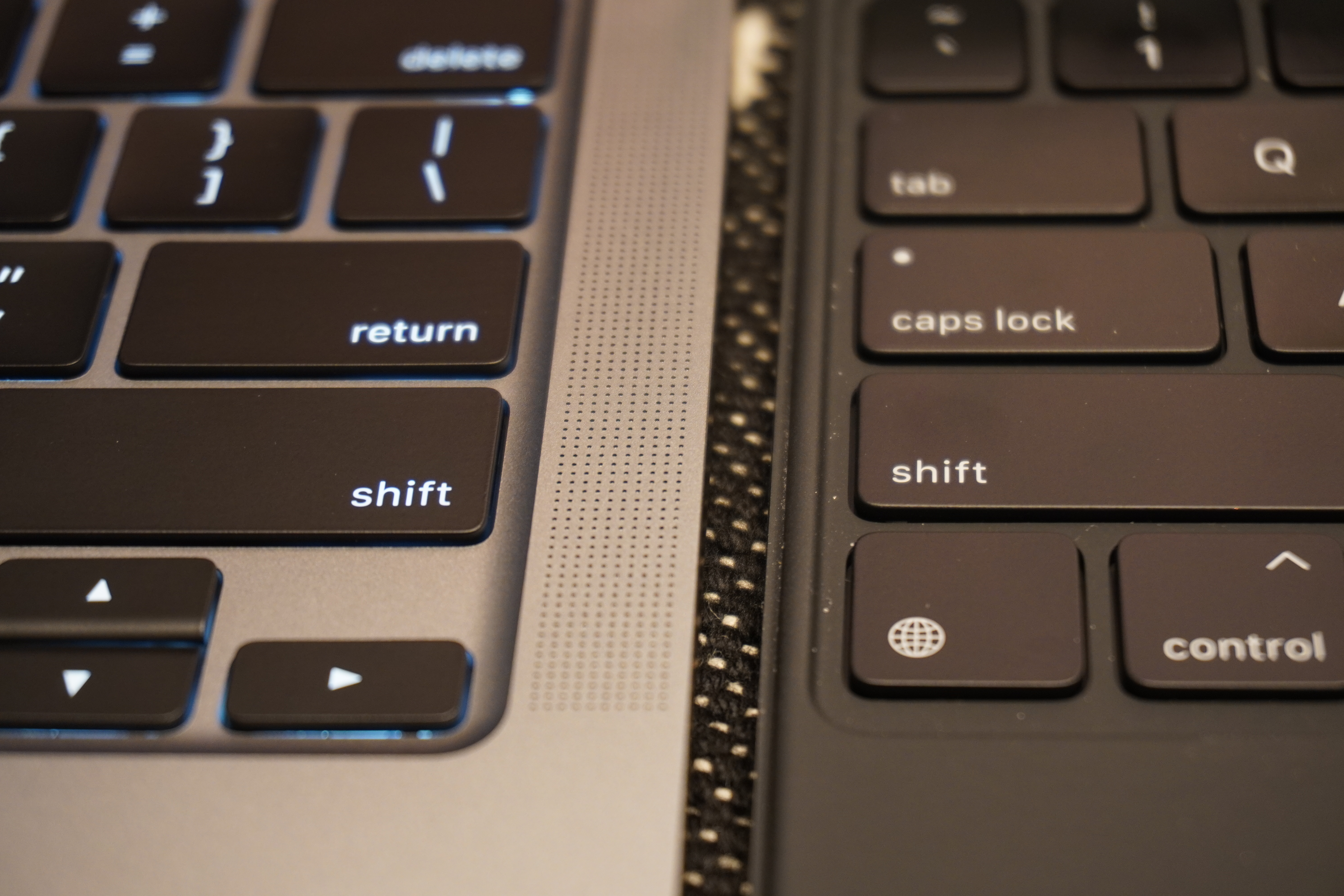
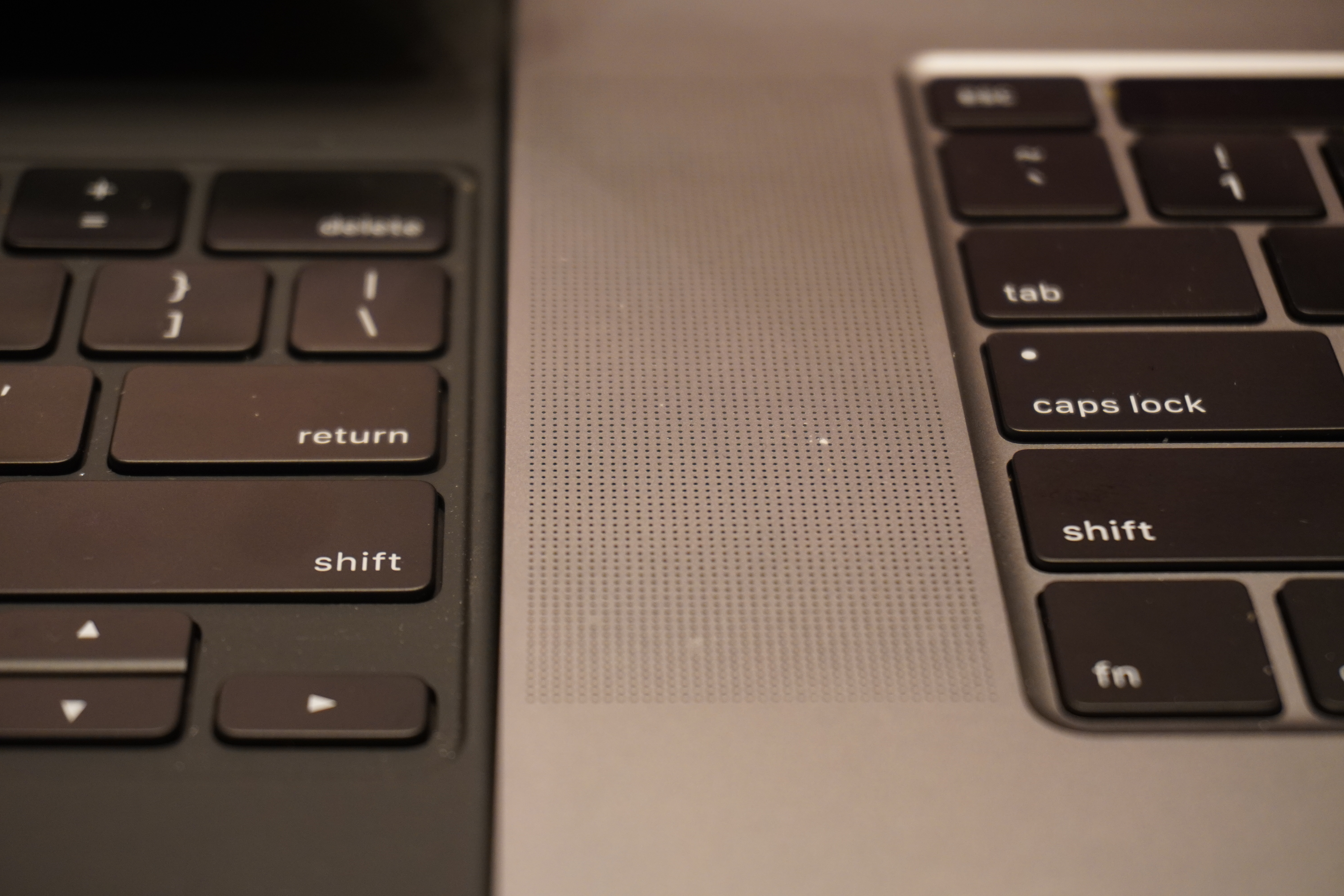
I've been testing the three keyboards alongside one another for the past few days and I can't stress enough how stable the keys are. Even the MacBook Air allows a tiny bit of key shift if you touch your finger to it and gently circle it - though the MacBook Pro is better. There's such a small amount of that here that it's almost imperceptible.
It's a tad spongier than the 16" MBP but more firm than the MacBook Air, which has a bit more return and travel. In my opinion, this keyboard is 'louder' (due to the plastic casing being more resonant than the aluminum), than the 16" MBP, but about the same as the MacBook Air. The throw feels similar to the 16" though, with the Air being slightly deeper but 'sloppier'.
So a hybrid between those two keyboards as far as feel goes, but a clear descendant of the work that was done to turn those offerings around.
Construction
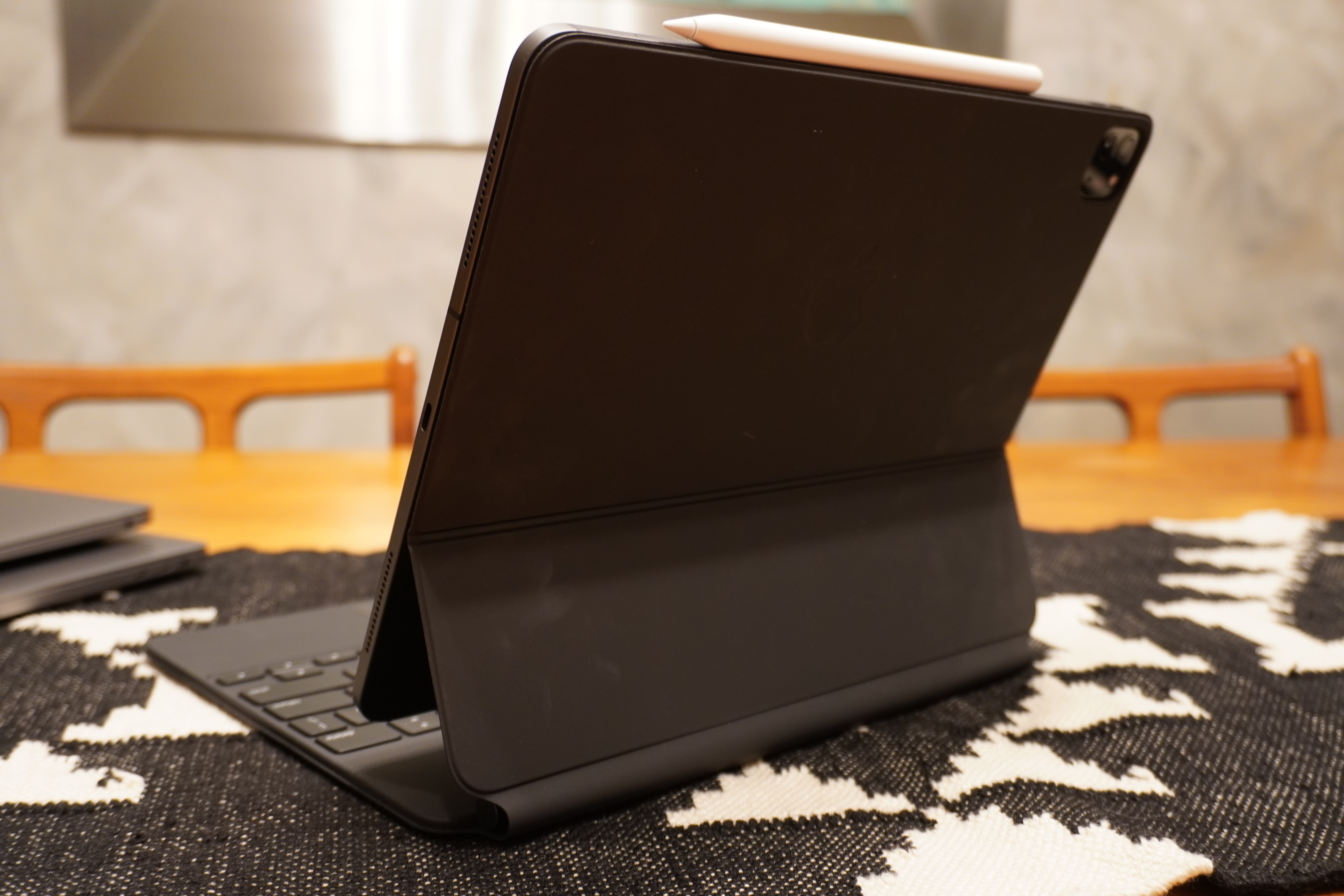
Among my biggest concerns was that Apple would get overly clever with the hinge design, making the the typing an exercise in wobble. Happy to say here that they took the clear path here and made it as sturdy as possible, even if that was at the cost of variability.
The hinge is a simple limit stop design that opens far less than you'd expect and then allows a second hinge to engage to open in an arc between the 80 and 130 degrees. The 90 degree and fully open positions basically mimic the angles that were offered by the grooves of the Keyboard Folio - but now you can choose any in-between position that feels natural to you.
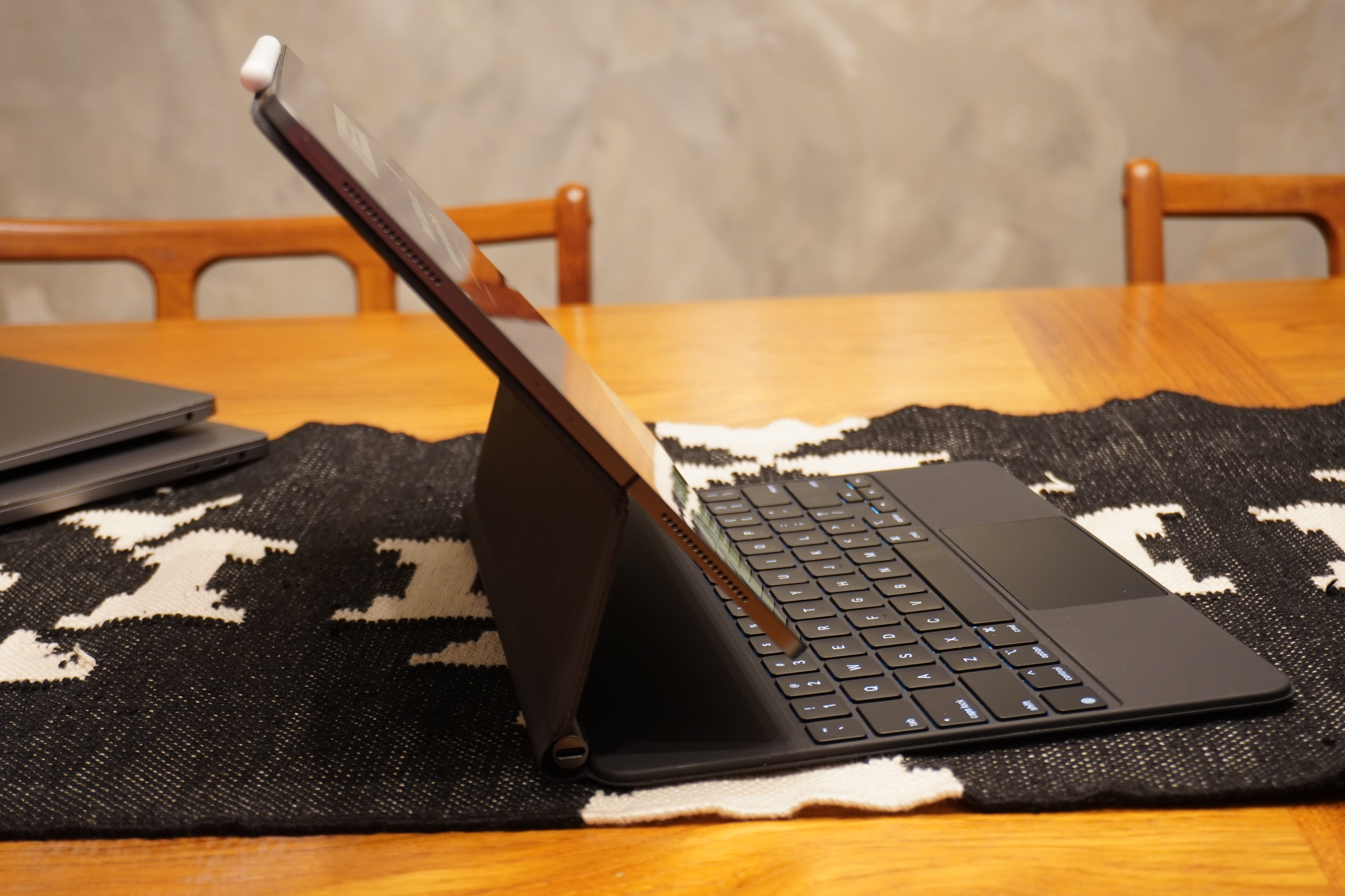
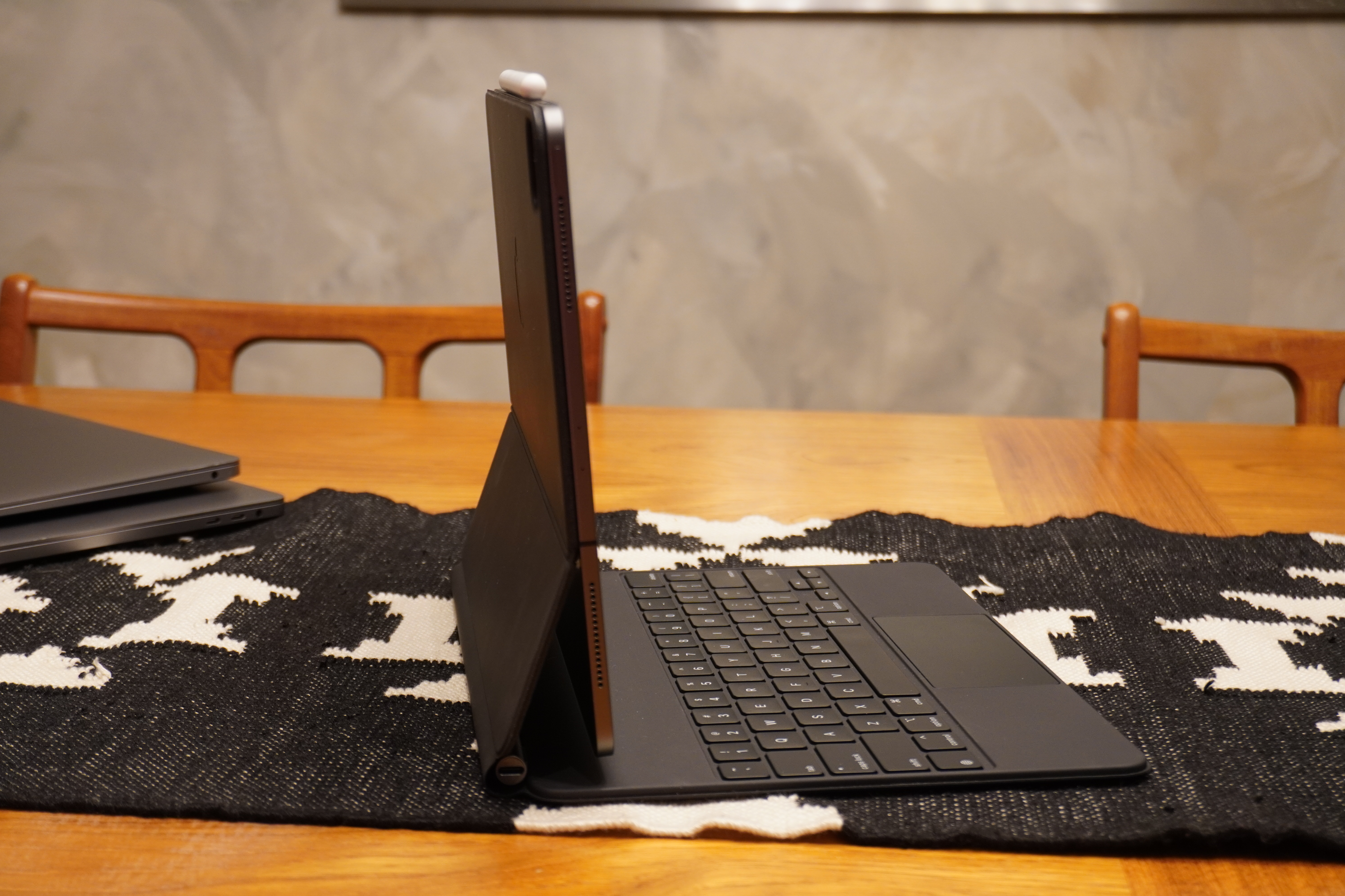
Apple has obviously put this hard stop fold out limit in place to maintain balance on tables and laps, and its clever use of counter opposing forces with the second hinge combines to limit tipping and to make typing on a lap finally a completely viable thing to do. The fact that you don't have to hammer the keyboard to type also makes this a better proposition.
For typing, these positions should be just fine for the vast majority of users. And the solid (very high friction) hinge means that the whole thing is very sturdy feeling, even with more moving parts. I have been quite comfortable grabbing the whole assembly of the 12.9" iPad Pro plus Magic Keyboard by the deck of the keyboard and carrying it around, much in the way I'd carry a laptop. No worries about accidental floppiness or detachment.
At the same time, the new design that floats the iPad in the air allows you to quickly pop it off with little effort by either your left or right hand. This makes the Magic Keyboard take on the use case of a desktop based dock, something that never felt right with the Keyboard Folio.
The touchpad physically moves here, and is not a haptic pad, but it is clickable across its entire surface. It's also a laptop-class trackpad, proving that Apple's engineering teams still have a better idea about how to make a trackpad that works crisply and as expected than any other hardware team out there.
I do love the soft touch coating of the case itself, but I believe it will wear in a similar fashion to these kinds of surfaces on other devices. It will likely develop shiny spots on either side of the trackpad on the hand rest areas.
The responsive half arrow keys are extremely welcome.
Some other details, quirks and upper limits
The camera placement situation is much improved here, as you're less likely to hold the left side of the iPad to keep it stable. The lift of the keyboard (at times about an inch and a bit) means that the eye line, while still not ideal, is improved for zoom calls and the like. Less double chin up the nose action. Apple should still move the iPad Pro's camera on future versions.
The keyboard's backlight brightness is decent and adjustable in the settings pane once it's attached to iPad Pro. The unit did use more battery in my tests, though I haven't had it long enough to assign any numbers to it. I did notice during a recent Facetime call that the battery was draining faster than it could charge, but that is so far anecdotal and I haven't had the time to reproduce it in testing. The charging port does put power through to the device at full speed though, according to some early testing.
This is not the case that artists have been waiting for. This case does not rotate around backwards like the keyboard folio, meaning that you're going to be popping it off the case if you're going to draw on it at all. In some ways the ease of removal feels like an Apple concession. 'Hey, we couldn't fit all this in and a way to position it at a drawing angle, so we made it really easy to get it loose.' It works, but I hope that more magic happens between now and the next iteration to find a way to serve both typing and drawing in one protected configuration.
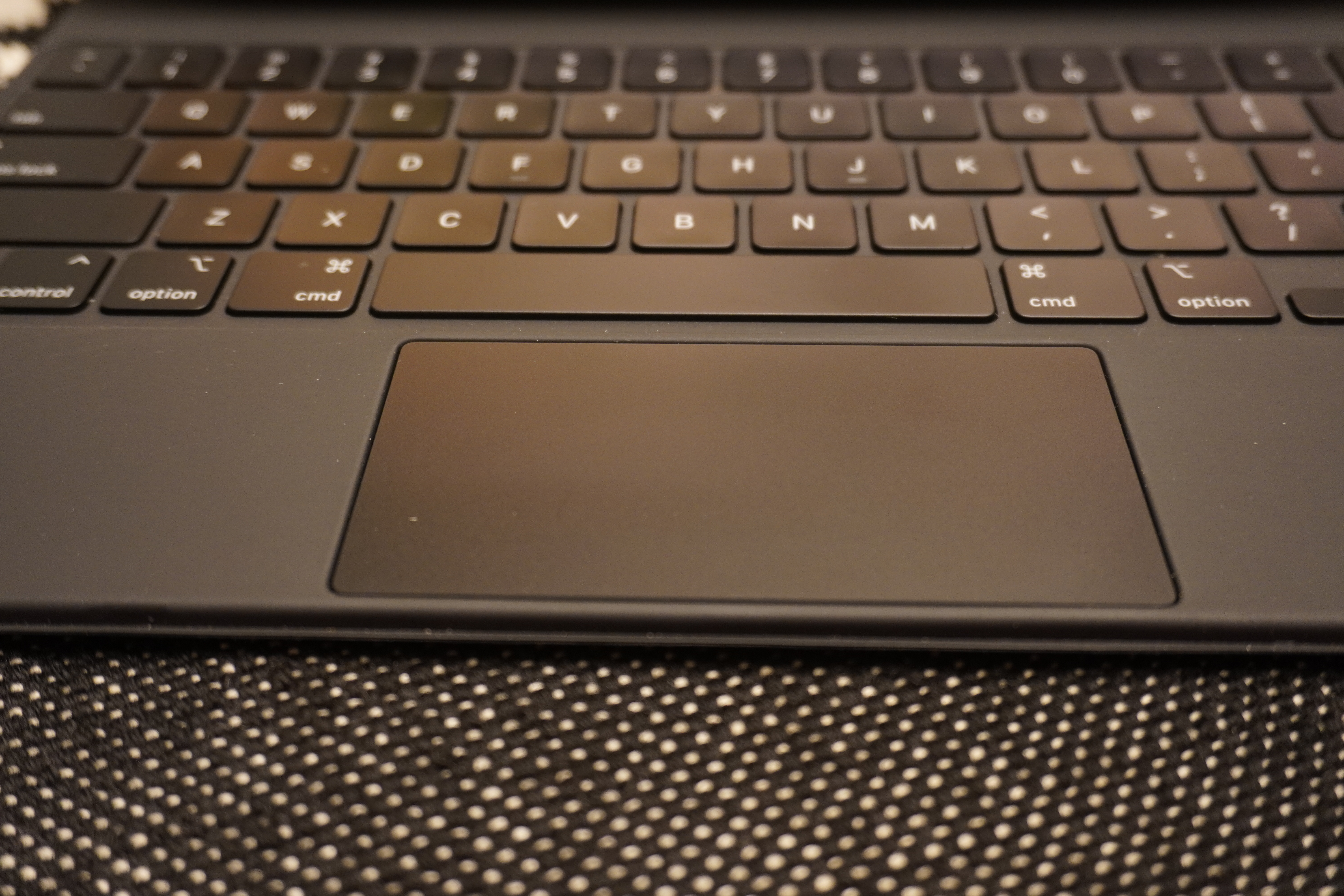
A little quirk: when it's tilted super far back to the full stop I sometimes nick the bottom edge of the iPad with my fingers when hitting numbers - could be my typing form or bigger hands but I thought it worth mentioning.
It's a bit heavy. At 700g for the 12.9" keyboard, it more than doubles the weight of the whole package. The larger iPad Pro and keyboard is basically the weight of a MacBook Air. Get the 11" if weight is a concern. This keyboard makes the iPad 12.9"^3 package feel very chunky. The
The fact that this keyboard works on the older iPad Pro (the camera just floats inside the cutout) means that this is a fantastic upgrade for existing users. It really makes the device feel like it got a huge upgrade without having to buy a new core unit, which fits with Apple's modular approach to iPad Pro and also stands out as pretty rare in a world where the coolest new features are often hardware related and new device limited.
At $300 and $350 for each size of Magic Keyboard, the price is something you must think about up front. Given that it is now easily the best keyboard available for these devices I think you need to consider it a part of the package price of the device. If you can't swing that, consider another option - it's that good.
I'd love more angles of use here and I'm hoping that they include more - that said! If you work seriously with the iPad and that work is based on typing, the Magic Keyboard is essentially mandatory. It's the dream keyboard for all of us who found ourselves crossing the Rubicon into iPad as primary computer over the past couple of years. It's not without its caveats, but it is a refreshingly straightforward and well executed accessory that makes even older iPads feel like better laptops than laptops.