iOS 14 reimagines how you find and use apps with App Clips, widgets and an App Library
At Apple's all-virtual Worldwide Developers Conference, the company introduced several new iOS features designed to help you clean up the mess of icons on your iPhone's homescreen. With iOS 14, users can opt to have iPhone's software organize their apps for them instead of manually moving them around into folders. The feature will benefit those who now have multiple pages of apps, and often forget where they've organized them on back screens. It also introduces the concept of homescreen widgets and lightweight apps, called App Clips.
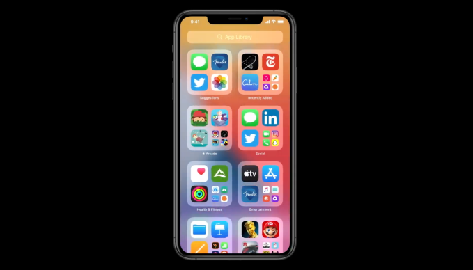
Instead of pages of apps, the new App Library offers a new space at the end of your homescreen where all your apps are organized in a one simple and easy to navigate view.
To use the feature, you first go into iPhone's jiggle mode" to begin organizing apps. But instead of dragging around icons on the homescreen or moving them into folders, you can now check off which pages of apps you want hidden from view. The apps on these pages will end up in your App Library, where apps are organized not only in thematic collections - like those you would have made, perhaps - but also into dynamically updated folders.

For example, a folder called Suggestions" will house those apps Siri believes you may be looking for next. Another called Recently Added" will feature apps you've recently downloaded. Other folders may include your Apple Arcade downloads, your Social apps, Health & Fitness apps (including Apple's own Health and Activity apps, for instance), Entertainment apps, and so on.
The apps you use the most from the category will be at the top level for easy launching.
These categories are automatically created and your apps will be organized for you into the ones where they fit best. These might not be how you would have organized them, necessarily, but it takes the work out of your hands. It also offers a way to hide your less-frequently used apps from view.
Up at the top of the App Library, you'll also have the search field, where you can still get access all your apps organized from A to Z.
The feature was introduced alongside iOS 14 widgets, which lets users - finally - surface rich data from within apps in the form of resizable widgets that sit on your homescreen. Before, iOS only allowed for widgets in the Today View, but not on its main screen.
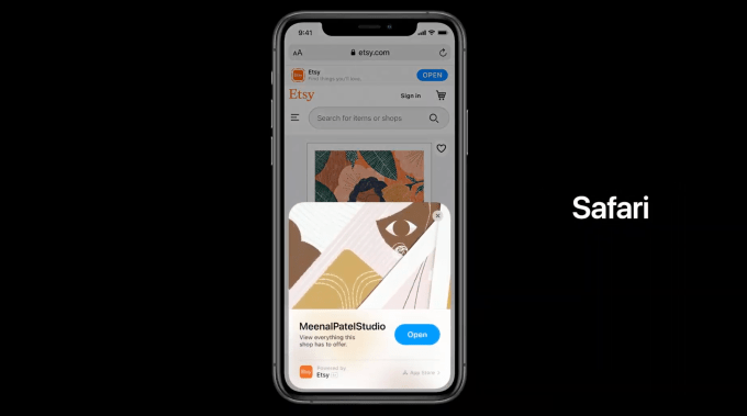
In another more radical change, Apple introduced the concept of App Clips, which can be launched via a visual code or NFC. A clip, like it sounds, is a small part of an app launched on demand. App Clips can include support for Apple Pay, but are small in size to be quickly downloaded in a time of need - like an app for paying for your parking meter, for instance.

The idea is not everyone needs a full app download immediately, which takes time. They just need a piece of software that lets you get the job done quickly.
With the App Library, widgets, App Clips, and other iOS 14 features, like picture-and-picture, Apple is giving the iPhone a much-need refresh in terms of its user interface at a time when the format of apps tucked inside folders was becoming a little dated. The features will arrive with iOS 14, which launches publicly later this year.
