YouTube revamps its mobile app with new gestures, video chapter lists, and more
YouTube today is rolling out a series of updates to its player page on mobile devices. The changes relocate some elements, add new features - like an expanded set of gesture-based navigation options - and update existing ones, like video chapters, among other things.
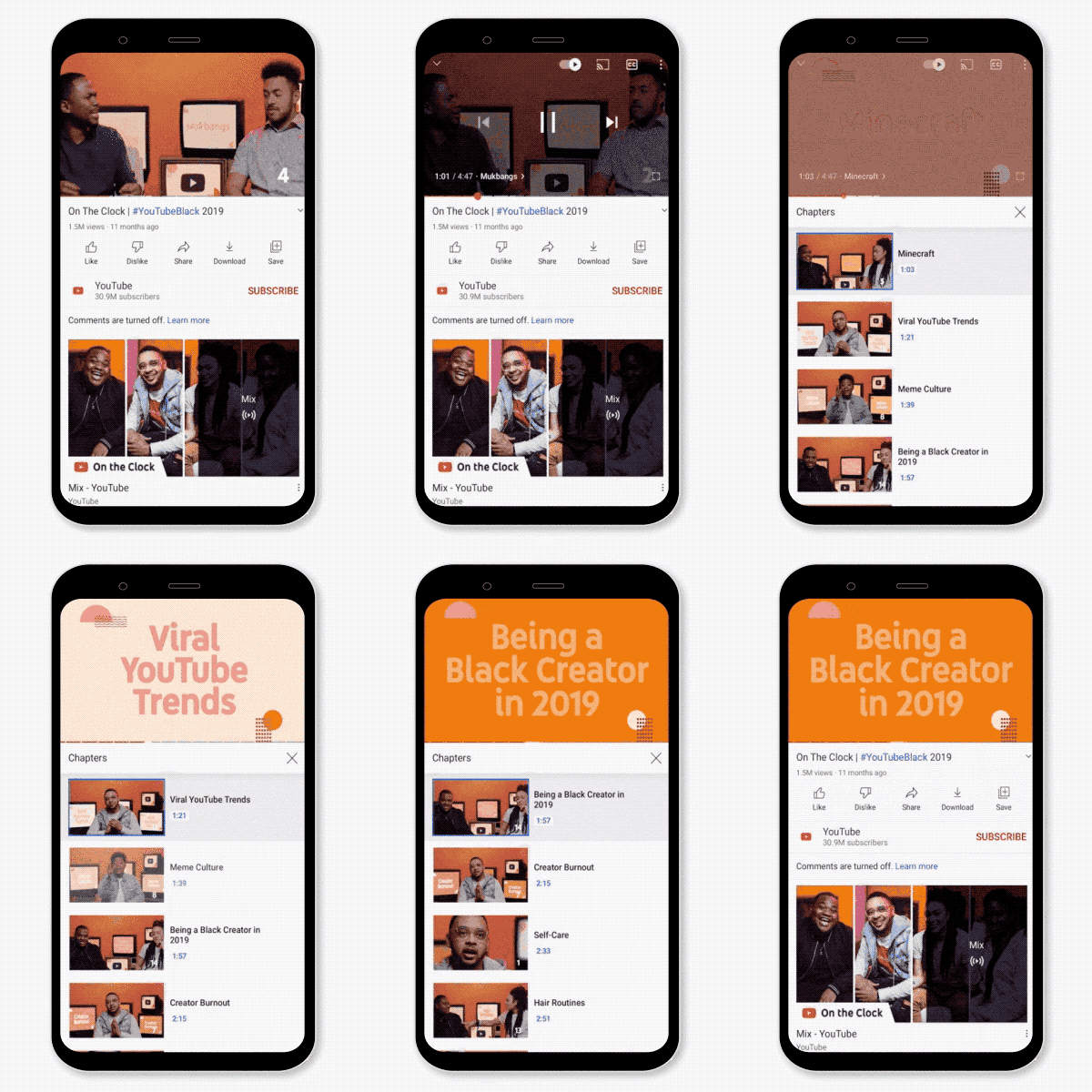
Video chapters were introduced in May, as an easier way to get to the good part" of a video, without having to manually fast-forward. Instead, creators can apply timestamps to their videos that allow users to quickly jump to a specific section of a video or backtrack to rewatch a key part.
These chapters are automatically enabled as a line of timestamps and titles, based on chapter information the creator adds to their video's description, beginning at segment 0:00.

Image Credits: YouTube
Today, YouTube is extending this feature to include a new list view that lets you see a complete list of all the chapters included in the video, each with their own preview thumbnail. You can access this list view by tapping or clicking on the chapter title in the player, then jump to the part of the video you want to see by tapping the video chapter in the list.
This make chapters easier to navigate, as the thumbnails offer a visual guide to the various parts of the video.
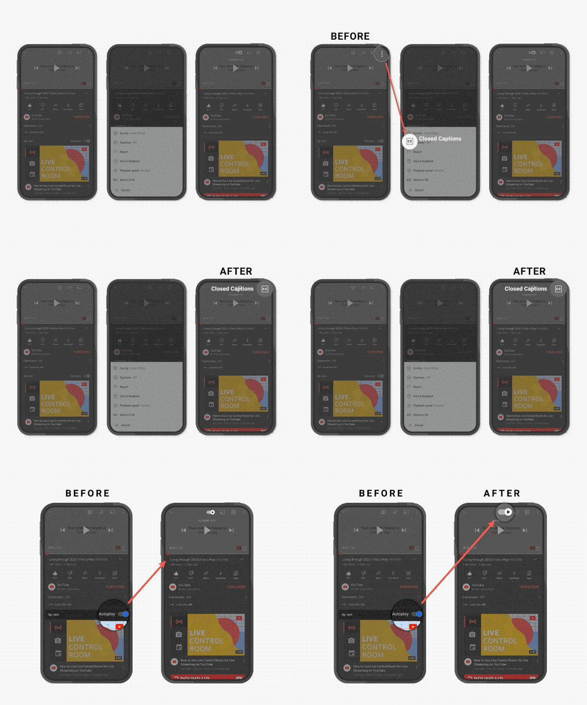
YouTube is also today updating its player page. To make captions more accessible, it's moving the button to a more prominent position on mobile phones. The auto-play toggle has been moved as well, so it's easier to turn it on or off while you're watching a video - a change that will roll out to desktop users soon, too, YouTube says.

Image Credits: YouTube
There are other small improvements on the new player page, including a re-arranged buttons and controls that respond to your input faster than they did before.
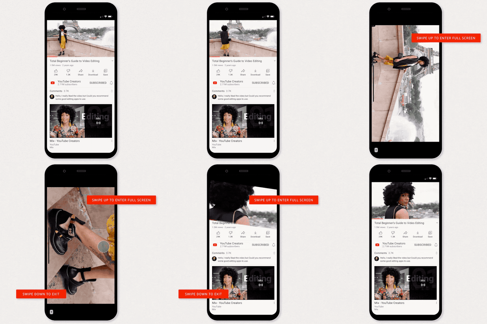
Along with the user interface changes, navigation has been updated to include an expanded set of gesture controls. Already, you can double tap on the left or right side of a video to either fast forward or rewind 10 seconds. Now, you'll be able to swipe up to enter full screen mode and swipe down to exit full screen, too.

Image Credits: YouTube
And if you want to see how much time is counting down versus how much time has elapsed in a video you're watching, you can tap the timestamp to switch back and forth between these numbers.
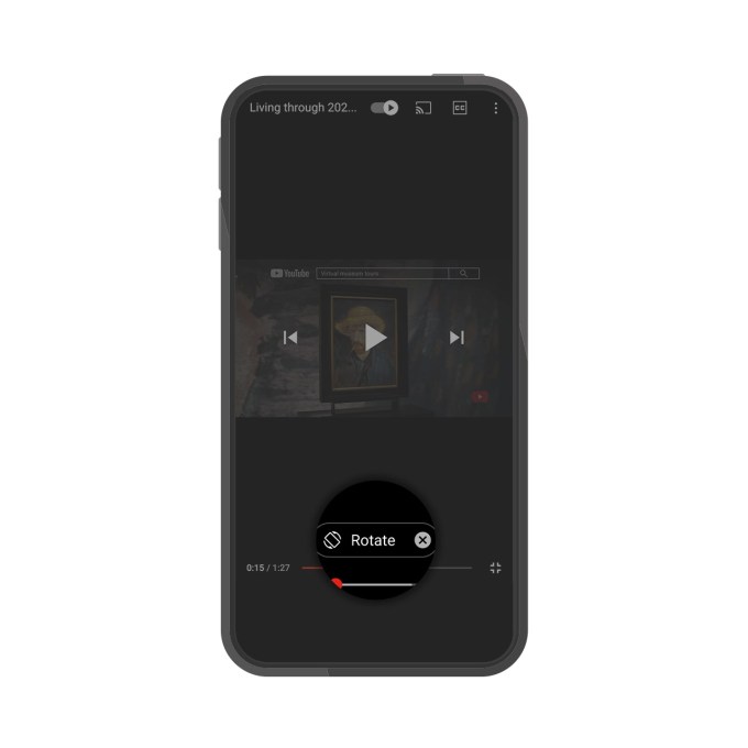
In another change, YouTube will prompt viewers with suggested actions" when there's a way to have a better video experience. For example, you may be prompted to rotate your phone for a landscape video, or play a video in VR. Over time, it will roll out more suggestions, as needed.

Image Credits: YouTube
In its announcement today, YouTube mentioned a bedtime reminders feature which actually launched earlier this year. It's not clear why it was lumped in with the other changes, as it's already live. (YouTube says it was just a recap").
Many of the other changes may not be new to all users, either, however. YouTube confirmed to TechCrunch that some users will already have these features at the time of the announcement, while others will receive them this week.
The updates will roll out across both iOS and Android, starting today.