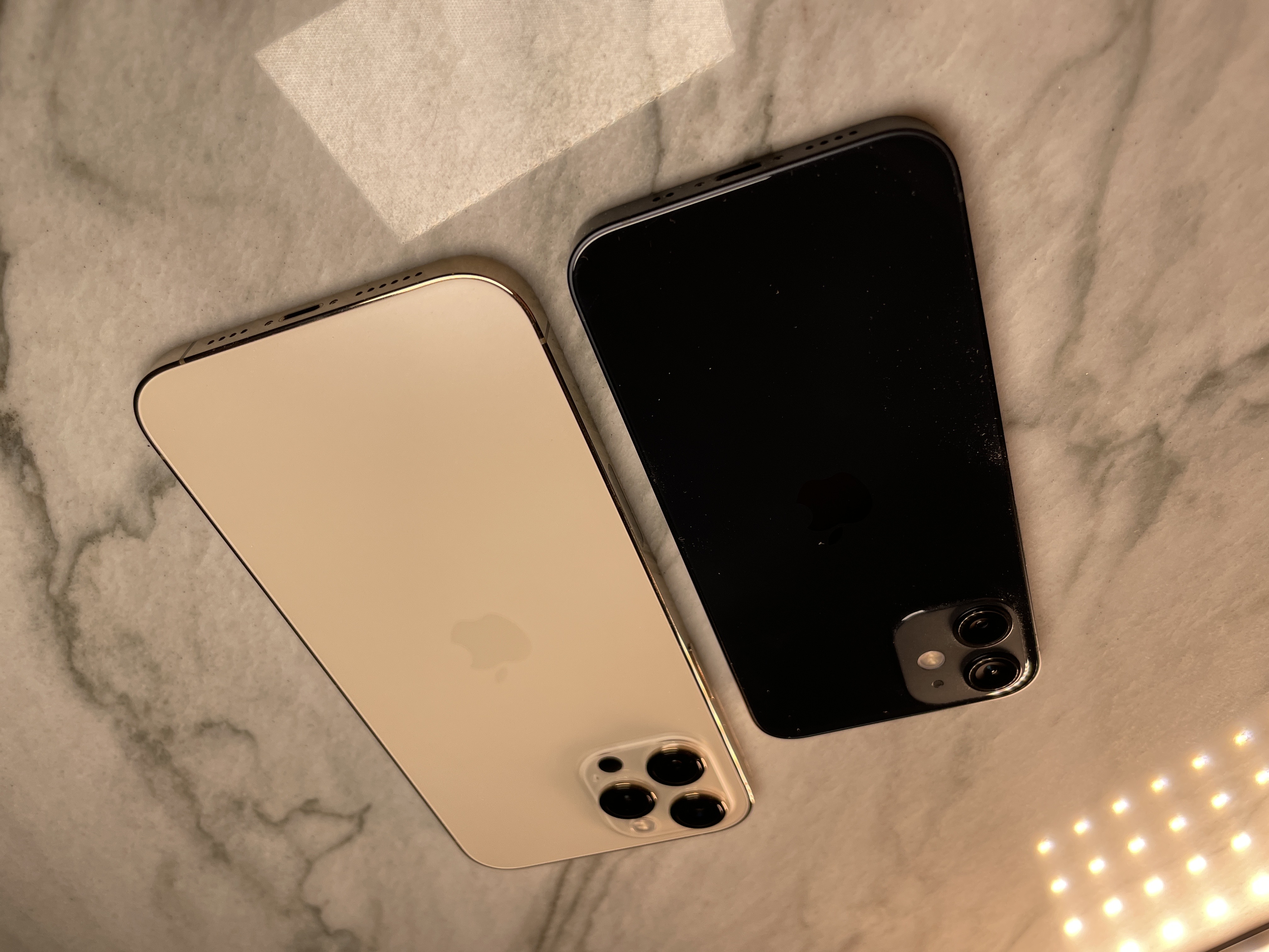
iPhone 12 mini Review: Tiny package, big bang
Reviewing the iPhone 12 mini and the iPhone 12 Pro Max at the same time has been an exercise in extremes. I noted in my earlier reviews of the iPhone 12 and iPhone 12 Pro that it was difficult to evaluate the middle of the lineup without having the extreme ends of the scale available to contrast them.
Now that I have had a chance to examine those extremes, I have come away incredibly impressed with the job that Apple has done on the whole lineup this year. These phones are extremely well sized, highly crisp from a design perspective and generously appointed with features. Aside from a handful of small items, there are no glaring examples here of artificial cliffs on the feature side or price side that attempt to push people upwards in the lineup. Something that has been the case in some years.
The most impressive of all of the iPhones 12 this year should be, by all rights, the iPhone 12 Pro Max. It's big screen and beautiful casing make it very attractive and it has the best camera I've ever seen in a phone.
But in my opinion, the iPhone 12 mini is the most attractive phone in the lineup. The dark horse that makes a strong case for itself outside of the I just want a small phone' crowd.
The size
The iPhone mini is 20% smaller and 18% lighter than the iPhone 12 and about half the size of the iPhone 11. It really hits a nicely sweet note for fit, and the lack of a home button means that the screen can accommodate quite a bit more content on display at once.
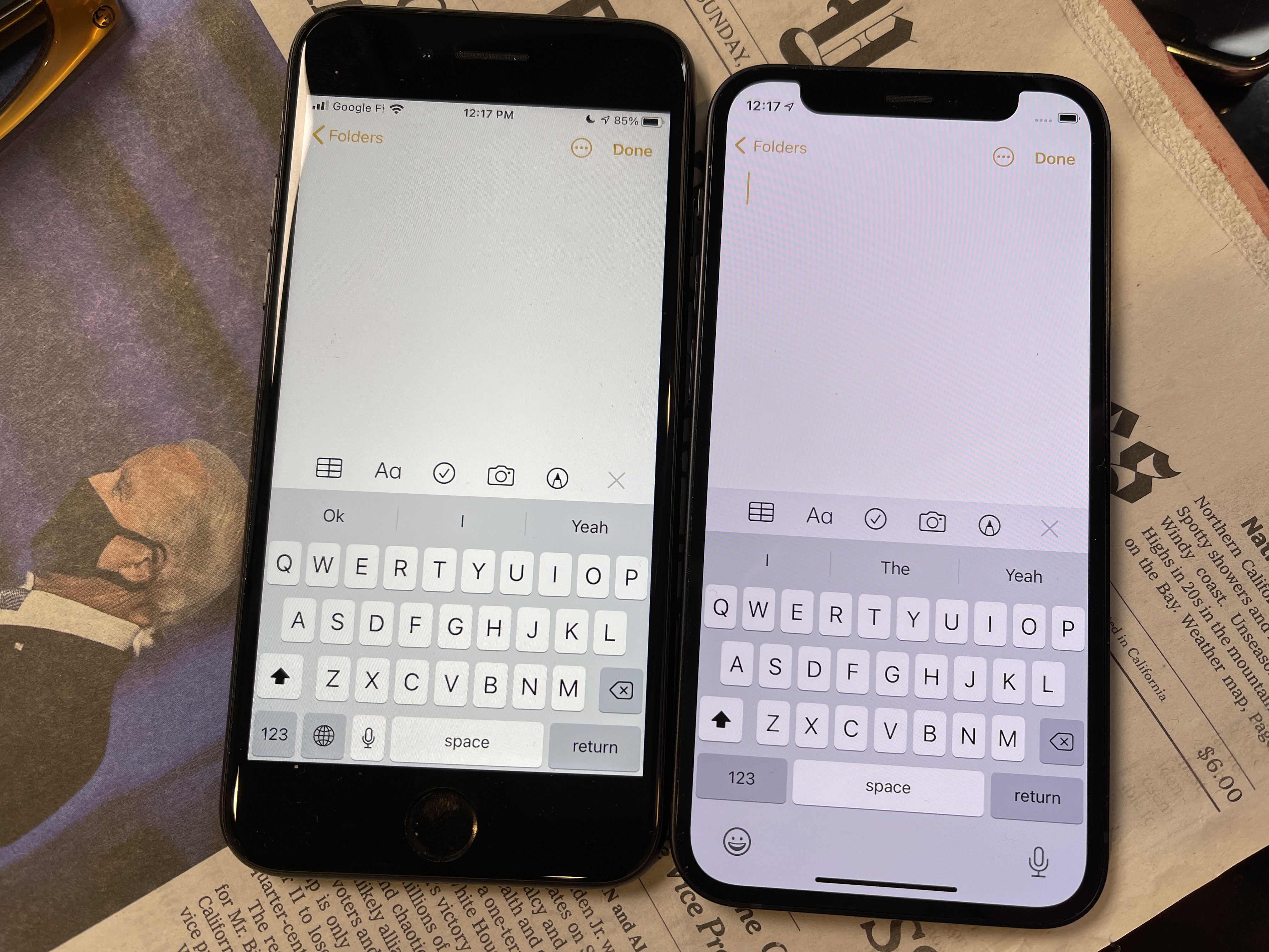
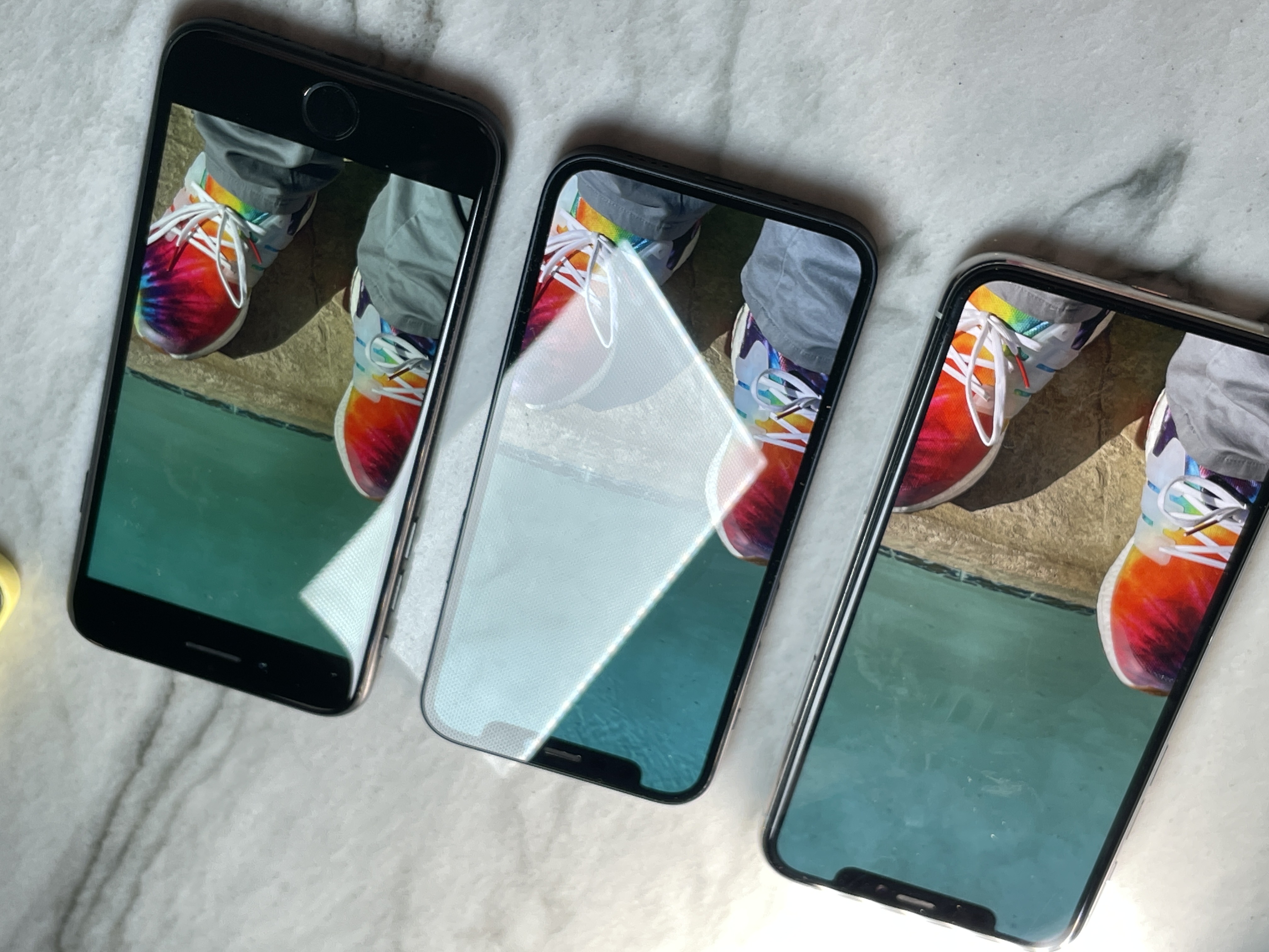
Though my larger hands do feel a bit more comfortable on the iPhone 12, I am happy to report that the typing experience on the iPhone 12 mini is far superior to the 4.0" first generation SE. It even gets a leg up on the 4.7" iPhone SE introduced earlier this year because the screen is the same width but taller - letting it pull of the Tardis trick of being smaller with a bigger screen. This allows the Emoji keyboard toggle and the voice dictation button to drop out of the bottom row of keys, relaxing spacing on the return, space and number pad buttons. This additional size, especially for the spacebar, improves the typing experience measurably. The key spacing is a bit less generous than the iPhone 12, but this is a workable situation for typing.
If you look at this and an iPhone 11, because of the way that the screen is rendered, you're going to see pretty much the same amount of content.
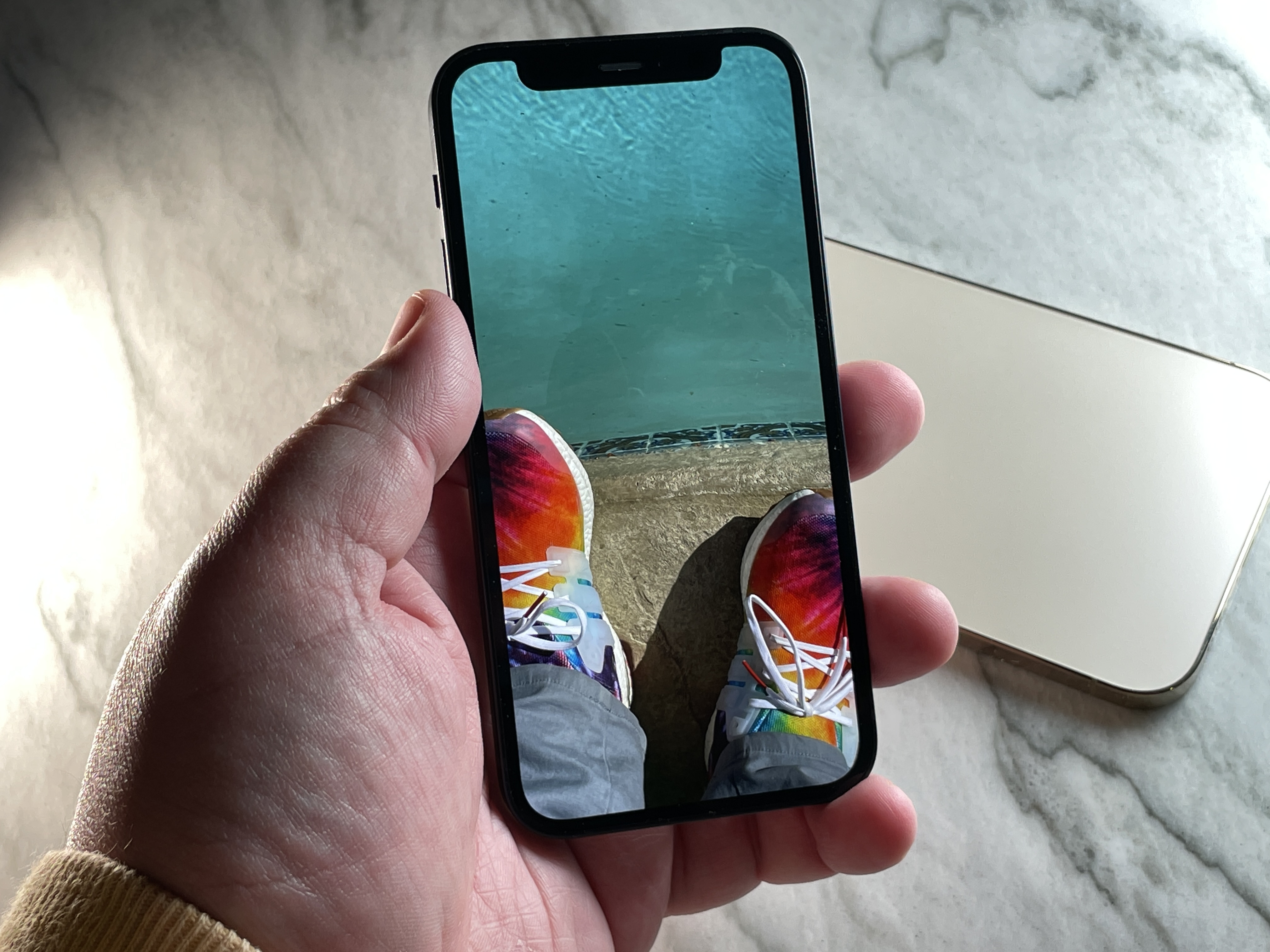
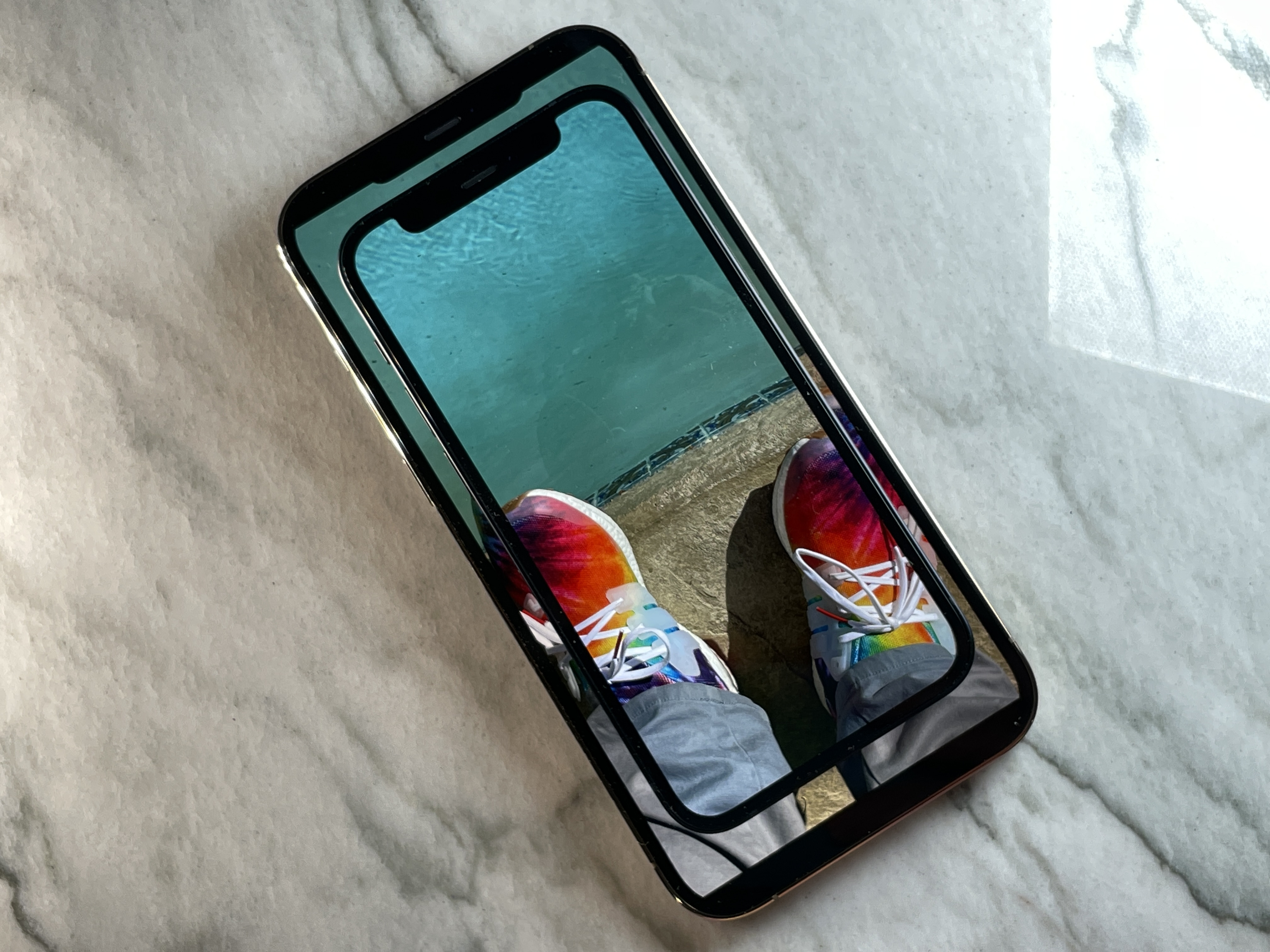
On top of an iPhone 12 Pro Max
Speaking of rendering, the iPhone 12 mini is scaled, which means that it is displaying at roughly .96 of its native' screen resolution of 2340*1080. In my testing, this scaling was not apparent in any way. Given that the mini has a resolution of 476ppi in a smaller screen than the iPhone 12 which clocks in at 460ppi that's not too surprising. iPhones have been doing integral scaling for years with their magnification features so Apple has plenty of practice at this. I didn't notice any artifacting or scrolling, and most apps looked just fine proportionally, though some developers that do not take advantage of Apple's native frameworks that support various screen sizes may have to do a bit of tweaking here and there.
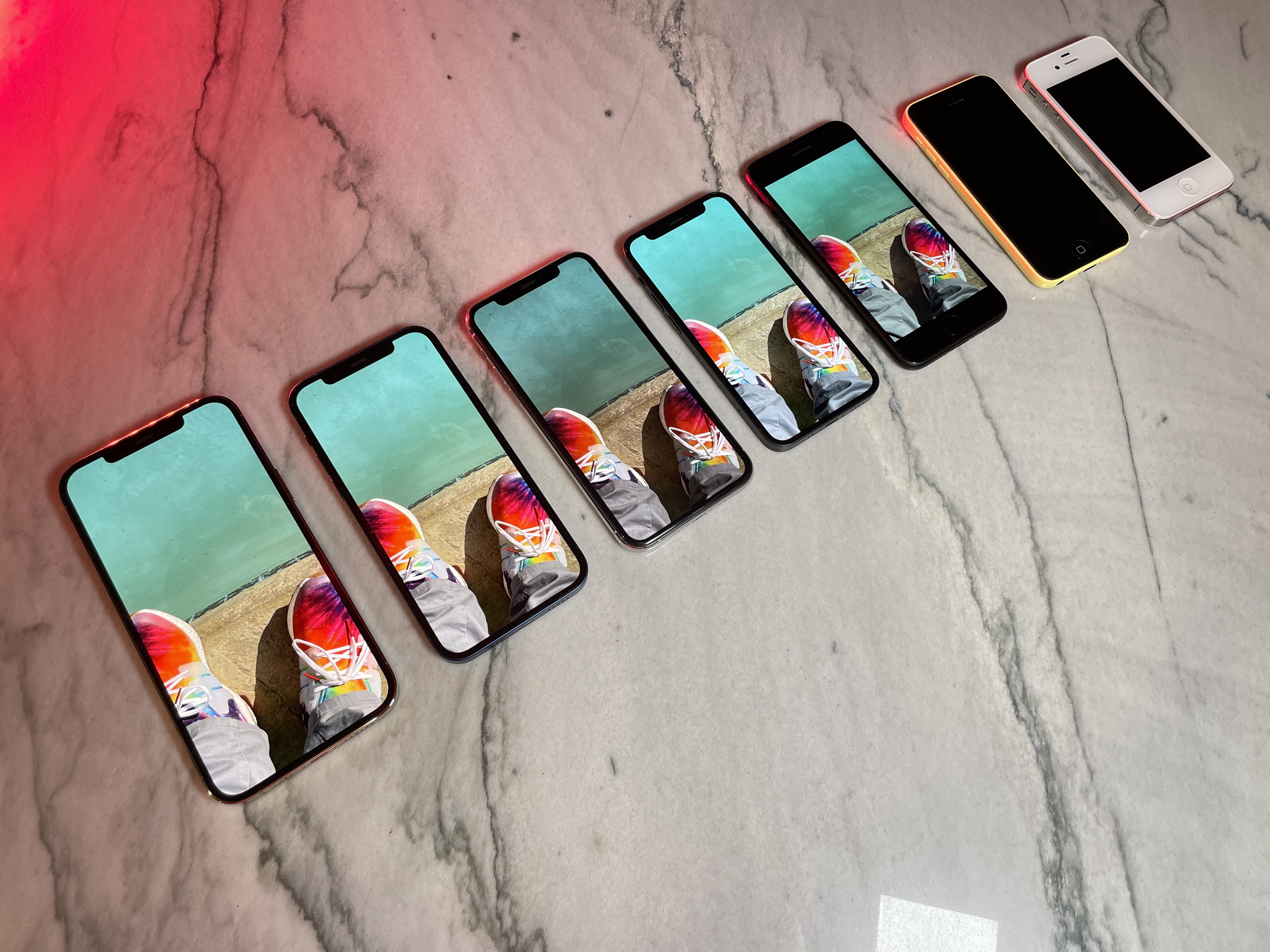
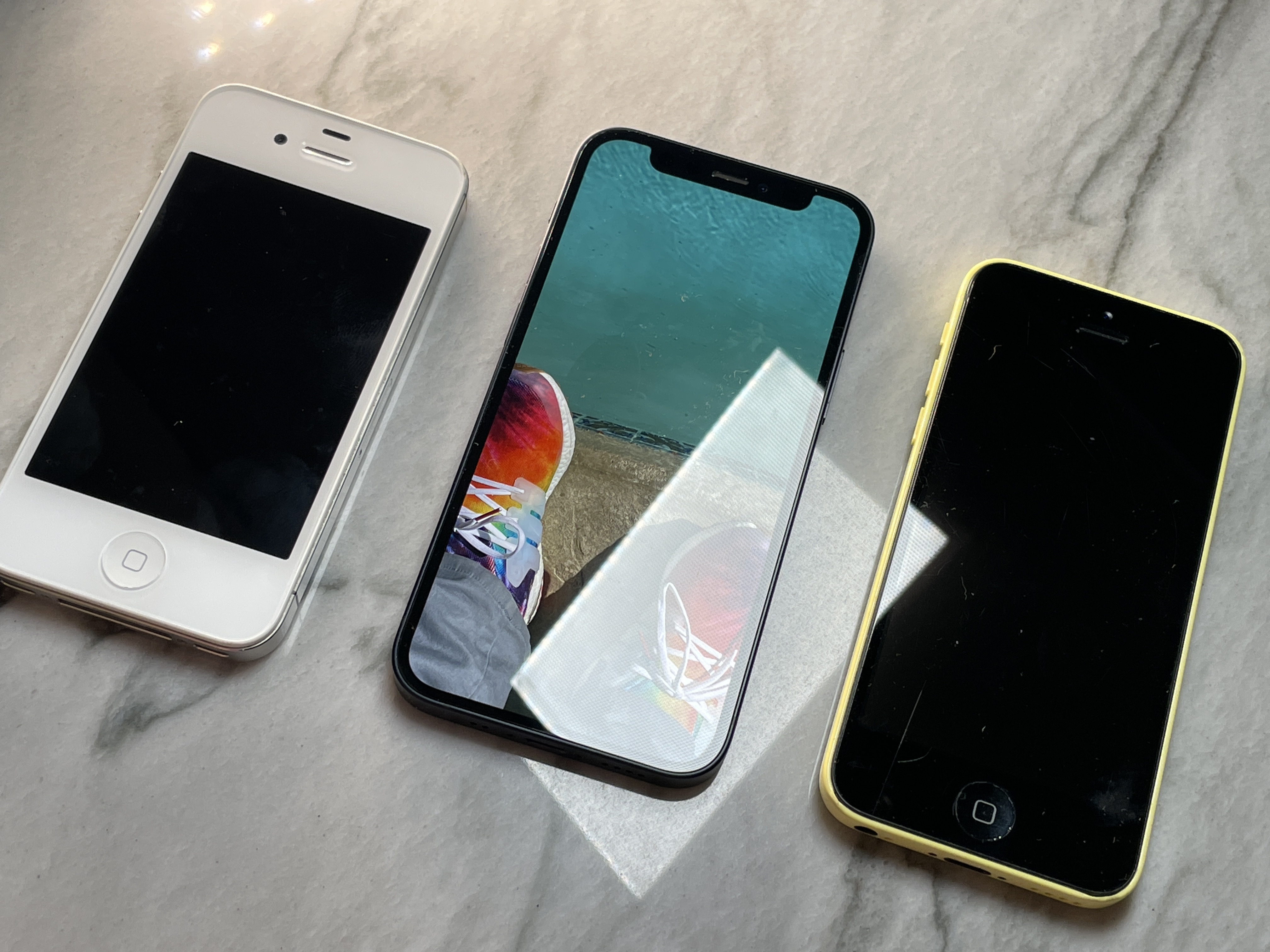
The iPhone mini has a nice lightweight compactness to it. In order to get a read on its vibe I compared it to the iPhone 4S, which felt far denser, the iPhone 5 which felt a bit more airy and the iPhone 5C which still feels fun but cheap. It shares pedigree with all of these devices but feels far more assured and integral. The iPhone 12 design language doesn't feel like multiple materials sandwiched together in the way that these earlier devices do. It feels grown, rather than made.
That integral quality does wonders when it's such a small device because every millimeter counts. Apple didn't cheap out on the casing or design and gave it an exterior to match its very performant interior.
The speaker and microphone grills, I'm sad to say, are asymmetric on the iPhone 12 mini. Ding.
And don't think you miss out on anything performance related when you go to the mini. While it appears that either heat management, scaling or power management in general has made Apple tweak the processor ever so slightly, the benchmarks are close enough to make it a wash. There is zero chance you ever see any real-world difference between the iPhone 12 mini and any other iPhone 12.
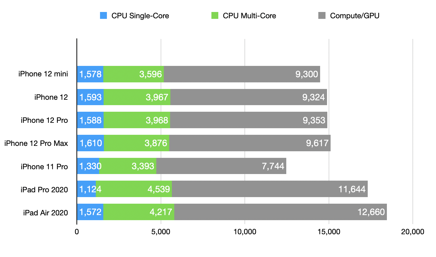
For what it's worth, the iPhone 12 mini has 4GB of RAM, same as the iPhone 12. The iPhone Pro and iPhone 12 Pro Max have 6GB. The biggest real world effect of RAM that I have found on iPhone is less dumping of Safari tabs in the background so if you're a pro browser take that into account.
The iPhone 12 mini is basically identical in the photography department to the iPhone 12. You lose nothing, it's a great camera. Nothing much to see there though so I'm not spending any time on it. You will have a world class phone camera, just no telephoto.
If you're a camera-oriented iPhone user, your usage of the telephoto lens is probably the most crisp deciding factor between the iPhone 12 Pro and the iPhone 12. The LiDAR benefits are there, and they absolutely make a big difference. But not having a telephoto at all could be an easy make-or-break for some people.
Cribbing from my iPhone 12 Pro review here, one easy way to judge is to make a smart album in Photos on a Mac (or sort your photos using another tool that can read metadata) specifying images shot with a telephoto lens. If that's a sizeable portion of your pics over the last year, then you've got a decision to make about whether you're comfortable losing that option.
When I did this, just about 19% of my iPhone 11 Pro shots were taken with the telephoto lens. Around 30% of those were portrait shots. So for me, 1 in every 5 images was shot with that tighter framing. It's just something I find attractive. I like a little bit more precise of a crop and the nice amount of compression (for closer subjects) that comes with the longer focal length.

You don't get 4k/60fps video but you still can shoot 4K/30fps Dolby Vision video in this super tiny device, which is wild. It's more than I think any normal iPhone 12 mini user will ever need.
Apple says that the iPhone 12 mini's battery life is better than the 4.7" iPhone SE and that bore out in my testing. I got through a day easily, with maybe a few percentage points difference between the iPhone 12 mini and the iPhone 12. I didn't have enough time to run a comparison against the battery king, the iPhone 11, but I doubt it would come anywhere near unseating it just from a physics perspective. This thing is small so the battery pack is small and the processor is not being majorly throttled in any way.
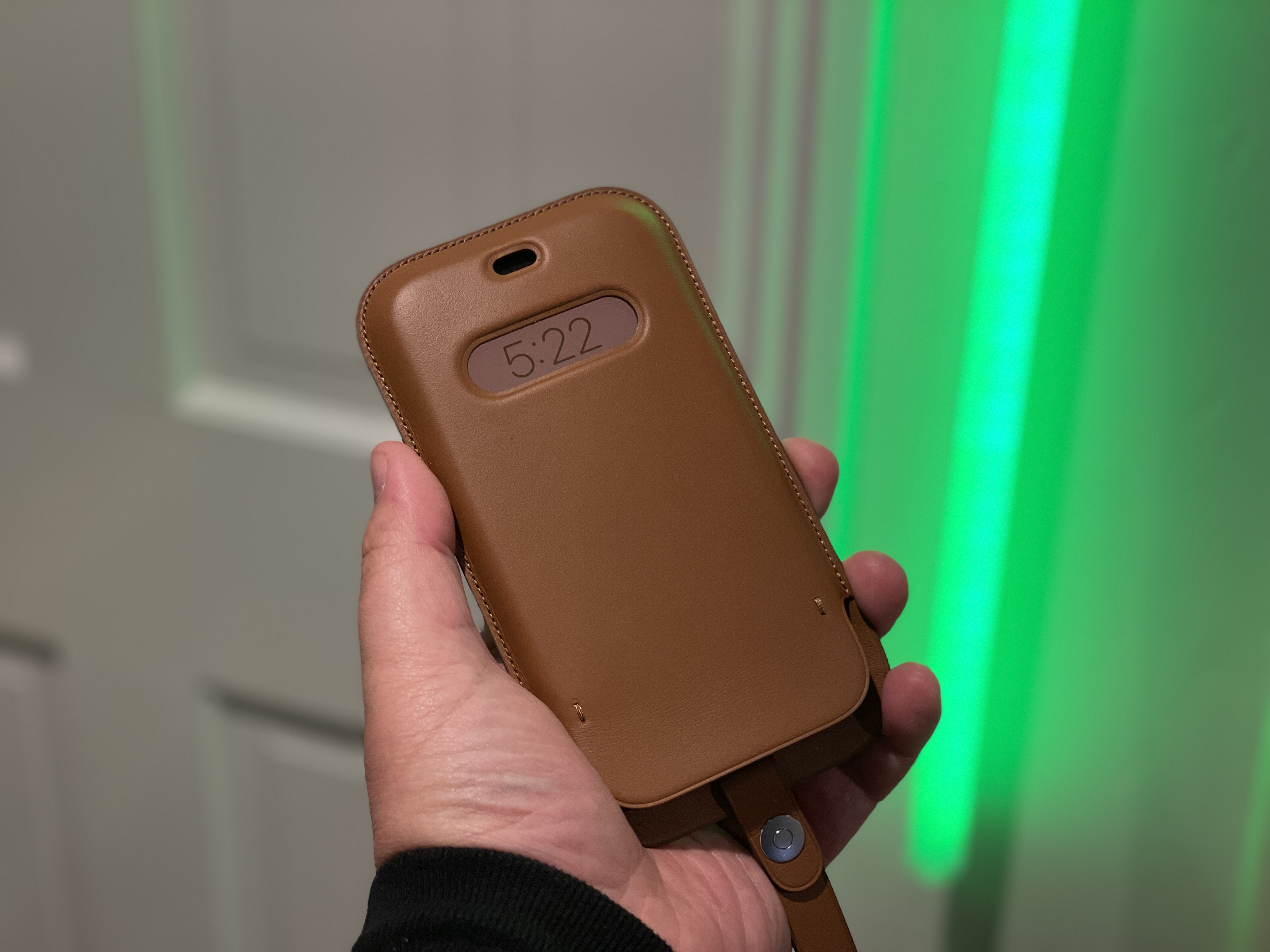
I did have a chance to try the iPhone 12 mini slip case and I thought it was well made and clever, though absolutely positively not for me. I use my iPhone too much to be sliding it into a sleeve and back out again, it would be an exercise in futility. But if you are in the market for this kind of case, I hold that the Apple version shows off the company's earned expertise in leather. It's well trimmed, it has nice edge finishing and a clever clasp.
It integrates Apple's MagSafe magnet array to display a live clock on the OLED screen with a space for the ambient light sensor. The clock display is pretty clever. It has a lightly colored background that matches the leather color of the case using the same NFC trick as the silicon cases which display a color matched ring when you put them on. The clock fades in two stages over a few seconds but will turn on when the ambient light sensor knows it's not in your pocket and the motion coprocessor in the A14 senses movement.
So a quick lift will flip the time on and let you check it. It also still allows tap-to-wake in the clock window, showing you the color matched time.
There's also a hidden card slot for maybe 1 credit card or ID card inside the mouth of the case. Like I said, it's not for me, but I can appreciate that a lot more is going on in this little case than meets the eye, and it shows off some of the sophistication that could be coming to other MagSafe accessories in the future.
The conclusion
In my iPhone 12/12 Pro review I noted my rubric for selecting a personal device:
- The most compact and unobtrusive shape.
- The best camera that I can afford.
And this is the conclusion I came to at the time:
The iPhone 12 Pro is bested (theoretically) in the camera department by the iPhone 12 Pro Max, which has the biggest and best sensor Apple has yet created. (But its dimensions are similarly biggest.) The iPhone 12 has been precisely cloned in a smaller version with the iPhone 12 mini. By my simple decision-making matrix, either one of those are a better choice for me than either of the models I've tested. If the object becomes to find the best compromise between the two, the iPhone 12 Pro is the pick.
Now that I have had both of those devices in my hand, I can say that my opinion hasn't changed, but my definitions of the lineup have a bit.
Because the iPhone 12 mini has no appreciable compromises in feature set from the iPhone 12, I consider these one device with two screen sizes. Yes, this may feel like a duh' moment but I didn't want to jump to this place without actually using the mini for an extended period. Most critically, I needed to get a feel for that typing experience.
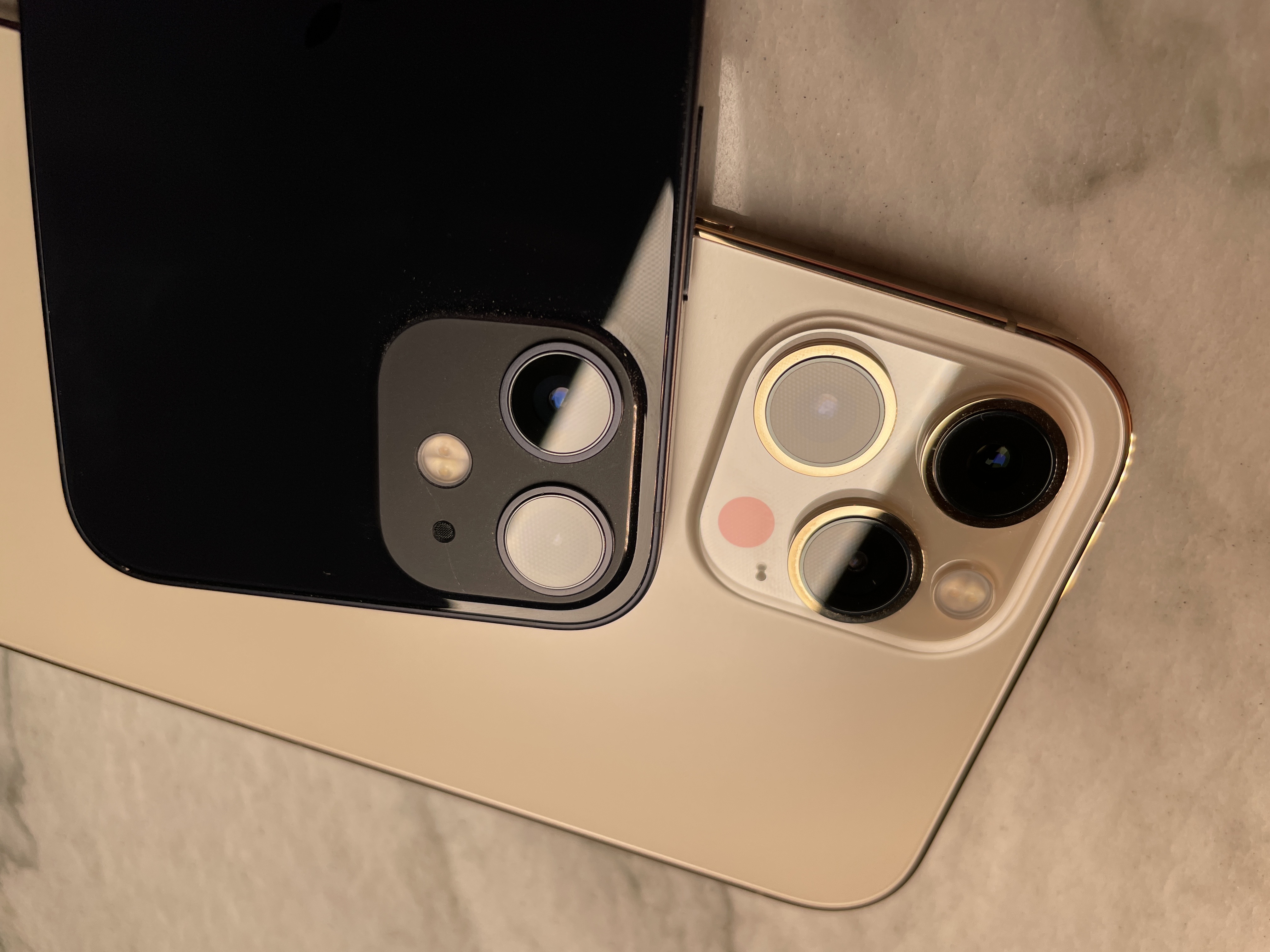
The iPhone mini is by far the best value per dollar in Apple's 2020 lineup. With this you get all of the power and advances of the iPhone 12, everything but the telephoto camera (and 60fps/4k video) of the iPhone 12 Pro and everything but the new sensor in the iPhone 12 Pro Max. Those additions will cost you anywhere from $300-$400 more over the life of your device if you choose to step up.
I've been thinking hard about what a clear break point would be between deciding on the iPhone 12 and the iPhone 12 mini. If you are someone who really likes or ergonomically needs a smaller screen, you're being treated to a device with no compromises in core functionality. But if you're not a small boi" fan then what is the deciding factor?
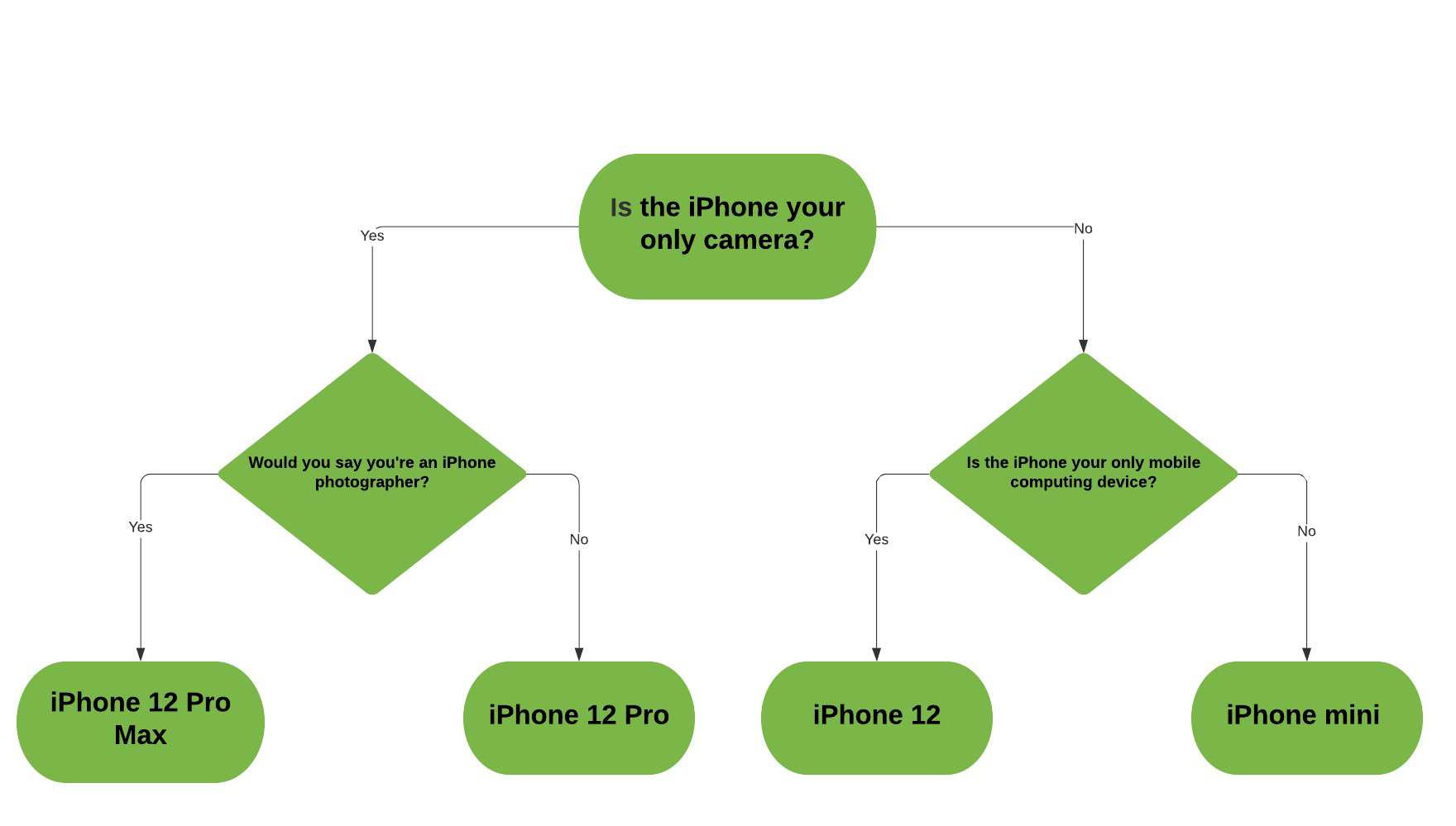
For me, it comes to this decision flow.
- Is the iPhone your only camera and do you use it constantly for images? Then choose the iPhone 12 Pro.
- Are you an iPhone photographer that regularly prints images or edits them heavily? Choose the iPhone 12 Pro Max.
- Are neither of those true, but it is true that the iPhone is your only mobile computing device? Go with the iPhone 12.
- If that's not true and you regularly carry an iPhone alongside a laptop or iPad, then go with the mini.
Here, I even made you a handy flowchart if that kind of thing is your bag:
This is one of the best years ever for the iPhone lineup. The choices presented allow for a really comfortable picking routine based on camera and screen size with no majorly painful compromises in raw power or capability. These are full featured devices that are really well made from end to end.
I hope that this template in sizing sticks around for a while as the powerful camera tech creeps its way down the lineup over time, invalidating at least the photography side of my flowchart above. Until then, this is still one of the better small" iPhones Apple has ever produced, and certainly one with the least overall compromise.
