Instagram redesign puts Reels and Shop tabs on the home screen
Instagram is putting its TikTok competitor Reels front-and-center in a redesigned version of its app by giving it the center position on its new navigation bar. The update, arriving today, also replaces the Activity tab (heart icon) with the Shop tab, following a test that had changed this aspect of the app's home screen earlier this summer.
In the redesigned app, both the Compose button and the Activity tab have been relocated to the top-right of the home screen, while the center middle button now belongs to Reels.
Before, Reels videos were mixed in with other photo and video content on the Instagram Explore page, though Instagram this fall began to experiment with different layouts (see below).
This led to some early complaints from users looking for Reels in the app, who had said it was harder to find, the company says.
We're starting to test different versions of Instagram's home screen - when you open the app you'll soon see a Reels tab and a Shop tab in one of these three layouts. pic.twitter.com/WLmjAwYwFW
- Adam Mosseri
(@mosseri) September 9, 2020
The redesign, which makes Reels the main button in the app, is an aggressive attempt on Instagram's part to direct users to its short-form video feed, which has so far seen only a lukewarm reception from reviewers. Critics have said Reels lacks competitive features, contributes to Instagram's bloat, feels stale and features a lot of recycled TikTok content. At best, it's been deemed a shameless clone.
Instagram, on the other hand, would argue that it's still early days for its Reels short-form video in its app. And the change could encourage more creators to share their Reels, given the now high-profile position given to the product.
That said, it cannot be understated how significant it is to relocate a Compose button in an app that relies on user-generated content. That Instagram would minimize the button's importance in this way is a testament to how much of its future relies on making Reels work.
The way we think about this update is that we're trying to make it really easy to use an expanded suite of products now available on Instagram, while maintaining a simplicity," explains Instagram's director of Product Management, Robby Stein.
Simplicity, given the wide range of products Instagram now offers, could become a challenge.
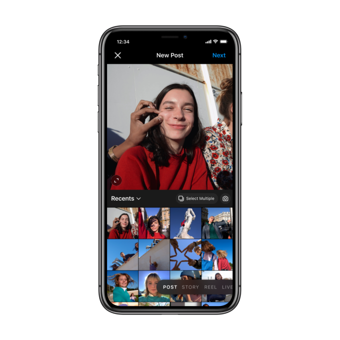
When tapped, the relocated Compose button will now take users to a redesigned Camera experience, too. Here, you can either pick photos or videos to post to your Feed, or scroll over to choose to post to your Story, Reels, or go Live. While this doesn't replace the swipe gesture to get to the Camera, it does give all the different post formats a more equal footing.

Image Credits: Instagram
Next to the new Compose button is the relocated Activity button (the heart icon) and a redesigned messaging button that takes you to your Instagram DMs - which are now connected to Facebook Messenger's universe. The messages button itself has been changed to look like the Facebook Messenger icon (for those who opted in to the new experience), and not the paper airplane icon that was previously associated with the Instagram inbox.
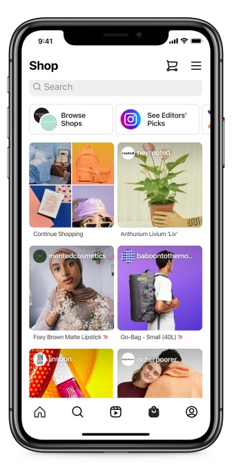
Another major change sees the Instagram Shop winning a home screen placement.
The company began testing the Shop tab in place of the Activity tab in July, where it would send users to an updated version of the Instagram Shop. Here, users could filter by brands they followed on Instagram or by product category. And, in many cases, users could pay for their purchase using Instagram's own Checkout feature, which involves a selling fee.
New forecast pegs TikTok to top 1.2B monthly active users in 2021
Instagram's push to make its app more of an online shopping destination through this and other changes comes at a critical time for the e-commerce market. The coronavirus pandemic accelerated the shift to e-commerce by at least five years, according to some analysts. That means any plans Instagram had to become a major player in online commerce were also just expedited.

Image Credits: Instagram
Combined, both moves signal a company that's worried about the impact TikTok may have on the long-term future of its business.
The Chinese-owned rival video app has been surging in popularity around the world, and particularly with the Gen Z demographic. TikTok is now projected to top 1.2 billion monthly active users in 2021, according to a recent forecast. However, the app's U.S. fate is still unknown due to a lack of attention from the Trump administration over the TikTok ban, as well as uncertainty as to how the incoming Biden administration will proceed to enforce it.
Today's TikTok captures users' attention with its short-form content, personalized For You" feed, sizable music catalog and special effects.

Image Credits: Instagram
But there's also potential for the app to expand beyond being just an entertainment platform, as its recent partnership with Shopify on social commerce indicates. TikTok's video format makes for an ideal medium to showcase a brand's products - which is why Walmart angled in on the would-be TikTok acquisition for its U.S. operations, driven by Trump's TikTok ban.
If and when TikTok scales this side of its business in the U.S., it could win social commerce market share from both Facebook and Instagram. And its appeal on the entertainment front could make it more difficult for Reels, or anyone else, to compete.
But Instagram has one big advantage in this battle: user data. It can inform its own personalization algorithms for Reels based on what users are doing elsewhere in its app, and even on Facebook if the user connected their account.
However, Stein says the main signals Reels personalization algorithms use are based on data coming from engagement within Reels, like whether you liked a video, for example.
Though Instagram users may not appreciate the buttons being relocated, Stein says, in tests, people came to adapt the changes. And in the end, it was necessary.
We try to maintain simplicity by making sure that it's clear why everything is where it is. But also, each tab has a really clear purpose to you," says Stein. So there's now one clear place to go to start watching video and be entertained and, hopefully, have some fun," he says. There's one really clear place to go now, when you want to post. And there's one really clear place now you want to shop, which is really important to us."
The changes will roll out to all markets where Reels and Shop are live, including the U.S., over the next few days.