How the Use of Background Complementary Colors Made ‘The Queen’s Gambit’ So Visually Engaging

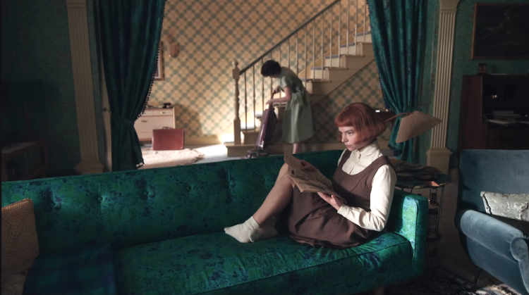
Martin Kaninsky of About Photography took a detailed look at how the The Queen's Gambit utilized complementary colors to make the entire series so visually engaging. Martin points out that many of the scenes work directly off the unique color of main character's hair.
By combining two primary colors yellow and blue for example we create a secondary color, in this case, green. This green color is then complimentary to the red color, meaning that it reaches its maximum intensity if we place it next to a red. Very simply said. Now that we know that we can take great advantage of that. ...when you look at Elizabeth Harmon in the show, what is her color? ...It is red and her red hair. So knowing that it would seem logical to somehow use the green in the same frame as Elizabeth, and that is exactly what they did.
via PetaPixel
Related PostsHow Vincent Van Gogh Created Optical Anxiety With His Deliberate Use of Conflicting Color in Night Cafe'How the Nebulous Concept of Time Became Impossibly Distorted During the Worldwide PandemicThe Famous Green Lady of Brooklyn Shares the Reason Why She Loves the Color So MuchAn Insightful Video Essay Examining How the Coen Brothers Use the Color Green In Their FilmsWhat Popular Brands Would Look Like if Their Color Schemes Were Swapped With CompetitorsHow Color Blind People See the WorldFollow Laughing Squid on Facebook, Twitter, and Subscribe by Email.
The post How the Use of Background Complementary Colors Made The Queen's Gambit' So Visually Engaging first appeared on Laughing Squid.
