Mining Traffic Data for Insights About The Pandemic
Every year for the past decade TomTom, the location technology company that supplies mapping and traffic data to navigation devices, carmakers, and apps around the world, releases an analysis of the world's traffic.
This analysis includes an index of congestion levels, created from data collected from 600 million drivers in 416 cities around the world, aggregated anonymously, and crunched with the company's proprietary algorithms. Their process identifies routes and calculates both optimal and average drive times. The outcome is expressed as a percent, that is, how much extra time the average trip took in a particular city during a particular time period, compared with how long it would take to drive that route with no traffic delays whatsoever.
TomTom's index features an overall competition" for the dubious title of most congested city in the world. In 2019, Bengaluru, India (Bangalore) and Manila, Philippines took the top spots, with traffic congestion in those cities increasing drive time by 71 percent.
TomTom also breaks down its results by hours, days, and weeks, highlighting local rush hours and weekly and daily trends. This data gets used by local governments to find ways to improve traffic flow, by employers to adjust work schedules, and by individuals to calculate commute times-all in hopes of making traffic flow a little better.
For 2020, however, TomTom's results revealed more about the pandemic than about the successes or failures of traffic mitigating efforts.
Indeed, its overall rankings turned out to be basically meaningless: Moscow topped the 2020 charts at 54 percent, but that's not because Moscow's drive times increased from 2019; they actually dropped 5 percent. Rather, Bengaluru and Manila dropped in the ranks, because India faced more strict pandemic restrictions.
So in 2020, instead of showing where new development caused snarls or where a infrastructure improvements eased congestion, TomTom's traffic data painted a picture of the coronavirus spreading around the world. The data also showed the extent of local lockdown orders, how well those were followed in different cities, and the reaction of workers when they were lifted.
Gijs Peters, a data scientist at TomTom, describes the pandemic as viewed through the lens of traffic:
When Wuhan went into lockdown, traffic there was gone," he says. Everything was still normal here in Europe. Then we watched the virus spread by watching traffic data. Traffic collapsed in Milan, then Rome, then the rest of Italy, followed by other European countries. ...
In the West," Peters continues, the first lifts of lockdown restrictions came in the summer, then they went back into place in September, in some cases more strict than in April. However, when we look at the traffic data, while we saw rush hour completely disappear in European cities in March, April, and May, now, even with similar restrictions in place, we see rush hour patterns again. The sense of urgency seems to be lower."
Data interactive: Move the slider to show how traffic changed from 2019 to 2020 as a result of responses to the pandemic.
Peters points out that changes in traffic patterns in the United States varied widely from city to city:
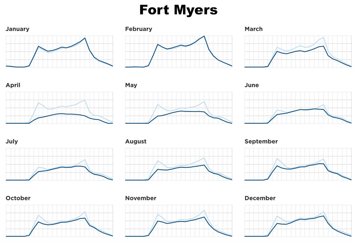
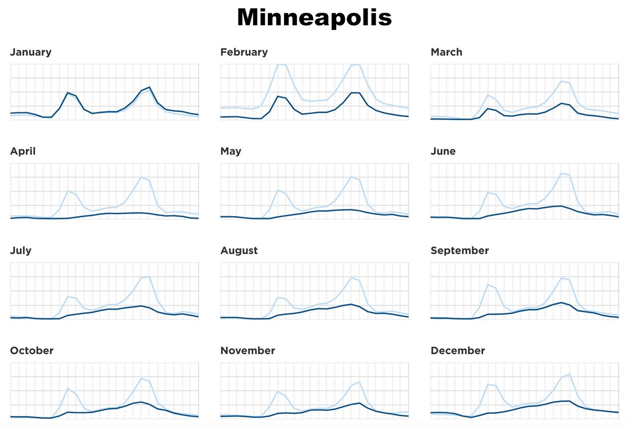
Minneapolis had stricter lockdowns compared with other U.S. cities. Traffic congestion there went to half in April and still is very low," he says. In Florida, however, where the lockdown was lifted on the first of June, traffic seems to be back to normal.
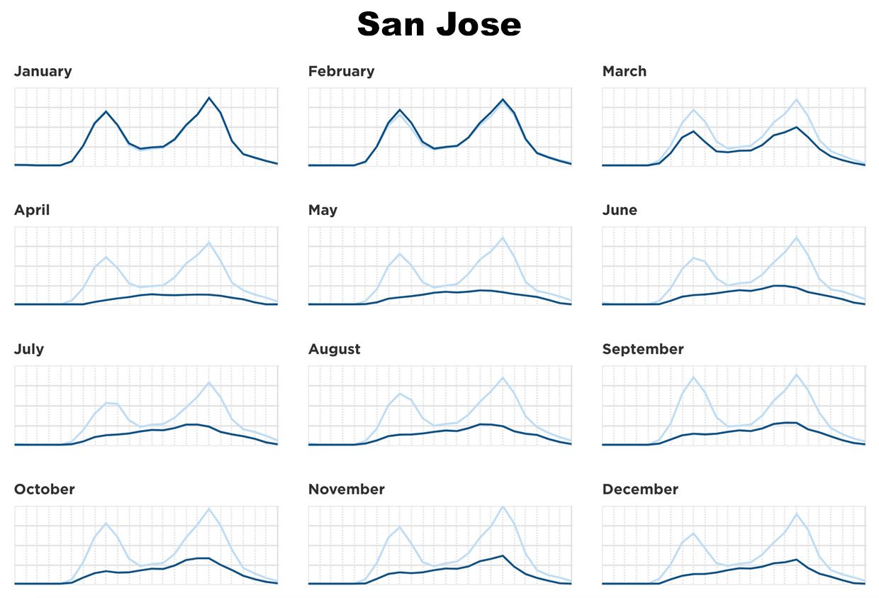
Meanwhile, in San Jose and the San Francisco Bay Area, we saw traffic drop ahead of the lockdown orders; as soon as employers said [to] start working from home. Working at home was easy for tech employees to do. So though you see traffic in many large U.S. cities catching up in recent months, traffic around San Jose is still very low."


 TomTom Traffic congestion on an average day (dark blue lines) changed across the U.S. as people reacted to the pandemic-but showed regional differences. Rush hours disappeared altogether in some cities, while traffic in others quickly returned to near normal. 2019 congestion appears in light blue for comparison.
 This kind of pandemic-related data drew the attention of financial analysts, banks, and media, trying to figure out how the pandemic was affecting daily lives and the overall economy.
Meanwhile, for traffic planners, the pandemic brought in data that one could only have dreamed of gathering in normal times.
For example, Peters says, When I look at [The] Netherlands, the total number of driven kilometers in April was about 50 percent of what we expected, and congestion was almost gone. In November, with second lockdown, congestion was still almost gone, but we saw the number of driven kilometers back up to 80 to 90 percent. What that tells us is, if we are able to reduce our traffic by 10 or 15 percent, we would be able to limit and potentially completely prevent congestion."
Peters hopes the work he and other data scientists are doing with TomTom's pandemic era traffic data will lead to long term changes.
If we are smarter," he says, and only go to work when we need to, that could lead to 10 percent of people staying home on average each day. And then we might be able to spend so much less time in traffic than we do right now. That would help us work towards a congestion-free, emissions-free future."