How to customize your phone's theme in Android 12
There are a lot of fun new features coming in Android 12 and chief among them is the first major update to Android's design and user interface (UI). Material Design was unveiled in 2014, dragging us out of the beautiful #HOLOYOLO darkness and into the multi-layered blindingly white of most Material Designed apps. Now, we're getting Material You, a fun new evolution that helps bring back a more cohesive look for Android while offering you the chance to make your phone look and feel totally unique and personal.
What's new in Material You theming - and who can take advantage of itWhile many parts of Material You will be available to all manufacturers and ROM-builders when Android 12 releases this fall, one aspect - in my opinion, the most important aspect - will be Pixel-exclusive at launch: Dynamic Color themes that will automatically theme your phone with colors extracted from your wallpaper. While the automatic Dynamic Color theming first arrived on Beta 2, you couldn't switch to other wallpaper-based palettes because the old Wallpapers & style menus were still there. Now that the new theming menus have arrived, here's how to take full advantage of them and change up your Android 12 theme.
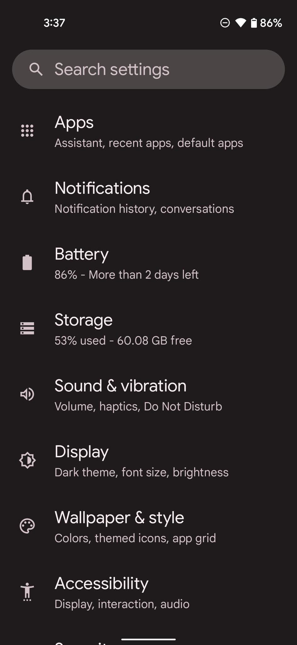
How to customize your Pixel's theme in Android 12- Open the Settings app.
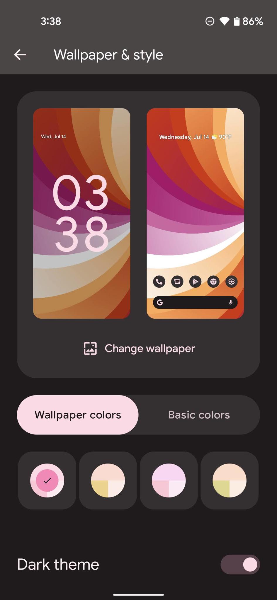
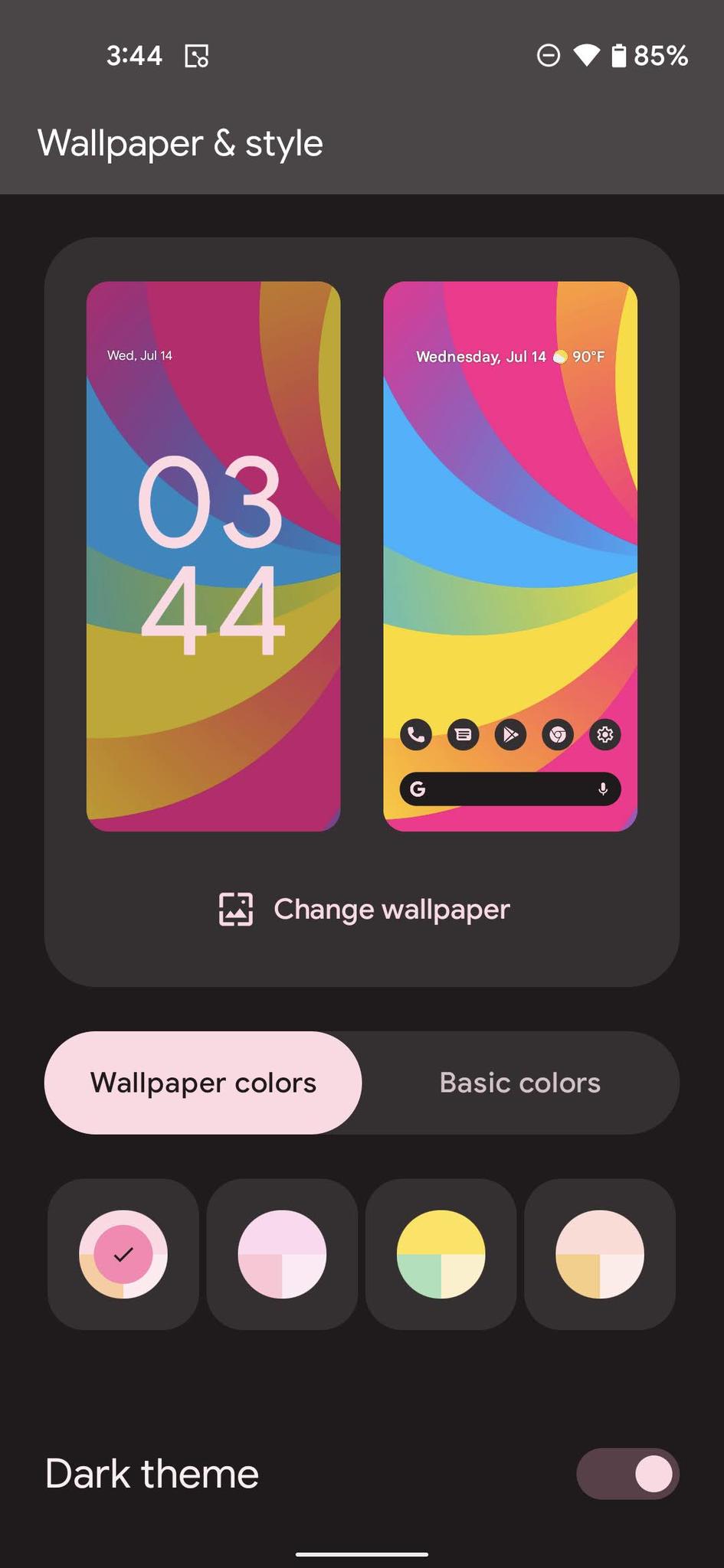
- Tap Wallpaper & style.
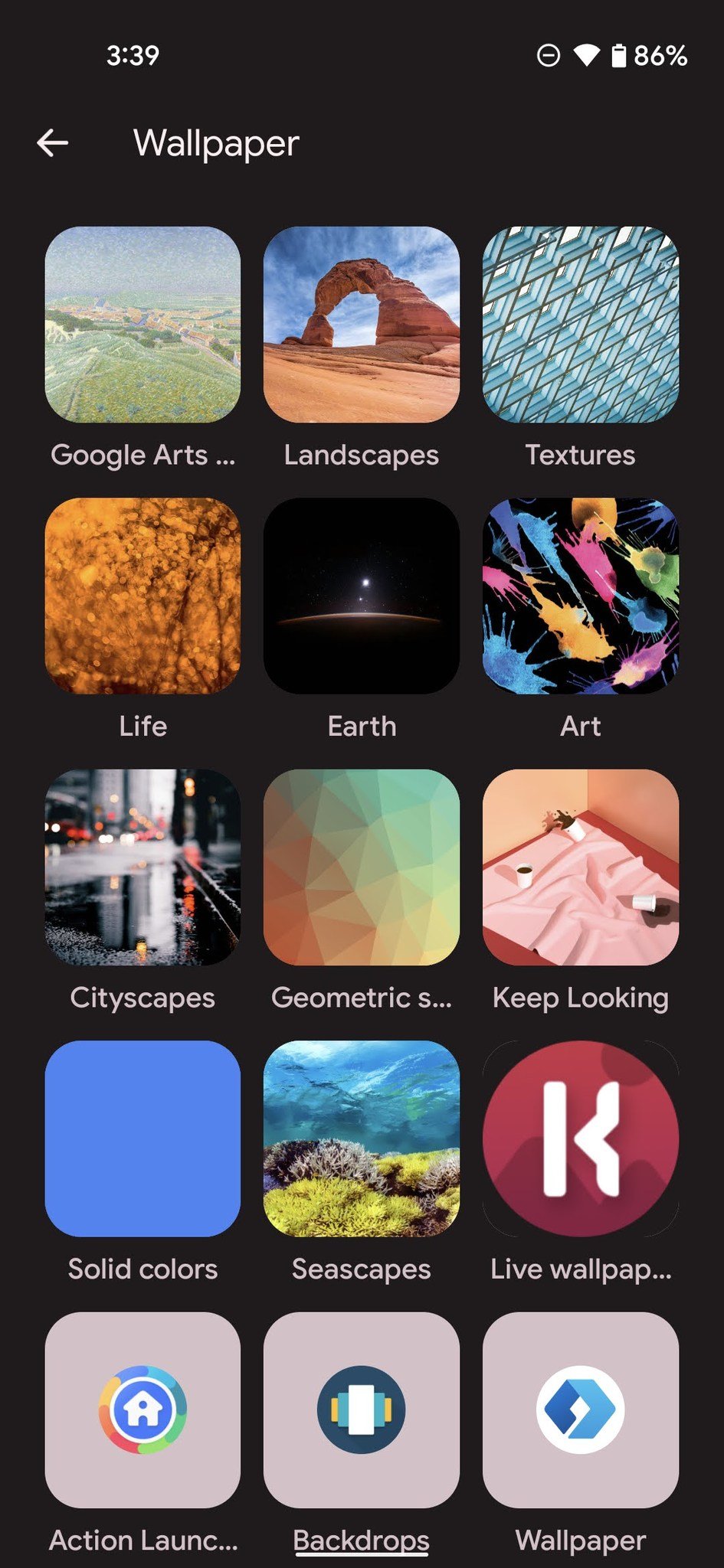
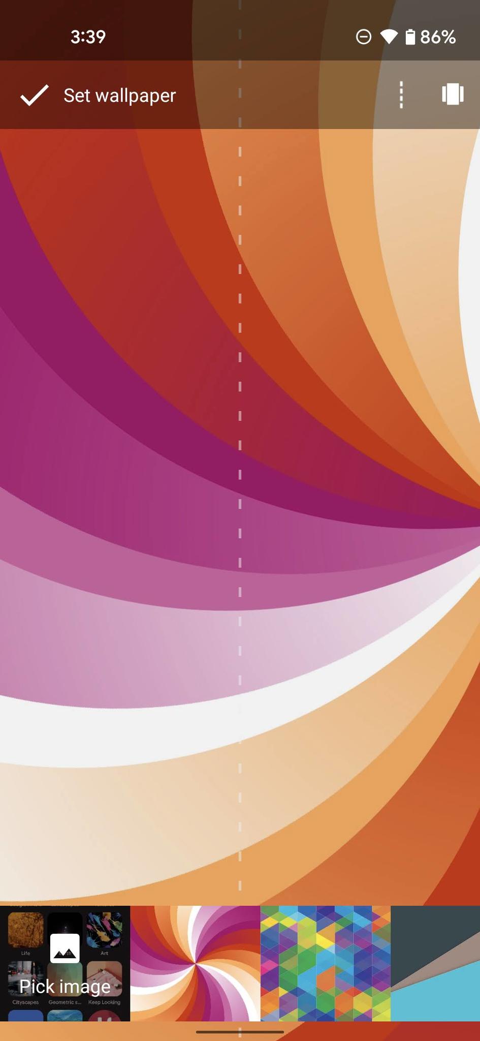
If you only see one color option under Wallpaper colors, tap Change Wallpaper and pick a wallpaper with more colors and less black/white. If you do see four options, skip ahead to step 8.
- Tap the wallpaper collection or app you want to set your wallpaper from.
- Pick image for the image you want to set.
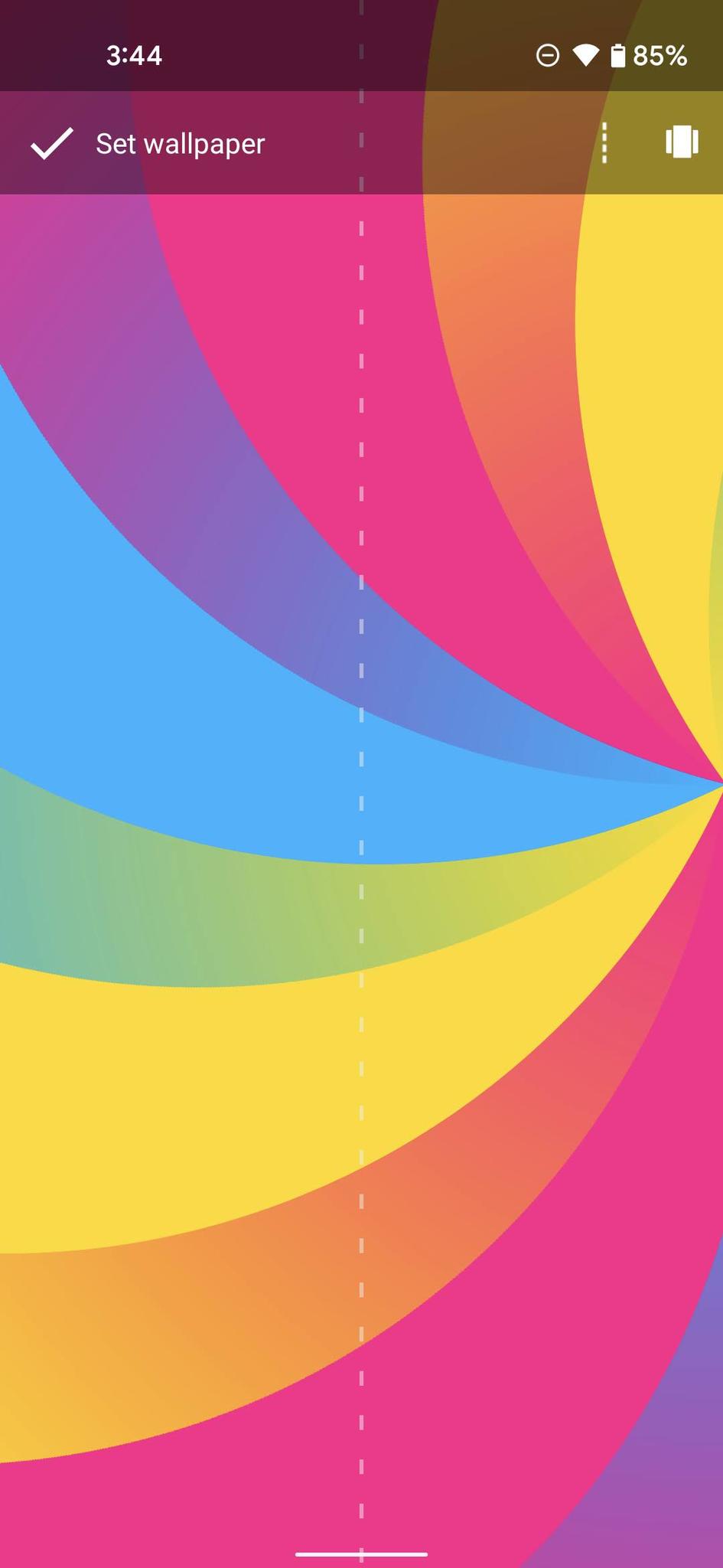
- Tap set wallpaper once you have your chosen image aligned the way you want.
Return to the Wallpaper & style menu.
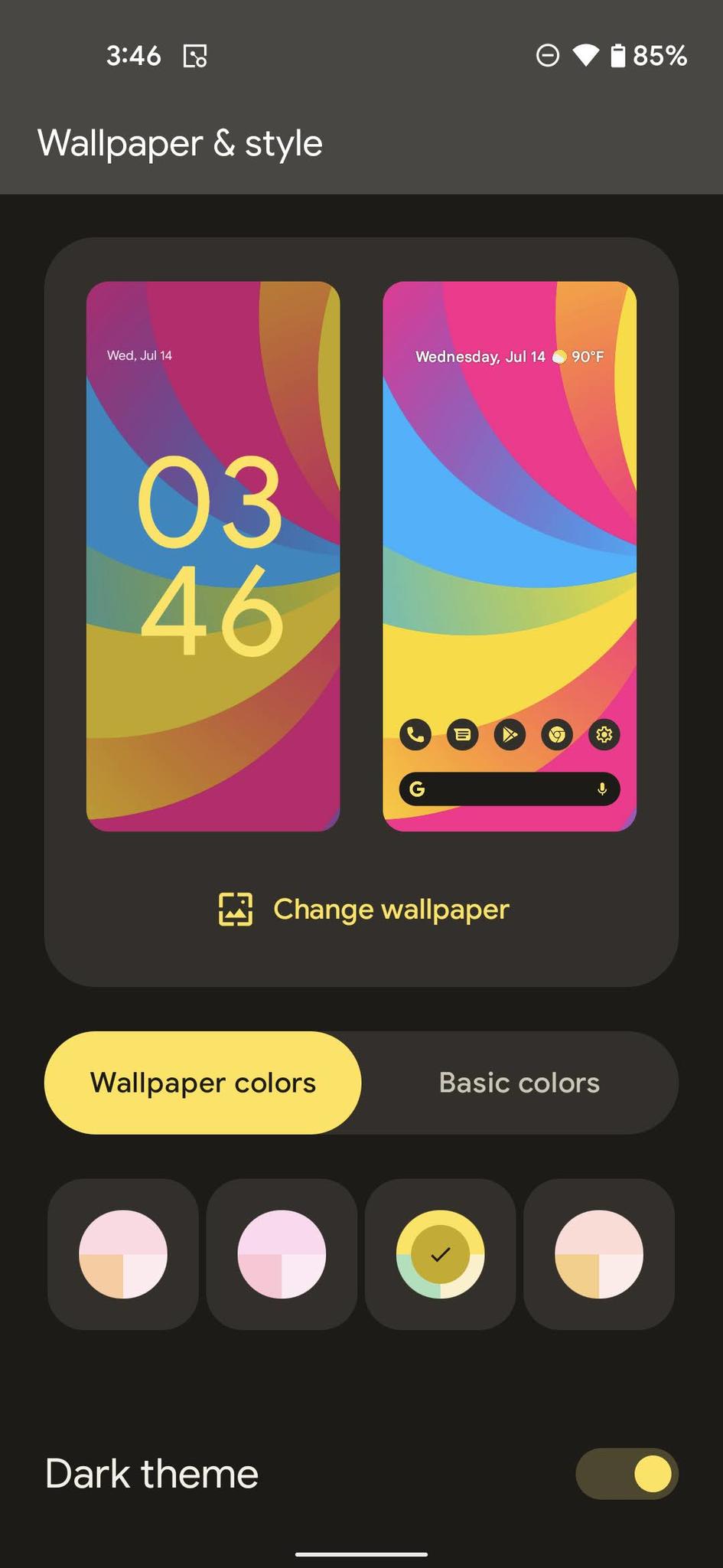
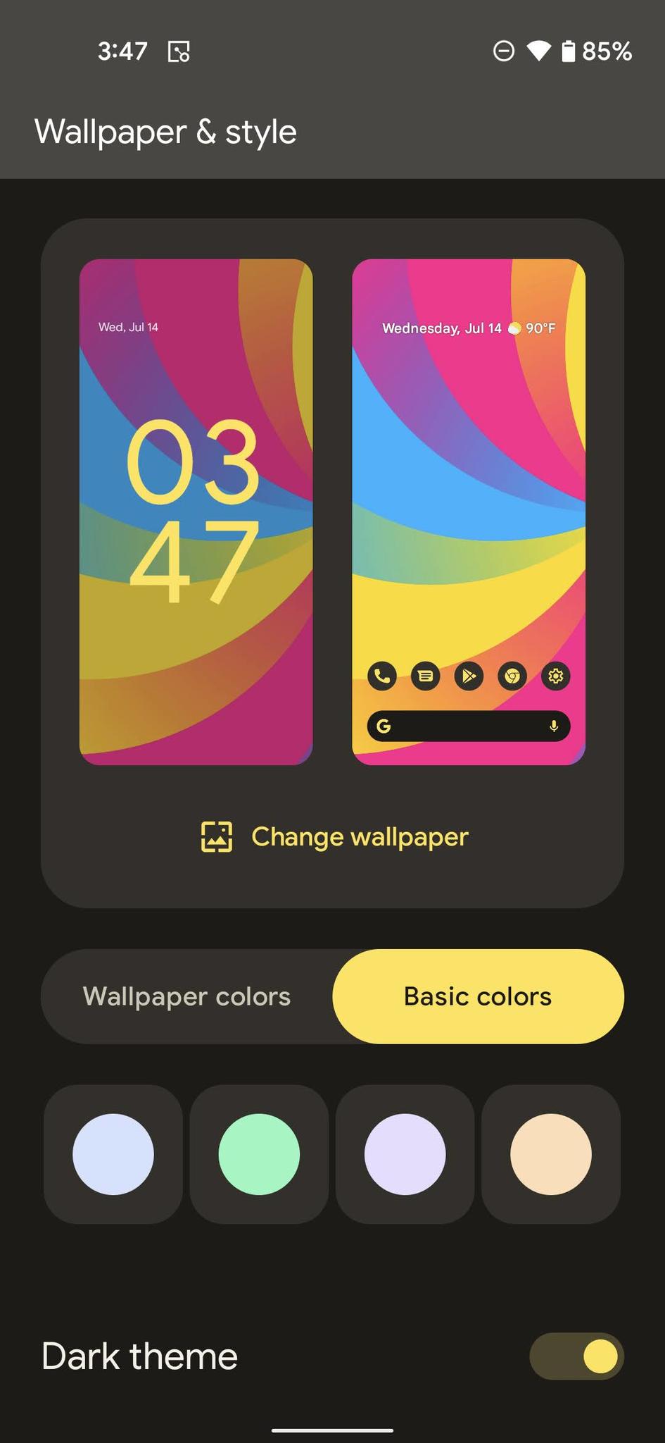
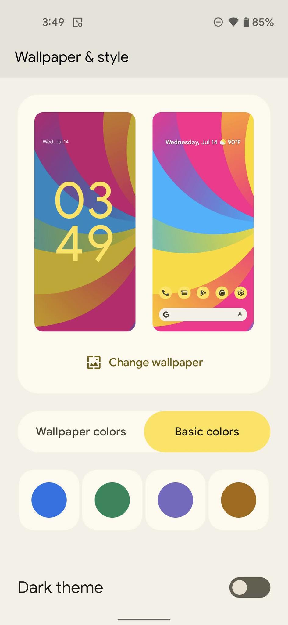
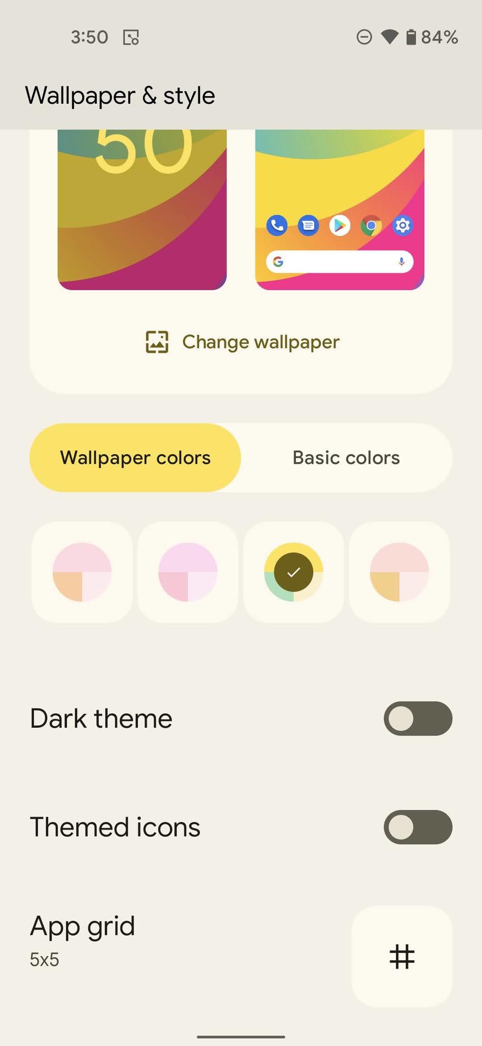
- Tap a theme palette to apply it.
Repeat step 8 until you have a color palette you like. If you don't like the wallpaper-based palette, tap Basic colors to pick from four basic, single-color themes instead.
- Tap the Dark theme toggle to see how the theme will look in the other mode. Colors are bolder in Light theme and more pastel-hued in Dark theme, so if you're having issues seeing the colors while in Dark theme, kick over to Light theme for easier viewing.
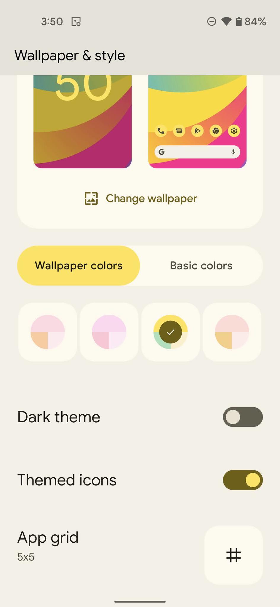
If you're using the Pixel Launcher, scroll down and tap Themed icons if you want to have the color applied to your home screen icons.
At any point, you can simply leave the menu once you're happy with how things look. If the Pixel Launcher isn't set as your launcher, you can't get the color applied to your home screen icons or search bar, but since this theming doesn't extend to the app drawer, I'm not sure it's worth giving up a third-party launcher just for the automatically themed icons, especially when Icon Pack Studio can do the same thing and set multiple colors for a little more vibrance in your theme.
What about my app icon shapes, fonts, and quick setting icons?While previous generations of Pixel allowed you to change the icon shape between one of ten shapes, in the Android 12 beta, that section of the Wallpaper & style menu seems to have disappeared now that the new Android 12 theme UI has been added. You also don't get a choice in fonts or the icons in your Quick Settings menu anymore, likely due to Google wanting a more unified and consistent look for Android in Material You. The examples of Material You shown at Google I/O only showed circular icons and the standard font.
I'll be honest, I never deviated from the standard theme, but I did prefer a non-standard icon set for Quick Settings and would use teardrop icons from time to time depending on the home screen theme I was rocking. It makes sense for Google to simplify things, but I still wish it were a subsection somewhere for enthusiasts that wanted to play with it. After all, the Google Pixel brand is primarily driven by Android enthusiasts, and we tend to like having all the options we can.
If you need more options, though, there's always the best Android launchers to expand your options and theming creativity. As a note, while some live wallpapers seem to work with the new Dynamic color theming system in Android 12, not all live wallpapers are guaranteed to work. It resamples each time you set a wallpaper, so if you don't like the palettes on the first try, re-apply the wallpaper and see if they change to your liking.
Try Android 12 earlyGoogle Pixel 4a$349 at Amazon (Black)$350 at Best Buy (Black)$349 at Google Store (Barely Blue or Black)
There's a lot of reasons to love the Google Pixel 4a - you get the great Pixel software without breaking the bank, the camera can beat phones twice the price, and a sensible, no-nonsense feature set - but it's also the most inexpensive phone you can test Android 12 on without having to mess with flashing builds or ADB commands.
