Spotify adds an attention-grabbing ‘What’s New’ feed to addict users to its app
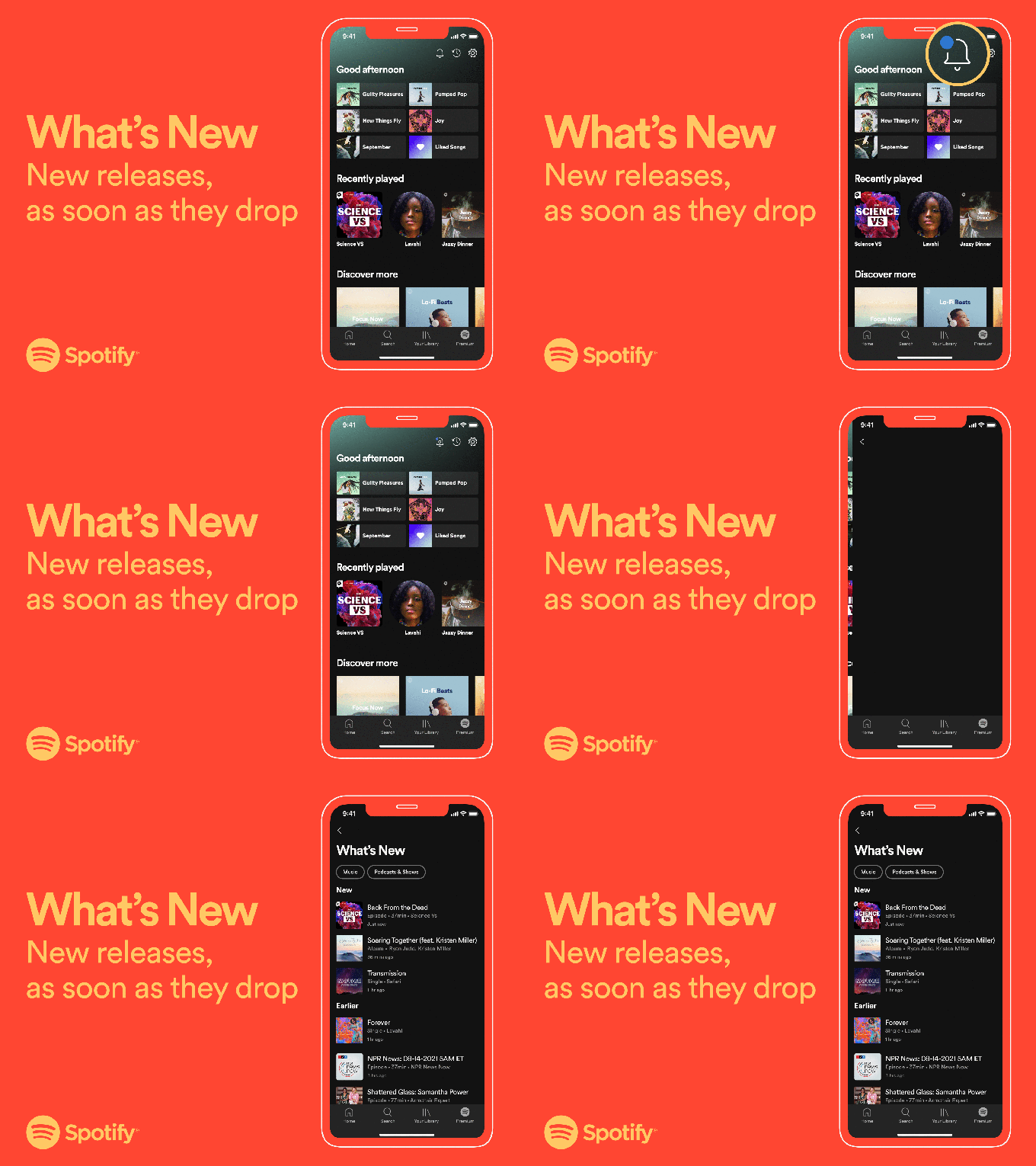
Spotify is taking a cue from social networks like Facebook, which deliver a constant stream of notifications under a bell" icon in the mobile app to keep users engaged with the latest content. This morning, Spotify introduced what it's calling the What's New" feed, which will deliver an ongoing series of updates to mobile app users focused on new releases.
According to the company, the What's New feed will serve as another way for Spotify users to keep up with all the new music and podcasts that are released from the shows and artists that they follow on the service. In other words, it's a personalized feed based on what you listen to, not a universal feed or one you more explicitly customize by making specific selections.
The feed will be under the new bell" icon at the top of the home tab alongside the recently played and settings icons on the top right.

Image Credits: Spotify
The feed will be also updated in real-time, Spotify says, and will display a blue dot when there are new songs and episodes that arrived since you last opened the app. Before, you could find information about new releases in various places in the app, including your home tab and in hubs on the app's search page.
While the feature may be useful because it gives you a single place to look in the Spotify app for everything that's new, the use of a notifications" feature that leverages dots is also a psychological trick that can make apps more addictive. Dots express a sense of urgency - making you feel as if you need to click to see what's new or even just clear the dot. In fact, there was such a backlash against the overabundance of these dots inside social apps that even Facebook a couple of years ago rolled out tools that let you turn its annoying red notification dots off. (To be fair, Facebook hasn't fully embraced red dot removal - the default is still set to on" and there are plenty of notification dots all over its website today).
This seemingly minor addition to the Spotify app is actually a quite calculated one - and one that steps back from the humane technology movement that emerged in recent years as a way to counter the overuse of growth hacks and other tricks to make apps more addictive.
Now, many companies are moving away from addictive features. Apple, for example, has added consumer-facing tools that put users back in control of when apps can notify them, including with the upcoming iOS 15 release, which lets you bundle notifications into daily summaries for less important apps or switch into focus" modes for when you need fewer distractions. TikTok, meanwhile, inserts videos that remind you when you've been watching for too long. Instagram added a message at the end of your feed to let you know when you were all caught up."
Spotify, with the launch of a more attention-grabbing notifications feature, is doing the opposite - it wants to increase user engagement, even if it understands that it may be sacrificing some sense of user comfort and enjoyment in the process.
What's New is rolling out to all users globally on iOS and Android over the next few weeks.