The iPhone 13 Pro goes to Disneyland
This year's iPhone review goes back to Disneyland for the first time in a couple of years for, uh, obvious reasons. I'm happy to report that the iPhone 13 Pro and iPhone 13 performed extremely well and the limited testing I was able to do on the iPhone mini and iPhone 13 Pro Max showed that for the first time you're able to make a pretty easy choice based on size once you've decided you're ok without telephoto.
One of the major reasons I keep bringing these iPhones back to Disneyland is that it's pretty much the perfect place to test the improvements Apple claims it is making in an intense real-world setting. It's typically hot, the network environment is atrocious, you have to use your phone for almost everything these days from pictures to ticket scanning to food ordering and you're usually there as long as you can to get the most out of your buck. It's the ideal stress test that doesn't involve artificial battery rundowns or controlled photo environments.
In my testing, most of Apple's improvements actually had a visible impact on the quality of life of my trip, though in some cases not massive. Screen brightness, the longer telephoto and battery life were all bright spots.
Performance and battery
The battery of the iPhone 13 Pro hit just over the 13 hour mark in the parks for me running it right to the dregs. Since there was so much video testing this year, the camera app did stay on screen longer than usual at just over 1hr of active on screen' usage which does put a bit of a strain on the system. I'd say that in real-world standard use you'll probably get a bit more than that out of it so I'm comfortable saying that Apple's estimate of an hour or more longer video playback time from the iPhone 12 Pro is probably pretty accurate.
Though it was hard to get the same level of stress on the iPhone 13 Pro Max during my tests, I'd say you can expect even more battery life out of it, given the surplus it still had when my iPhone 13 Pro needed charging. Bigger battery, more battery life, not a big shock.
If you're using it in the parks and doing the rope drop I'd say I would plan on taking it off the charger at 6am or so and plan to have a charger handy by about 4pm so you don't go dead. That's not a bad run overall for an iPhone in challenging conditions and with heavy camera use.
Apple's new ProMotion display was a nice upgrade as well, and I did notice the increased screen brightness. Typically the bump in brightness was only truly noticeable side-by-side with an iPhone 12 Pro with high-key content displayed on the screen. Popping open the Disneyland app for the barcode meant a bit better consistency in scanning (though that's pretty hard to say for sure) and a visual increase in overall brightness in direct sun. Out of the Sun I'd say you'd be hard pressed to tell.
The variable refresh rate of the ProMotion screen cranking all the way up to 120hz while scrolling Safari is a really nice quality of life improvement. I'm unfortunately a bit jaded in this department because I've done a ton of my computing on the iPad Pro for the past couple of years, but it's going to be an amazing bump for iPhone users that haven't experienced it. Because Apple's system is not locked at 120hz, it allows them to conserve battery life by slowing down the screen's refresh rate when viewing static content like photos or text when not scrolling. I'm happy to say that I did not see any significant ramping while scrolling, so it's really responsive and seamless in its handling of this variability.
The new A15 chip is, yes, more powerful than last year. Here's some numbers if that's your sort of thing:
Impressive as hell, especially for more battery life not less. The power-per-watt performance of Apple's devices continues to be the (relatively) un-sung victory of its chips department. It's not just that this year's iPhones or the M1 laptops are crazy fast, it's that they're also actually usable for enormous amounts of time not connected to a charger. For those curious, the iPhone 13 Pro appears to have 6GB of RAM.
Design
The design of the iPhone continues to be driven by the camera and radio. Whatever is necessary to support the sensors and lenses of the camera package and whatever is necessary to ensure that the antennas can accommodate 5G are in control of the wheel at this point in the iPhone's life, and that's pretty natural.
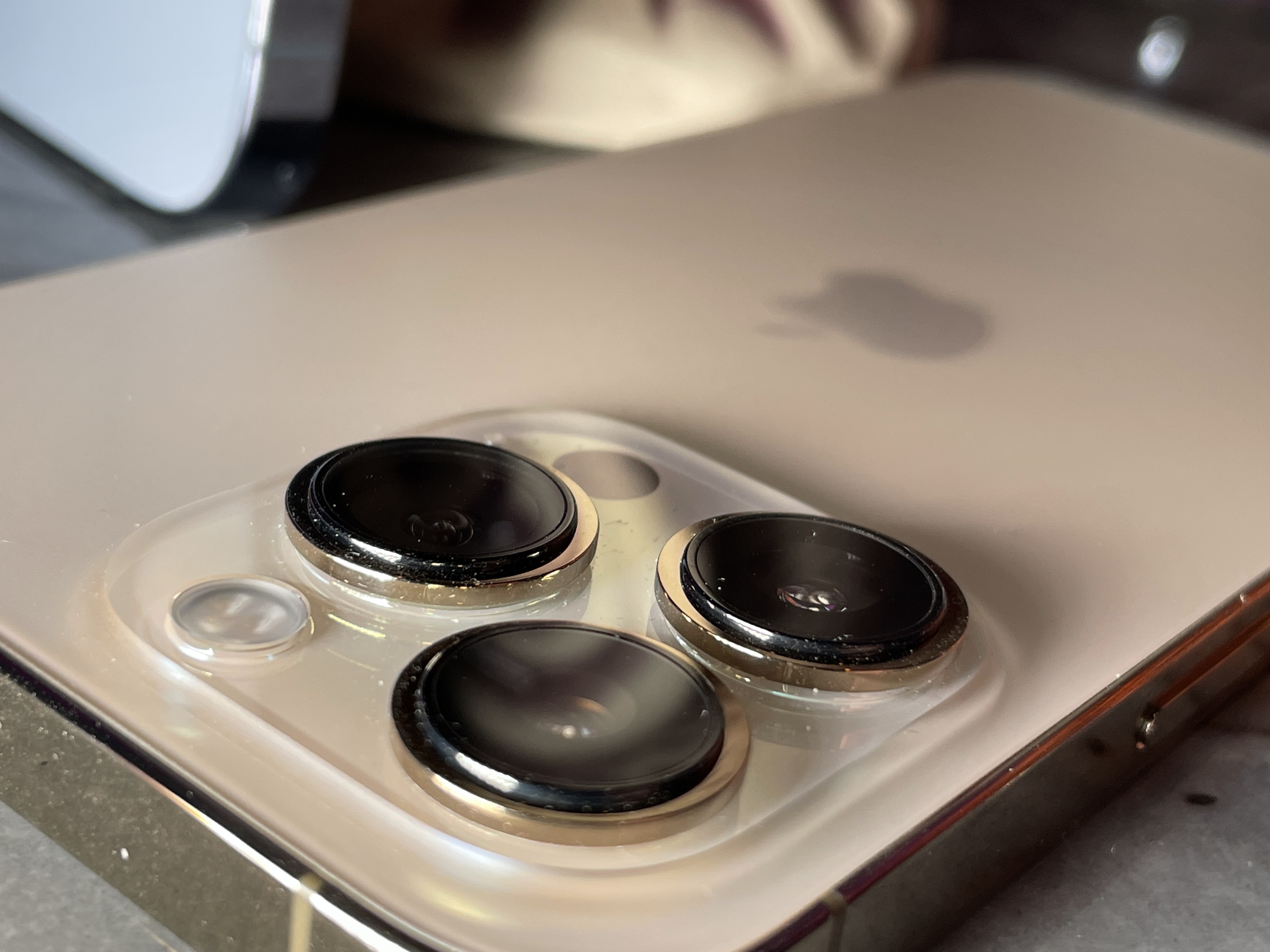
The camera array on the back of the iPhone 13 Pro is bigger and taller in order to accommodate the three new cameras Apple has installed here. And I do mean bigger, like 40% bigger overall with taller arrays. Apple's new cases now have a very noticeable raised ridge that exists to protect the lenses when you're setting the case down on a surface.
Everything else is sort of built around the camera and the need for wireless charging and radio performance. But Apple's frosted glass and steel rim look retains its jewel-like quality this year and they're still really good looking phones. I doubt the vast majority of people will see them long without a case but while you do they're nice looking phones.
The front notch has been pared down slightly due to improvements in camera packaging, which leaves a tiny bit more screen real-estate for things like videos, but we'll have to wait to see if developers find clever ways to use the extra pixels.
Now, on to the cameras.
Cameras
It seems impossible that Apple continues to make year-over-year improvements that genuinely improve your optionality and quality of images that are enough to matter. And yet. The camera quality and features are a very real jump from the iPhone 11 Pro across the board and still a noticeable improvement from the iPhone 12 Pro for you early adopters. Anything older and you're going to get a blast of quality right to the face that you're going to love.
The camera packaging and feature set is also more uniform across the lineup than ever before with Apple's IBIS in camera sensor shift stabilization system appearing in every model - even the iPhone 13 mini which is a crazy achievement given the overall package size of this sensor array.
In my experience in the parks this year, Apple's improvements to cameras made for a material difference no matter which lens I chose. From low light to long zoom, there's something to love here for every avid photographer. Oh, and that Cinematic Mode, we'll talk about that too.
Telephoto
Of all of the lenses I expected improvement from, the telephoto was actually not that high on my list. But I was pleasantly surprised by the increased range and utility of this lens. I am an admitted telephoto addict, with some 60% of my photos on iPhone 12 Pro taken with the tele lens over the wide. I just prefer the ability to pick and choose my framing more closely without having to crop after the fact.
Having Night Mode on the telephoto now means that it doesn't fall back to the wide lens with crop in dark conditions as it used to. Now you get that native telephoto optics plus the Night Mode magic. This means much better black points and great overall exposure even hand held at zoom - something that felt just completely out of reach a couple of years ago.
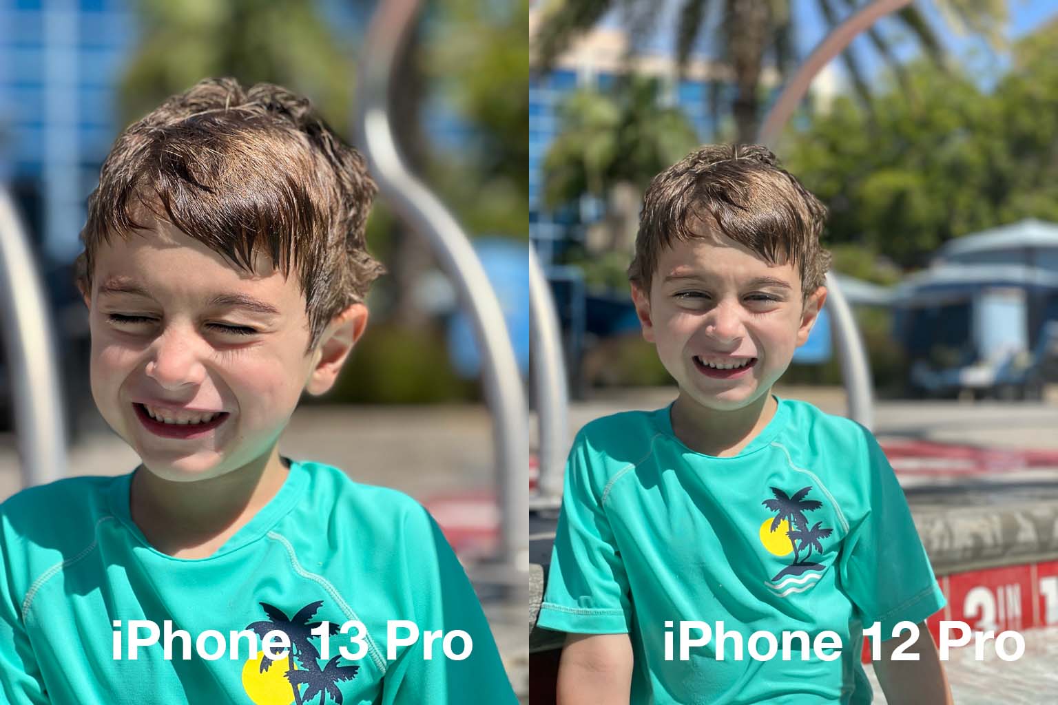
With the higher zoom level, portraits are cropped tighter, with better organic non-portrait-mode bokeh which is lovely. With this new lens you're going to be able to shoot better looking images of people, period.
If you're a camera person, the 3x reminds me a lot of my favorite 105mm fixed portrait lens. It's got the crop, it's got the nice background separation and the optical quality is very, very good on this lens package. Apple knocked it out of the park on the tele this time around.
The longer optical range was also very handy in a Disneyland world where performers are often kept separate from guests - sometimes for effect but mostly because of pandemic precautions. Being able to reach out and get that shot of Kylo Ren hyping up the crowd was a fun thing to be enabled to do.
Wide
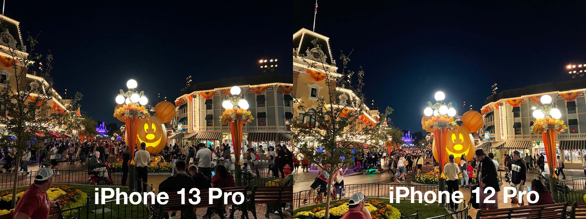
Apple's wide lens gets the biggest overall jump in sensor technology. A larger f/1.5 aperture and new 1.9m pixels roughly doubles the light gathering - and it shows. Images at night and inside ride buildings had a marked improvement in overall quality due to deeper blacks and better dynamic range.
With Night Mode enabled, the deeper light gathering range and improved Smart HDR 4 makes for deeper blacks and a less washed out appearance. If I had to characterize it, it would be more natural' overall - a theme I've seen play out across the iPhone cameras this time around.
Without Night Mode enabled, the raw improvement in image quality due to more light being captured is immediately evident. Though I think there are few situations where you need to turn off Night Mode any more, subjects in motion in low light are one of those and you'll get a few inches extra of wiggle room with this new sensor and lens combo in those instances.
Having sensor shift OIS come to the wide on the iPhone 13 across the range is a huge godsend to both still shots and video. Though I'm spoiled having been able to play with the iPhone 12 Pro Max's stabilization, if you haven't shot with it before you're going to be incredibly happy with the additional levels of sharpness it brings.
Ultra Wide
Apple's ultra wide camera has been in need of some love for a while. Though it offered a nice additional perspective, it has suffered from a lack of auto-focus and sub-par light gathering ability since its release. This time around it gets both a larger f/1.8 aperture and autofocus. Apple claims 92% more light gathering and my testing in pretty rough lighting conditions shows a massive improvement across the board.
Typically at Disneyland I like to shoot the wide in one of two ways: up close to create a fisheye-type perspective for portraits or to snag a vista when the lighting or scene setting is especially good. Having auto focus available improves the first a ton and the wider aperture gives the second a big boost too.
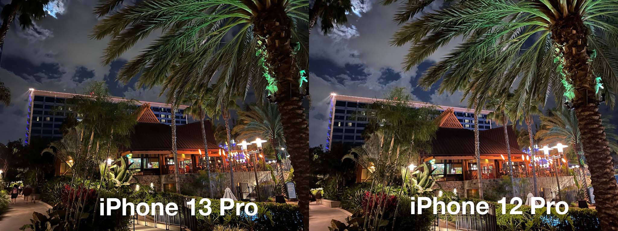
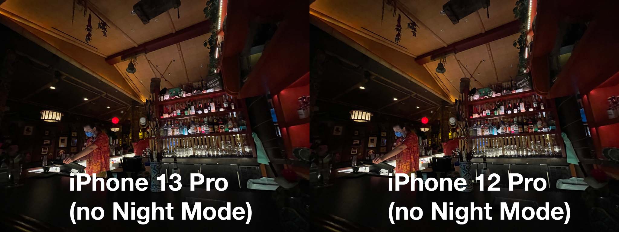
Check out these shots of a moonlit Trader Sam's, a snap that you might grab because the lighting and scenery are just right. The iPhone 12 Pro isn't bad at all here but there is an actually quite clear difference between the two in exposure. Both of these were taken with Night Mode disabled in order to compare the raw improvement in aperture.
The delta is clear, and I'm pretty impressed in general with how much Apple keeps improving this ultra wide camera, though it seems clear at this point that we're hitting the upper limits of what a 12MP sensor at this size can bring to a lens with such a wide POV.
The new ISP also improves Night Mode shooting here too - and with a bit more raw range to work with given the wider aperture, your night mode shots lose even more of that bright candy-like look and get a deeper and more organic feeling.
Macro photos and video
Another new shooting possibility presented by the iPhone 13 Pro is a pretty impressive macro mode that can shoot as close as 2cm. It's really, really well done given that it's being implemented in a super wide lens on a smartphone.
I was able to shoot incredibly detailed snaps very, very close-up. We're talking the surface texture of objects' close; pollen hanging off a bee's thorax' close; dew...well you get the idea. It's close, and it's a nice tool to have without having to carry a macro attachment with you.
I found the sharpness and clarity of the macro images I captured to be excellent within the rough 40% area that comprised the center of the capture area. Due to the fact that the macro mode is on the ultra wide, there is a significant amount of comatic aberration around the edges of the image. Basically, the lens is so curved you get excess blurring at the edges of a hyper-spherical element. This is only truly visible at very close distances at the minimum of the focal range. If you're a few cm away you'll notice and you'll probably crop it out or live with it. If you're further away getting a medium macro' at 10cm or whatever you'll likely not notice it much.
This is a separate factor from the extremely slim field-of-focus that is absolutely standard with all macro lenses. You're going to have to be precise at maximum macro, basically, but that's nothing new.
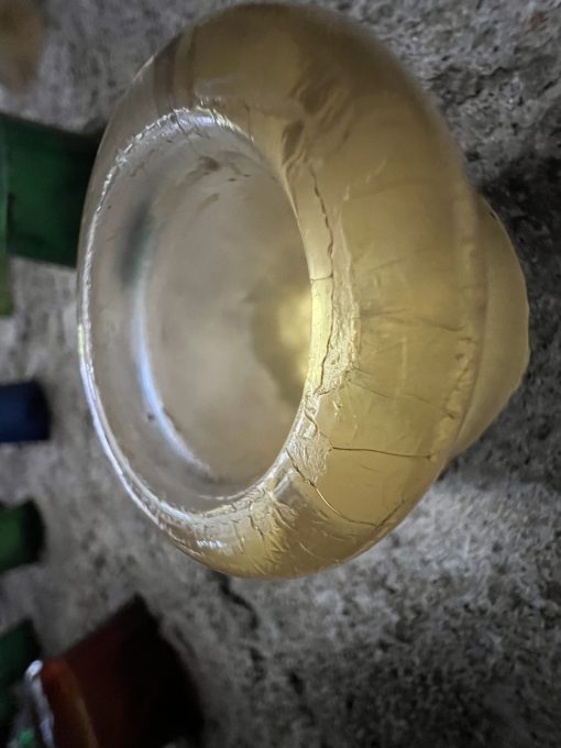
Given how large scale Disneyland is I actually had to actively seek out ways to use the macro, though I'd imagine it would be useful in more ways in other venues. But I still got cool shots of textures in the bottles in Radiator Springs and some faux fungi at Galaxy's Edge.
Macro video is similarly fun but requires extremely stable hands or a tripod to really take advantage of given that the slightest movement of your hands is going to move the camera a massive amount of distance proportional to the focal area. Basically, tiny hand moves, big camera moves in this mode. But it's a super fun tool to add to your arsenal and I had fun chasing bugs around some flower petals in the garden of the Grand Californian hotel with it.
 As a way to go from world scale down to fine detail it's a great way to mix up your shots.
One interesting quirk of the ultra wide camera being the home of macro on iPhone 13 Pro is that there is a noticeable transition between the wide and ultra-wide cameras as you move into macro range. This presents as a quick-shift image transition where you can see one camera clicking off and the other one turning on - something that was pretty much never obvious in other scenarios even though the cameras switch all the time depending on lighting conditions and imaging judgement calls made by the iPhone's camera stack.
Users typically never notice this at all, but given that there is now an official macro camera available when you swoop in close to an object while you're on 1x then it's going to flip over to the .5x mode in order to let you shoot super close. This is all totally fine, by the way, but can result in a bit of flutter if you're moving in and out of range with the cameras continuously switching as you enter and exit macro distance' (around 10-15cm).
When I queried about this camera switching behavior, Apple said that a new setting will be added in a software update this fall to turn off automatic camera switching when shooting at close distances for macro photography and video."
This should solve this relatively small quirk for people who want to work specifically at the macro range.
Photographic Styles and Smart HDR 4
One of the constant tensions with Apple's approach to computational photography has been its general leaning towards the conservative when it comes to highly processed images. Simply put, Apple likes its images to look natural', where other similar systems from competitors like Google or Samsung have made different choices in order to differentiate and create punchier' and sometimes just generally brighter images.
I did some comparisons of these approaches back when Apple introduced Night Mode two years ago.
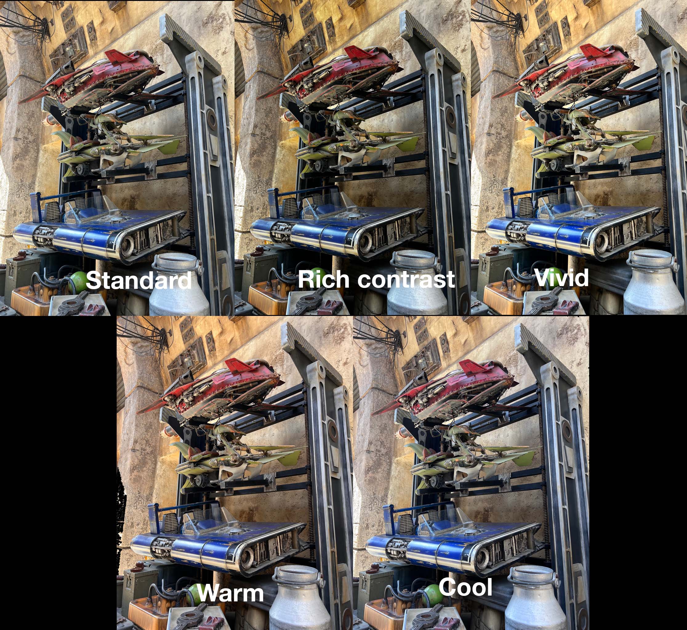
The general idea hasn't changed much even with Apple's new launches this year, they're still hewing to nature as a guiding principle. But now they've introduced Photographic Styles in order to give you the option of cranking two controls they're calling Tone and Warmth. These are basically vibrance and color temperature (but only generally). You can choose from 5 presets including no adjustments or you can adjust the two settings on any of the presets on a scale of -100 to +100.
I would assume that long term people will play with these and recommendations will get passed around on how to get a certain look. My general favorite of these is vibrant because I like the open shadows and mid-tone pop. Though I would assume a lot of folks will gravitate towards Rich Contrast because more contrast is generally more pleasing to the human eye.
In this shot of some kid-sized speeders, you can see the effects on the shadows and midtones as well as the overall color temperature. Rather than being a situational filter, I view this as a deep camera setting' feature, much like choosing the type of film that you wanted to roll with in a film camera. For more contrast you might choose a Kodak Ektachrome, for cooler-to-neutral colors perhaps a Fuji, for warm skin tones perhaps a Kodak Portra and for boosted color maybe an Ultramax.
This setting gives you the option to set up your camera the way you want the color to sit in a similar way. The setting is then retained when you close camera.app. This way when you open it, it's set to shoot the way you want it to. This goes for the vast majority of camera settings now under iOS 15, which is a nice quality of life improvement over the old days when the iPhone camera reset itself every time you opened it.
It's worth noting that these color settings are imbedded' in the image, which means they are not adjustable afterwards like Portrait Mode's lighting scenarios. They are also not enabled during RAW - which makes sense.
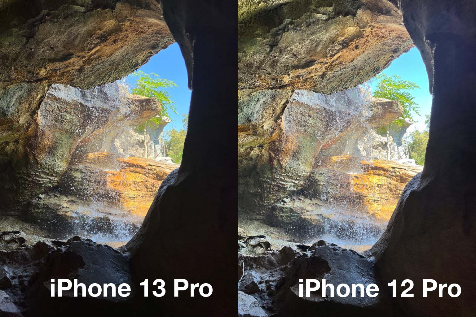
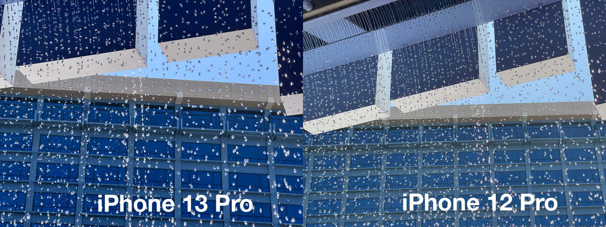
Smart HDR4 also deserves a mention here because it's now doing an additional bit of smart segmentation based on subjects in the frame. In a situation with a backlit group of people, for instance, the new ISP is going to segment out each of those subjects individually and apply color profiles, exposure, white balance and other adjustments to them - all in real time. This makes for a marked improvement in dark-to-light scenarios like shooting out of windows and shooting into the sun.
I would not expect much improvement out of the selfie camera this year, it's just much the same as normal. Though you can use Cinematic Mode on it which is fun if not that useful in selfie modes.
Cinematic Mode
This is an experimental mode that has been shipped live to the public. That's the best way to set the scene for those folks looking to dive into it. Contrary to Apple's general marketing, this won't yet replace any real camera rack focus setup on a film set, but it does open up a huge toolset for budding filmmakers and casual users that was previously locked behind a lot of doors made up of cameras, lenses and equipment.
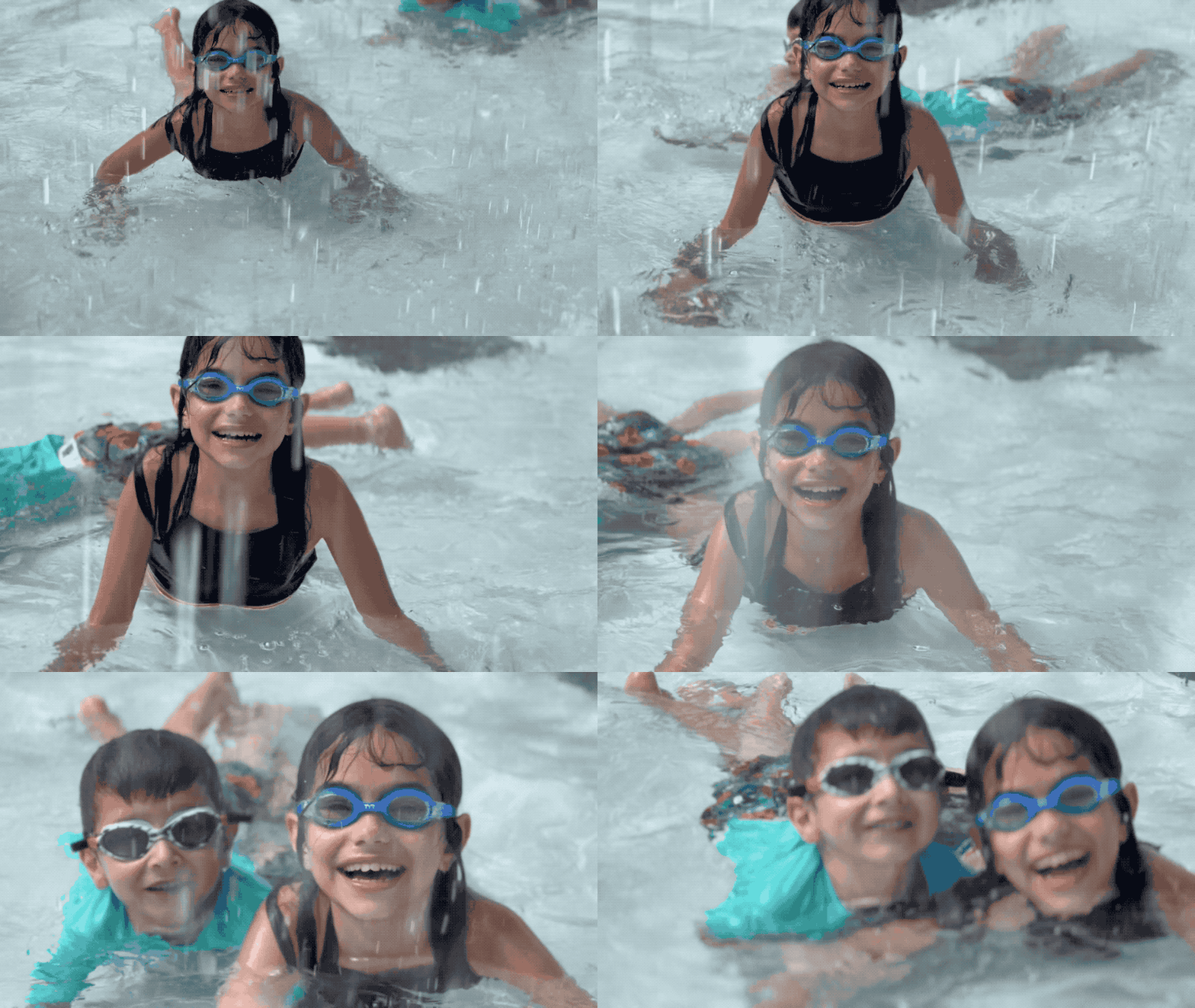
Cinematic Mode uses the camera's depth information, the accelerometer and other signals to craft a video that injects synthetic bokeh (blur) and tracks subjects in the frame to intelligently rack' focus between them depending on what it thinks you want. There is also some impressive focus tracking features built in that allow you to lock onto a subject and follow them in a tracking shot' which can keep them in focus through obstacles like crowds, railings and water. I found all of these depth-leveraging features that did tracking to be incredibly impressive in my early testing, but they were often let down a bit by the segmentation masking that struggled to define crisp, clear borders around subjects to separate them from the background. It turns out that doing what portrait mode does with a still image is just insanely hard to do 30 times a second with complex, confusing backgrounds.
The feature is locked to 1080p/30fps which says a lot about its intended use. This is for family shots presented on the device, AirPlayed to your TV or posted on the web. I'd imagine that this will actually get huge uptake with the TikTok filmmaker crowd who will do cool stuff with the new storytelling tools of selective focus.
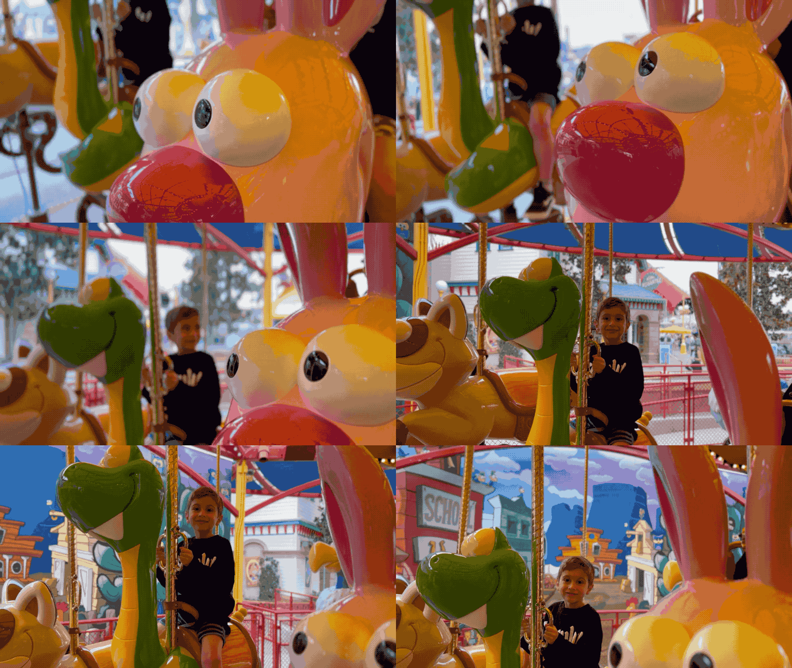
I did some test shooting with my kids walking through crowds and riding on carousels that was genuinely, shockingly good. It really does provide a filmic, dreamy quality to the video that I was previously only able to get with quick and continuous focus adjustments on an SLR shooting video with a manually focused lens.
That, I think, is the major key to understanding Cinematic Mode. Despite the marketing, this mode is intended to unlock new creative possibilities for the vast majority of iPhone users who have no idea how to set focal distances, bend their knees to stabilize and crouch-walk-rack-focus their way to these kinds of tracking shots. It really does open up a big bucket that was just inaccessible before. And in many cases I think that those willing to experiment and deal with its near-term foibles will be rewarded with some great looking shots to add to their iPhone memories widget.
I'll be writing more about this feature later this week so stay tuned. For now, what you need to know is that an average person can whip this out in bright light and get some pretty fun and impressive results, but it is not a serious professional tool, yet. And even if you miss focus on a particular subject you are able to adjust that in post with a quick tap of the edit button and a tap on a subject - as long as it's within the focal range of the lens. 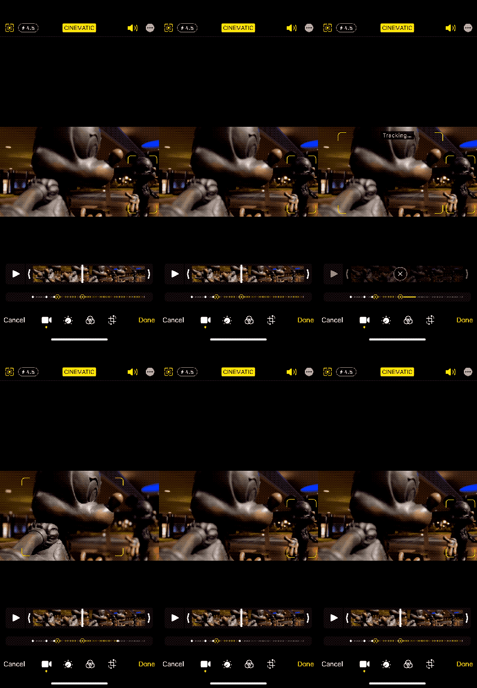
As a filmmaking tool for the run and gun generation it's a pretty compelling concept. The fact is that it allows people to spend less time and less technical energy on the mechanics of filmmaking and more time on the storytelling part. Moviemaking has always been an art that is intertwined with technology - and one of the true exemplars of the ideal that artists are always the first to adopt new technology and push it to its early limits.
It's kind of hard to explain because I think most of us are so used to the language of film these days but having these tools in your arsenal is a huge step forward in how everyone's home videos will look and feel over the next few years.
Just as Apple's portrait mode has improved massively over the past 6 years, I expect Cinematic Mode to keep growing and improving. The relatively sketchy performance in low light and the locked zoom are high on my list to see bumps next year, as is improved segmentation. It's an impressive technical feat that Apple is able to deliver this kind of slicing and adjustment not only in real-time preview but also in post-shooting editing modes, and I'm looking forward to seeing it evolve.
Assessment
This is a great update that improves user experience in every way, even during an intense day-long Disneyland outing. The improved brightness and screen refresh means easier navigation of park systems and better visibility in daylight for directions and wait times and more. The better cameras mean you're getting improved shots in dark-to-light situations like waiting in lines or shooting from under overhangs. The nice new telephoto lets you shoot close-up shots of cast members who are now often separated from the crowds by large distances, which is cool - and as a bonus acts as a really lovely portrait lens even while not in Portrait mode.
Overall this was one of the best experiences I've had testing a phone at the parks, with a continuous series of wow' moments with the cameras that sort of made me question my confirmation bias. I ended up with a lot of shots like the night mode wide angle and telephoto ones I shared above that impressed me so much I ended up doing a lot of gut checking asking other people in blind tests what they thought of the two images. Each time I did so the clear winner was the iPhone 13 - it really is just a clear cut improvement in image making across the board.
The rest of the package is pretty well turned out here too, with massive performance gains in the A15 Bionic with not only no discernable impact on battery life but a good extra hour to boot. The performance chart above may give the wow factor but that performance charted on the power usage of the chip across a day is what continues to be the most impressive feat of Apple's chip teams.
The iPhones 13 are an impressive field this year, providing a solid moat of image quality, battery life and now, thankfully, screen improvements that should serve Apple well over the next 12 months.
