Google is restoring one of Gmail's useful features on the web
Gmail's big Compose button is coming back to desktops.
What you need to know- Google announced a new update for the Compose button of Gmail on the web.
- The button will revert to its original large design following a popular demand.
- Gmail on the web will bring back the big Compose button on November 3.
Google appears to have recognized that removing the old large Gmail button for creating a new email on desktop did not sit well with the majority of users. The old Compose button is now making a comeback on many of the best laptops.
The search giant has announced that the original big button will return to Gmail on the web starting on November 3. Googled noted that it has come up with this decision after hearing from users that the original version of the button was more intuitive.
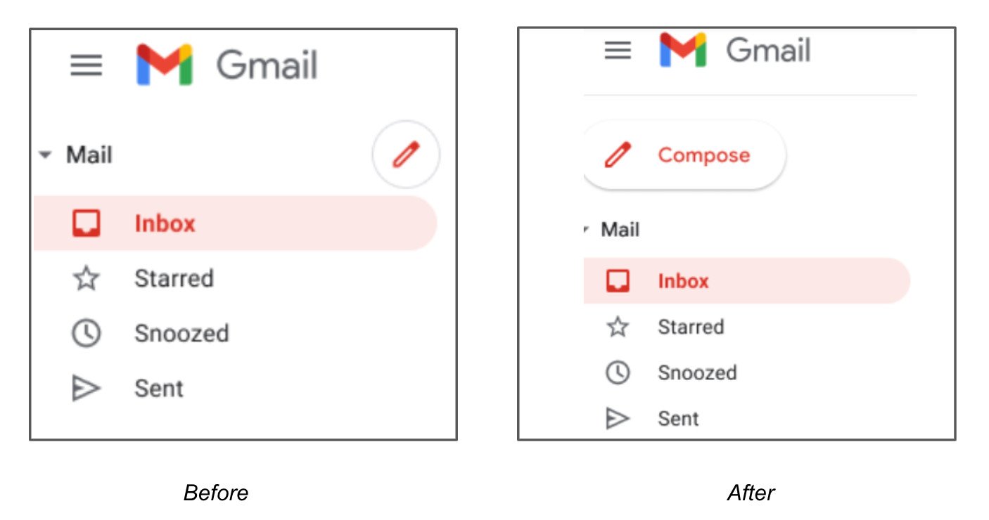
Aside from the larger size, there will be a few design changes. The four-color plus button that represented Google's Material Theme design, for example, will no longer be available. Instead, the web-based email client will use a larger button with a red pencil icon and the word "compose" inside the floating action button (FAB).
If it looks familiar, that's because this is the same design Google introduced for Gmail on Android earlier this year, except that the mobile version has a different color. The new button for Gmail's desktop version will replace the soon-to-be-erstwhile red circular button.
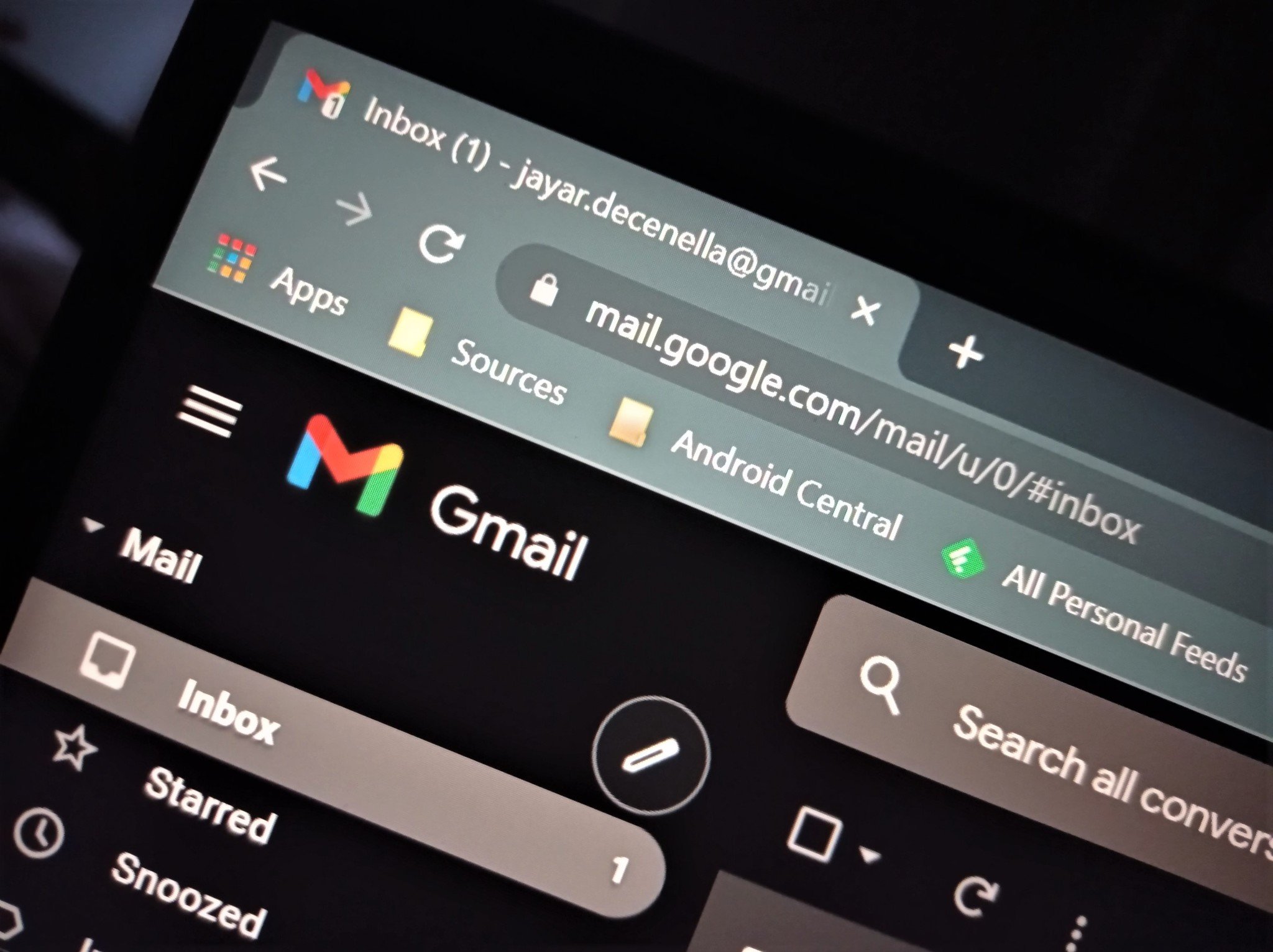
That button was introduced in April when Google rolled out a new Gmail client on the web that integrated Chat and Rooms for free users. It was rather an uncalled-for design change, replacing the larger FAB with a smaller, icon-only button that could be easily drowned out on large desktop screens.
So the latest update is a welcome change. All Workspace customers and those with personal Google accounts will have access to Gmail's old Compose button starting next week. Keep in mind, however, that it may take up to 15 days to become available to everyone.

