Samsung Galaxy Z Flip 4: 5 features we want to see
Last year was refinement. This year, we need evolution.
The Galaxy Z Flip 3 is one of the best foldable phones for a reason. Aside from actually being small enough to fit in a pocket, its release provided much-needed upgrades over its predecessor like a proper water-resistance rating. But foldable phones are still in their infancy with plenty of room for improvement.
With the expectation that Samsung will release a fourth-generation flip phone later in 2022 - especially given how well the Flip 3 is selling - we're hoping for more than just a spec bump. We'd love to see a design evolution that includes a few hardware upgrades.
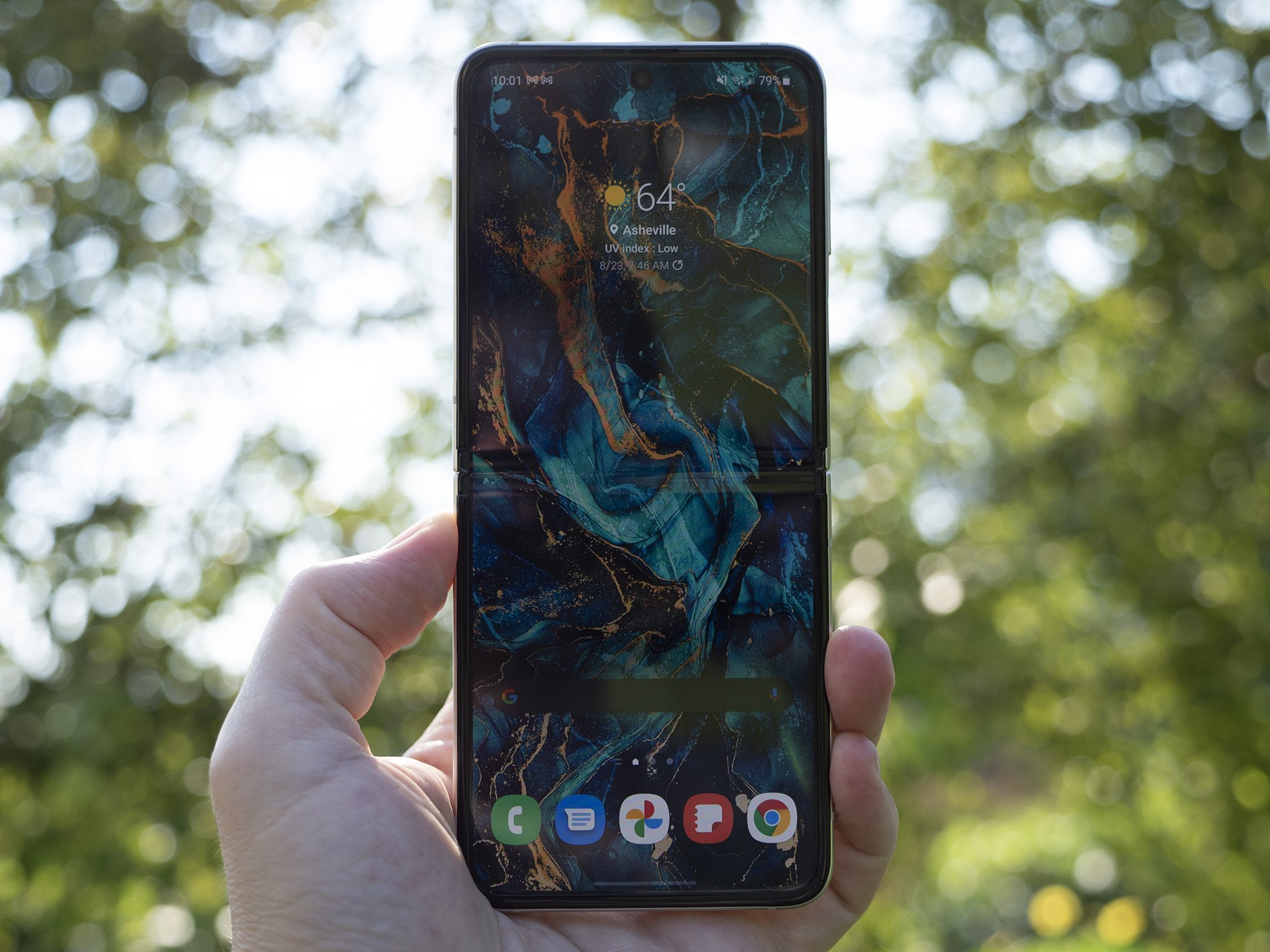
Goodbye creasePeople seeing or using the Z Flip 3 for the first time typically have one consistent concern amidst all the positivity and excitement: the horizontal crease in the display's center. To my recollection, everyone I know who has seen the phone in person has asked me if the crease is a bother.
Acting like a crease is ideal isn't any better than acting like a display notch isn't annoying to look at all the time.
While my first answer is no, the crease really isn't a big deal - and it's not, your eyes do adjust - acting like a crease is ideal isn't any better than acting like a display notch isn't annoying to look at all the time.
We know it's entirely possible to ship a creaseless foldable because phones like the Moto RAZR 5G already have proven it can be done. Even larger foldable phones, like the OPPO Find N, have also begun shipping with no noticeable crease when folded open, so it's time Samsung does a little display hinge redesign and gets on board.
Compared to the Z Fold 3's vertical crease, the crease on the Z Flip 3 annoys me more because it runs lengthwise across a much smaller display. You'll likely thumb it throughout the day because it's easily within reach. That's why, for me, it's the first thing that should go in a proper Z Flip 4 redesign.
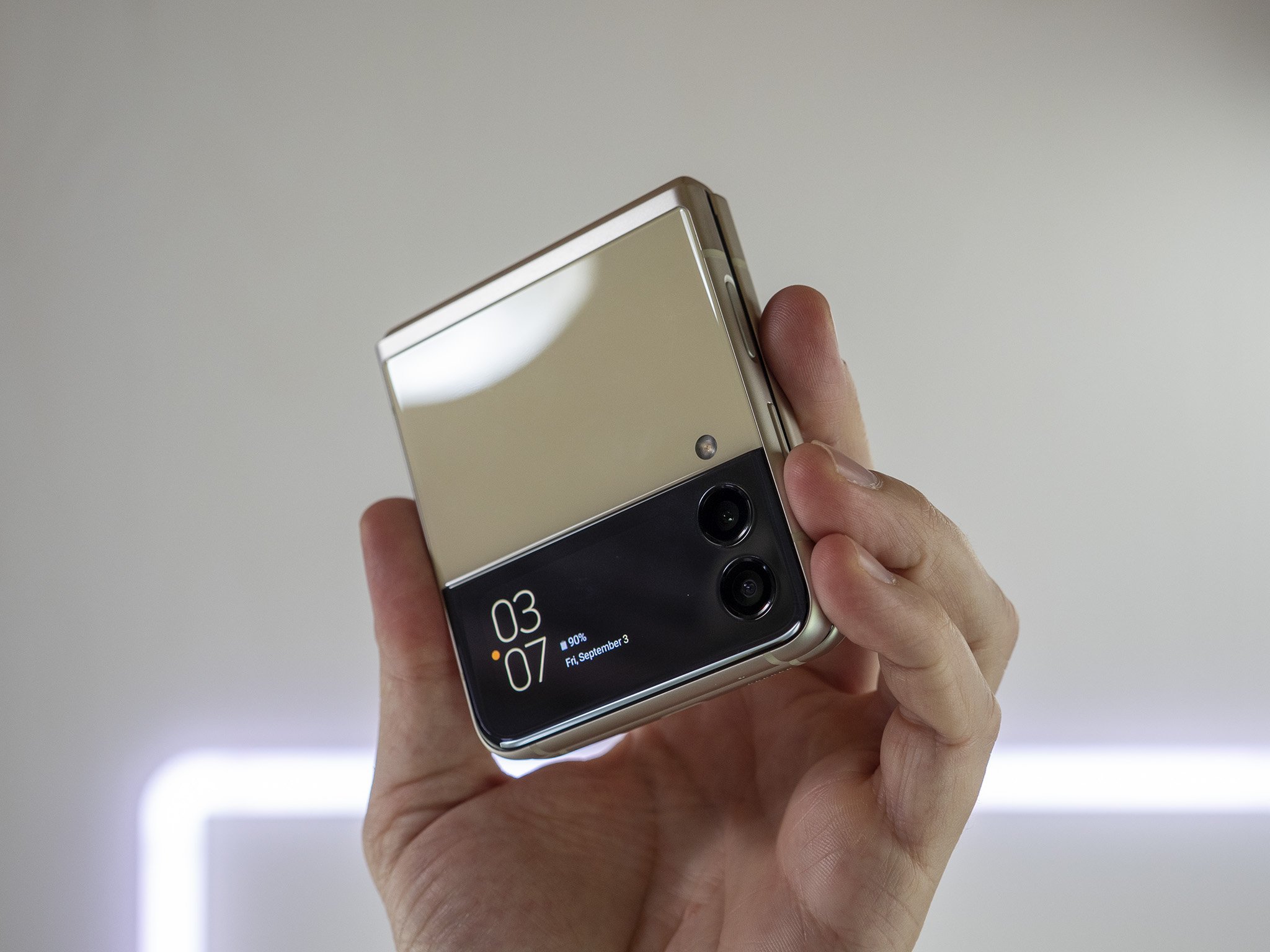
Bigger outer screenWhile we're at it, I'd love to see Samsung borrow one more thing from the Moto RAZR 5G: that larger outer screen. While the Z Flip 3 increased the screen size over its predecessor - making it actually useful for quick tasks like notifications, setting alarms, etc. - having a full-sized 4:3 screen on the front would be a lot more convenient.
Sometimes, it's just nice to have a quick tap on the smaller screen to get the job done.
One of the best design traits of that RAZR 5G is that outer screen, simply because you can actually do anything you want on it. Unlike Samsung's smaller Flip 3 display, which only displays very specific information, the Moto RAZR 5G's outer display is just a normal display, complete with home screen.
The downside to having a larger outer screen, of course, is that it increases the likelihood of possible damage encumbered from a fall. That would make it all the more important to wrap a case around the phone. But I'm OK with the risk given the amount of productivity it would add to the device.
Flipping a phone open is great fun, but sometimes a quick tap on the smaller screen gets the job done. I've learned that from the Z Flip 3, and the same would apply here.
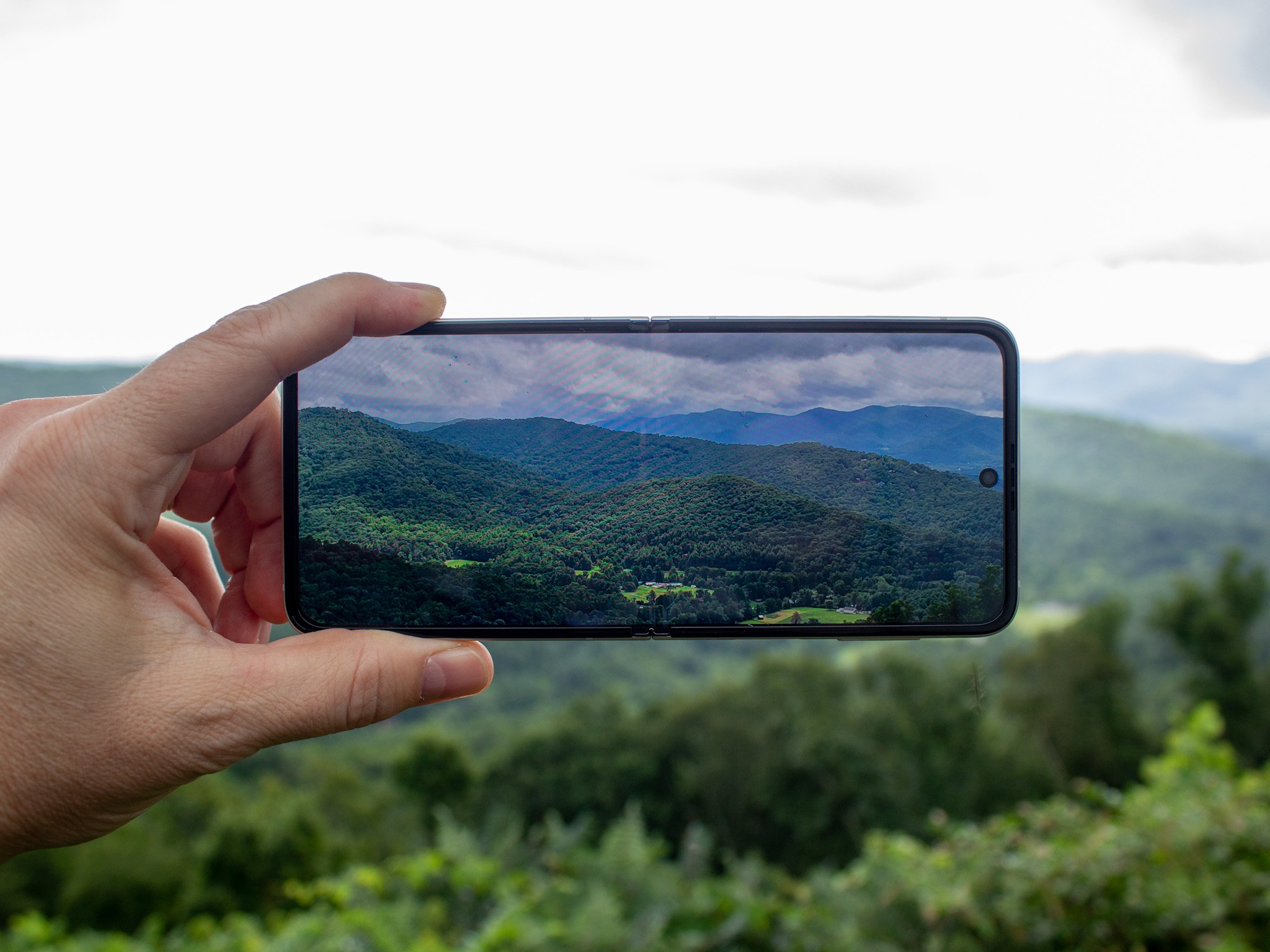
Better camerasThis one is a big ask, given that newer, larger camera sensors take up more room in a tiny foldable phone body, but it's still one I'd love to see happen. As much as I hate camera humps, most premium phones utilize the extra space to add in bigger and better camera sensors. If that's what it takes to get better cameras on the Z Flip 4, so be it.
At the very least, adding in some sort of telephoto camera is an absolute must for the 2022 release.
Now the cameras on the Z Flip 3 aren't bad, by any means. Samsung completely overhauled their AI-based scene detection algorithm with their 2021 phone releases and, with that, came significantly better photos.
That is especially true when movement is involved, as Samsung's camera software now acts more like Google's. It takes pictures constantly, both before and after you've pressed the shutter button. The back-end processing algorithm will then analyze all these photos, choosing the ones with the least amount of blur, then combining all of them together to make one super amazing photo.
Now that we've finally got better processing on Samsung's camera software, it's time we see a big hardware upgrade to the camera hardware on the Z Flip 4. At the very least, adding in some sort of telephoto camera is an absolute must for the 2022 release.
More powerThis one isn't referencing the processing power or the amount of RAM. Those components are both fine on the Z Flip 3, and there's no reason to think Samsung is going to change the high-end spec goal for the Z Flip 4.
No, what we want here is a bigger battery and faster charging. Much like the camera hardware request, this one is likely a difficult ask given that extra room has to be made inside the phone for all the folding components and the hinge.
Nevertheless, the Z Flip 3's battery life certainly isn't epic and, for some folks, might not even get them through a full day's use.
But Samsung can do a few things to help improve the poor battery life perspective without increasing the size of the battery in the Z Flip 4.
We want a bigger battery and faster charging.
Adding a larger outer screen - as we so politely requested in the section above - would ensure that users will open the phone less during the day to use that larger, folding display. A smaller display doesn't sip as much power as a larger one, therefore reducing the strain on the battery throughout the day.
Secondly, Samsung really needs to bump up the charging speed on the Z Flip 4. The Flip 3 only charges at 15W wired and only 10W wireless. Those speeds were fast 5-6 years ago; today, that's pretty darn slow. If we have to live with short battery life, being able to plug the Z Flip 4 in and quickly charge to 30-50% in just a few minutes would make up for it.
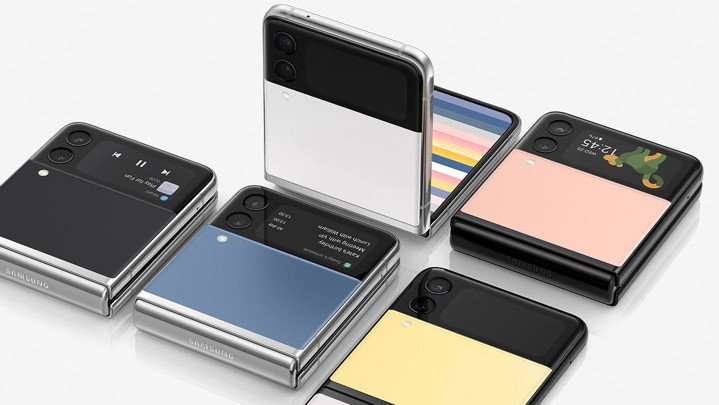
All-in on styleA few months after the Z Flip 3 launched, Samsung announced the Z Flip 3 Bespoke Edition, a special edition of the Z Flip 3 that you could customize and order directly from Samsung. Folks could choose from 49 color combinations to make their Z Flip 3 look exactly like they want it to.
What I'd love to see is a harkening back to the Moto Maker.
But the Bespoke Edition is still pretty limiting in scope. There are really only a handful of colors to choose from - the 49 number comes from mixing and matching colors instead of a huge bin of possibilities - and there are no different materials to choose from.
What I'd love to see is a harkening back to the Moto Maker days, where you could completely customize your phone down to the etching on that back. That included wood and leather back options, all sorts of colors for the metal rails around the phone, and more.
As it stands, buying the Bespoke edition isn't such a great idea at $1,000 because, quite frankly, there aren't enough customization options.
Flipping out at the possibilitiesThe Flip 3 was marketed and catered to an audience that was looking for something hip and new. The ads were fancy, the cases were wild and unique looking, and the phone successfully merged the feeling of nostalgia with the feeling of something new and exciting in a way phones haven't for years. I hope Samsung takes further advantage of that with the Z Flip 4 and goes all-in on style and color.


