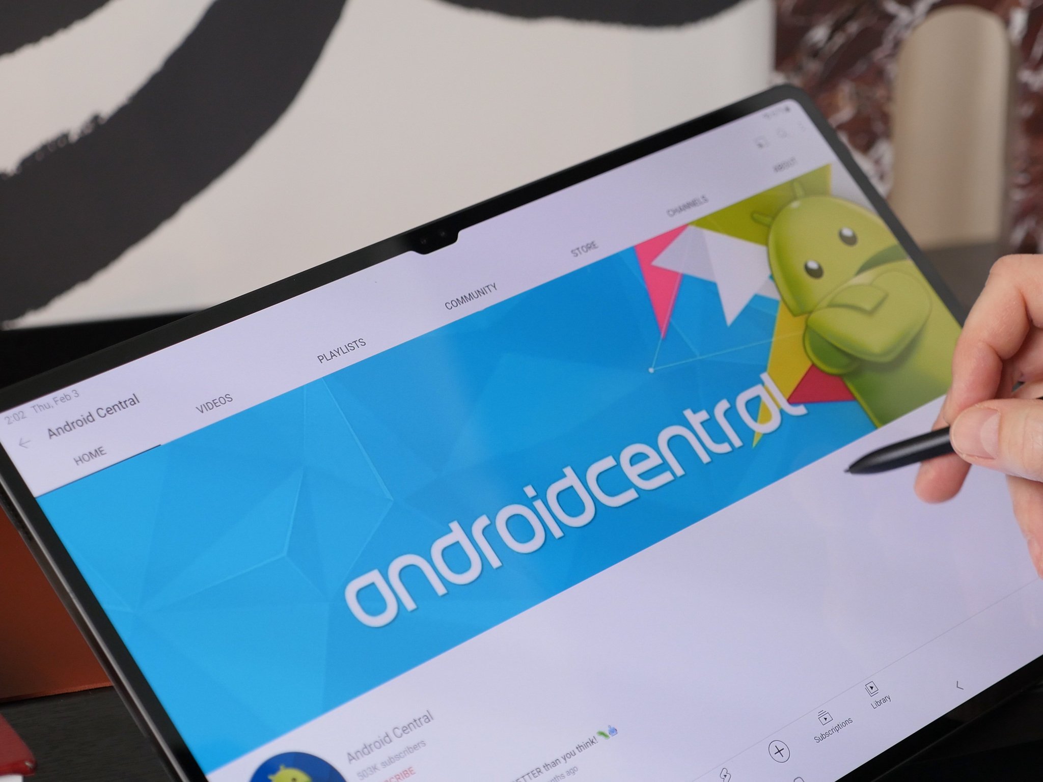
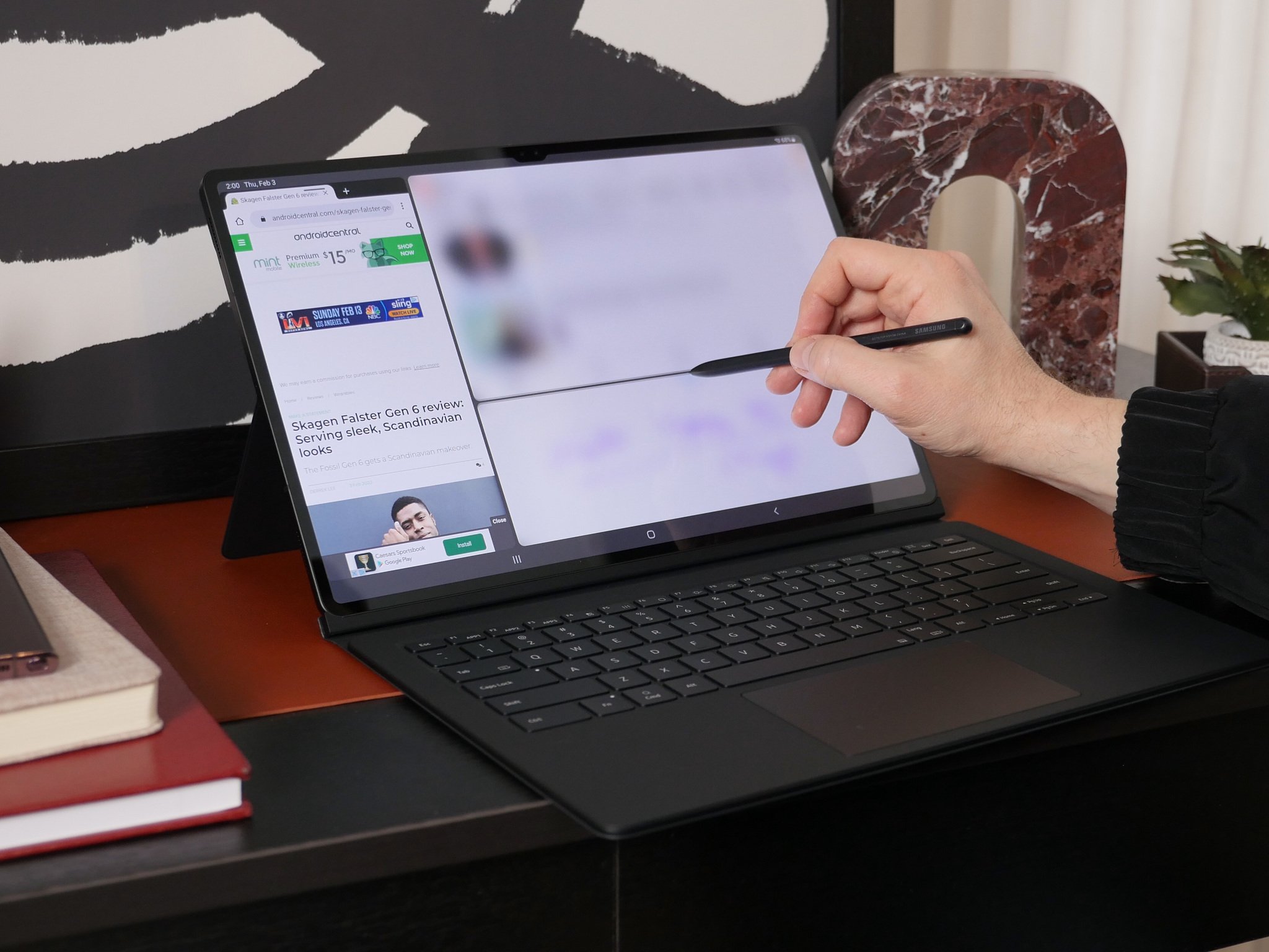
It's not-ch a problem that the Galaxy Tab S8 has unique bezels
Notches take getting used to on an iPhone but are barely noticeable on massive screens like the Tab S8 Ultra or MacBook Pro.
Samsung loves to dunk on Apple for "bad decisions" that it ends up emulating down the line. It mocked Apple for not bundling a charger with the iPhone 12, only to delete the ads once the S21 shipped without one. After deriding Apple for ditching the headphone jack, Samsung has all but abandoned them. And after tweeting "Imagine still having a notch in 2021," Samsung announced the Galaxy Tab S8 Ultra in 2022...with a notch.
The Galaxy Tab S8 series takes all of the attractive qualities of the S7 series and adds a revamped CPU, more base RAM, four promised OS updates and better selfie cams for just $50 more than the S7 launch prices. And the new Tab S8 Ultra gives you 14.6 inches with teeny-tiny bezels, making the iPad Pro 12.9-inch look compact by comparison. But for many, the notch has overshadowed all of the Ultra's perks.
The Galaxy Tab S8 Ultra notch is no big deal.
I've seen plenty of Android users on Twitter, other sites, and our own comment sections bemoaning the notch as a deal-breaker. So having spoken to my colleague Nick Sutrich, who got hands-on time with the Ultra last week, I'm here to assure you: the notch is no big deal. It's fine. There are plenty of reasons to question whether or not to buy a $1,100 Android tablet, but the notch isn't one of them.
A tablet notch isn't like a phone notchI'm not here to reignite the Android Central notch wars of yesteryear. Hot takes that "the notch is fine" or that hole punches are worse than notches inspired hundreds of disgusted comments at the time. But these days, no one besides Apple bothers with them outside of budget phones, and the iPhone 14 will ditch the notch, making the point moot.
Even people who tolerate the notch or prefer it to a hole-punch will agree that it's something your brain learns to ignore and that the smaller it is, the better. In a phone that's maybe three inches wide, you'll have trouble disregarding it. But when you stick a tiny black trapezoid on a nearly 13-inch-wide display, that's an entirely different story.
In zoomed-out renders showing the full tablet in all its massive glory and the 2960x1848 display wallpaper shining brightly, the notch stands out like a tiny blemish. No other mainstream tablets have bothered with one because their bezels leave a few centimeters of buffer that easily masks the front camera housing. But the Tab S8 Ultra's ridiculous screen-to-body ratio means the sloped notch juts down a few millimeters, making it visible for full-screen apps.
So why isn't this a big deal? Because after Nick, our Senior Content Producer, went to NYC to test out the Galaxy Tab S8 Ultra (and Galaxy S22), he told me he "didn't notice the notch at all while using it."
"The aspect ratio means it won't encroach on videos, and the tablet is so large (and the bezels/notch so small) that it's out of your normal field of view."
When staring at a laptop-sized screen, your eyes can't take in everything at once unless you're sitting at a remove. You tend to stare in the middle, with the menu bar only at the periphery of your vision. And in most cases, that menu bar is darker than the rest of your display regardless, so the notch doesn't stick out that much.
DeX mode makes the notch even less noticeable than it already is.
The same applies with the Galaxy Tab S8 Ultra when you use it in DeX mode for multitasking. Its notch blends into the status bar, so you'll only see it if you're clicking around at the top of the screen. And as a laptop-replacement device, you're likely going to use DeX a lot.
The notch does become visible when using certain apps in full-screen mode, but as Nick said, the aspect ratio on streamed films and shows ensures that portion of the screen will be blacked out regardless. And the same often applies to Android apps that add a bit of buffer along the top to leave room for your status bar.
The MacBook Pro notch is worse but isn't that badI haven't had a chance to test the Galaxy Tab S8 Ultra yet, but I have used the new MacBook Pro with its controversial notch. And while you can and should rag Apple for not supporting Face ID, I can promise you that the notch doesn't affect your browsing experience on the Pro at all - not in the way it does on the iPhone.
Why bring this up? Because the MacBook Pro and Galaxy Tab S8 Ultra have very similar display sizes, and given Samsung's notch is smaller and more useful, my experience with the Pro should hopefully reassure you.
99% of the time, you'll forget the notch is there.
Apple stuck the notch in the menu bar, but the 14-inch display has enough room for a dozen icons on the right and tons of menus on the left, so it's not as if that webcam space gobbled up limited real estate. It's certainly noticeable at 1.5"x0.5", but unless you stick your laptop on a stand, you're naturally going to look down at the display anyways, so your eyes naturally look below it most of the time. And macOS Monterey apps don't use that space, so nothing is ever blocked even if you go full-screen. 99% of the time, you'll forget the notch is there.
With the Galaxy Tab S8 Ultra, it has slightly thicker bezels than the Pro, so the notch juts out slightly less. And while Nick didn't bring a tape measure with him, the notch looks at a glance to be about a half-inch narrower even before it slims down near the bottom. And, of course, the Galaxy Tab series actually supports Face Unlock, unlike the MacBook Pro.
If you're still uncertain about buying Samsung's mega-tablet, the Galaxy Tab S8+ still gives you a 12.4-inch AMOLED display that's more affordable, lighter, and plenty powerful in its own right. But only the Tab S8 Ultra offers 12GB and 16GB RAM upgrades, so you'll have to come to terms with the notch (and the high price) if you want a Samsung tablet you can use as a laptop replacement.
We'll have a full review of the Galaxy Tab S8 Ultra in the coming weeks, but it's obvious it will top the best Android tablets alongside the S8 and S8+. The only question is whether Samsung's new One UI multitasking tools make the S8 Ultra a better purchase than the iPad Pro or a Chromebook for productivity.
Massive display, tiny notchSamsung Galaxy Tab S8 UltraAn iPad Pro rival
With a 14.6-inch Super AMOLED 120Hz display, 4nm Octa-Core processor, up to 16GB of RAM, quad Dolby Atmos speakers, an 11,200mAh battery, and an upgraded S Pen, the Galaxy Tab S8 Ultra offers a premium-quality experience.


