Instagram won’t make an iPad app, but its web interface is getting better
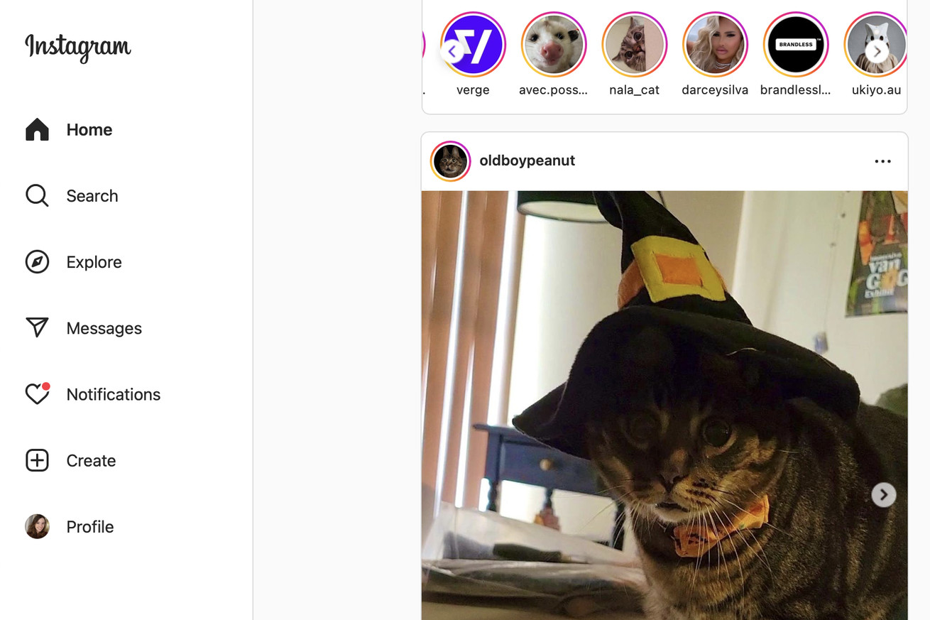
 The new Instagram for web interface.
 Instagram's CEO has made it clear that an iPad app isn't a huge priority for the company, but it is at least doing something to make the big-screen experience better. Some people, including a few members of The Verge's staff, have started noticing a slightly redesigned version of Instagram for the web, which features a navigation sidebar with links to pages like search, explore, messages, and notifications instead of having those as unlabeled buttons at the top.
The design is relatively similar to how Twitter is laid out and definitely seems more at home on a bigger screen - you get more info about what the buttons are and what they do, and the options to access settings, your saved posts, or the ability to switch accounts have been...