Walmart’s redesigned website looks better than Amazon
 Image: Walmart
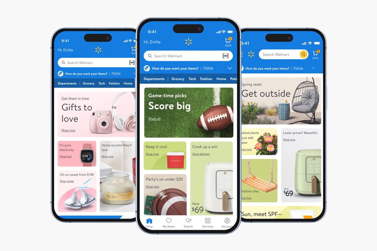
 Walmart's website and app have a new look, and I have to admit that it looks a lot cleaner than Amazon's. The retail giant swapped out a more cluttered interface for one with bubbly blocks displaying various departments and deals across the store.
When you scroll down on the homepage, you'll see even more shopping categories, along with specific items tailored to upcoming holidays, events, or the current season. Meanwhile, searching for a product yields several rows of products matching your search that you can scroll through horizontally.
Walmart executive vice president Tom Ward describes the change as a more engaging way to browse" through Walmart's inventory, noting that it surfaces items that matter most to [customers] at any...