So long, sharrow. Check out our new logo.

What I started Seattle Bike Blog in 2010, I chose an icon that seemed to best represent the experience of biking in Seattle at the time: The sharrow. Officially called a shared lane marking," SDOT had painted dozens of miles of sharrows in mixed traffic lanes across the city, including on many busy streets.
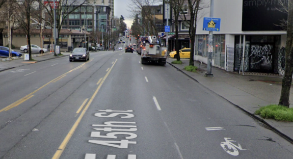
The sharrow itself is just a marking, and they can be used in ways that are helpful such as marking bike routes that cross driveways or identifying neighborhood greenway routes. But in Seattle, it seemed like sharrows were being misused as a way to pretend to make a street safer for biking without actually doing the difficult work of redesigning it to provide the space and protection people needed. Sharrows did not signify any changes in the rules of the road. People could bike on these busy streets before, too, but now they can ride over little pictures of bikes while they do it. Below is a classic example from the era on NE 45th Street in the U District, which gets bonus points for the equally useless drive carefully" sign that might be funny if people didn't actually get hit trying to cross this dangerous street:
 From Street View. By the way, the little grocery store that opened in that old Simply Mac space is great.
Here's a bit of useless trivia for you: I also chose the sharrow as the icon for this blog because if you turn it sideways and make it the color of the text on the screen, I thought it looked a bit like a DOS prompt. This was a reference I'm not sure any reader ever got. If you did get this reference, you won! Congratulations.
 The old blog header. RIP.
 What you might see before hacking the mainframe (or playing Commander Keen) in the early 90s.
But here's the thing. Seattle isn't the city of sharrows anymore. I mean, there are still plenty of them out there, but the sharrow is no longer emblematic of the city's efforts to make the city more bike friendly. In fact, it's been more than a decade since the city consciously rejected the sharrow as a solution for busy streets. Largely thanks to advocacy efforts people like you, a movement Seattle Bike Blog has been proud to be part of, Seattle has been focusing its bike investment efforts on infrastructure that is welcoming to people of all ages and abilities. This means providing proper protection from traffic when bike routes are located on busy streets.
Of course the city is not always meeting this goal, but Seattle has come a very long way. We now have a protected bike route from the Fremont Bridge (and, thus, the Burke-Gilman Trail) all the way through the heart of downtown and into the International District. And more pieces of this vision keep opening. Seattle has both failed to meet its ambitious Bike Master Plan targets and accomplished some amazing bike route feats at the same time. That's what makes this such an interesting place to do this work.
I have been meaning to change the site's logo for many years now, but never came up with anything good enough until now. I have always loved those vertical grade warning signs when on a bike adventure. It's like they're saying, WARNING: FUN AHEAD." The bike lane person stencil and vertical grade sign elements fit with the roadway iconography theme of the old logo while the hill and the rain confront the most common reasons people claim Seattle can't be a biking town. Joke's on them, we love biking these hills in the rain.
So there you have it, way too much information about a logo change. Thanks for reading. And stay tuned because I have some more fun site-related stuff in the works.