Grrl Power #1227 – The really yucky breath of life
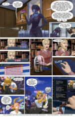
This page is a tad busy admittedly, but I couldn't resist a little aside back to the base to show Arianna just... aging a little bit each time Sydney's name suddenly gets a bunch of social media hits. I don't know why I made her drink of choice roast coffee rum, other than I didn't want her to be another whiskey drinker. The comic already has a few whiskey snobs in it.
When I look back through the comic, I think the biggest issue with it is the density. Since I want every page to tell it's own little segment of the story, there's no big splash pages (except for page ~100 I think, where Sydney gets dropped off at the base for the first time) or larger establishing panels that showcase new locations. The result is that the visual pacing is kind of homogenous, which is to say, dense, cause every page has 9 plus or minus 2 panels, which is really a lot for a standard comic page. I've considered trying to draw larger panels on occasion to vary to pacing, but then I'd have to post twice as many page, like doing those tall double pages I've used on occasion, in order to have the same amount of story per post. Unfortunately that would almost definitely mean more work for me. Probably not double, but if I used those larger panels for some establishing location shots, it would mean quite a bit more background work, which would benefit the comic I think, but man I am slow at them. And I don't even do very detailed (or good, if I'm honest) backgrounds. Like look at that first panel. No comic shop has bare walls like that. There'd be posters all the way to the rafters, and there's be little displays all over the counters and tent signs and all kinds of visual clutter.
Honestly, when I look at those artist that seem to delight in drawing some anime witch girl sitting in front of a cauldron in some shop with a 4 dozen bookshelves and plants and papers scattered all over the place and a bunch of owls or cats lounging in all the nooks and crannies, I'm like... that's 60 hours of work, right? Drawing all those spellbooks in the shelves, all different heights and widths and some of them canted slightly and the little compasses and vials and jars full of eyeballs or whatever... that has to be like a week and a half of 8-5 work for that one picture, right?
Anyway, that's why Sydney's comic shop is really... uh, tidy.
The newvote incentiveis up! Crimson and Scarlett have a present for Ingsol!
It's them, they're the present. They've decided that Sire-versaries" are a thing and Ingsol has to be convinced this is a good idea each time. Everyone thinks his pair of names-that-are-synonyms-with-red sirelings who are both women and who were both turned in that age range that ensure peak hotness means he's a dirty old man, but he actually isn't. It just worked out that way. And don't forget that while it looks like there's a 25 year age gap between the girls and him, it's actually much worse, as he is 700 years old, while Scarlett is something like 180 and Crimson is only 40. But at the same time it's meaningless as they were both fully adults when they got turned, so it's all copacetic.
As usual, Patreon has the pair of them in various states of undress.
Double res versionwill be posted over atPatreon. Feel free to contribute as much as you like.

