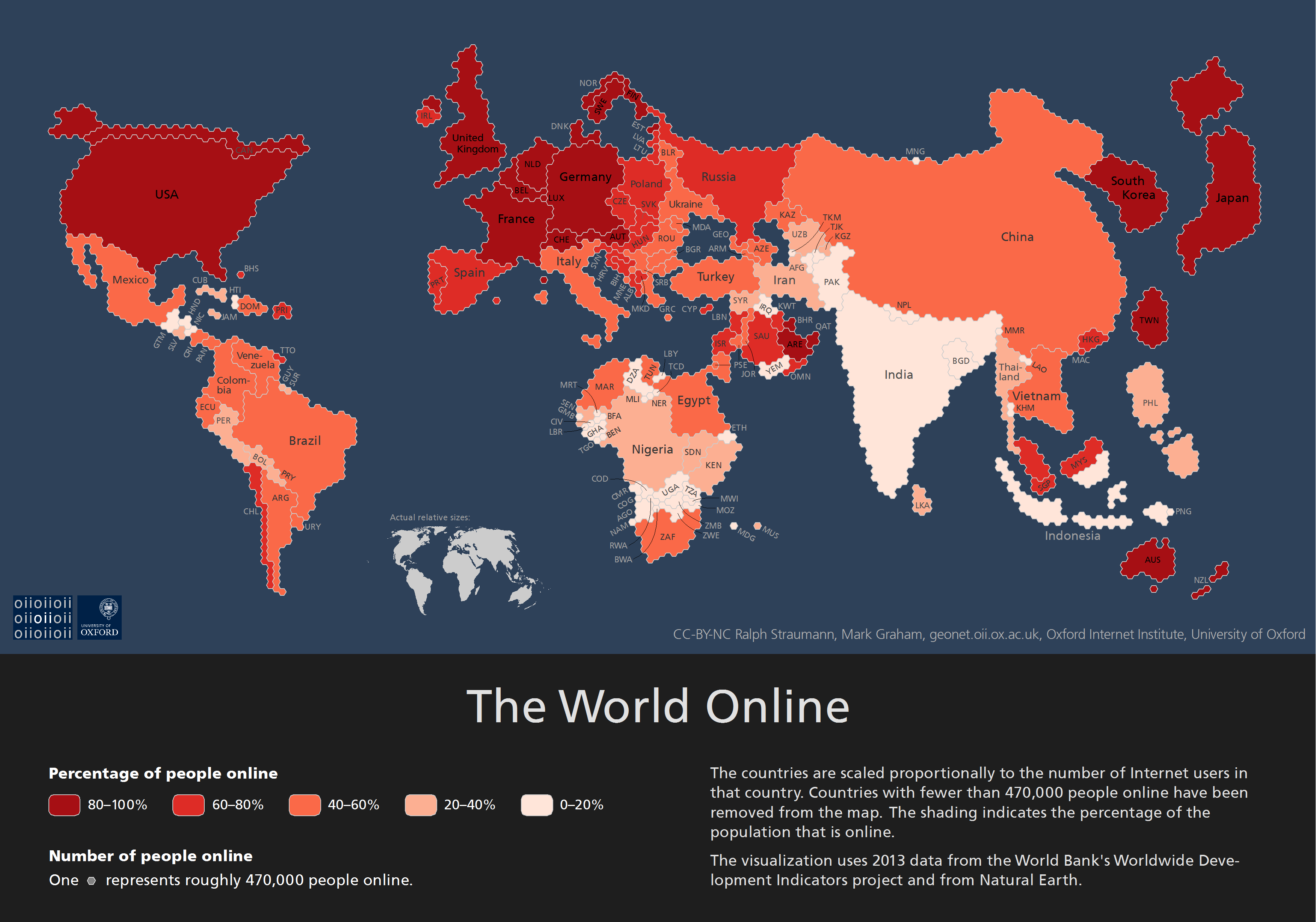
Countries sized to match their online population
by Rob Beschizza from on (#E9MQ)

"This map shows the total number of Internet users in a country (size of the country) as well as the percentage of the population that has Internet access (shade of the country)."
Looks similar to a 2014 visualization by other researchers.