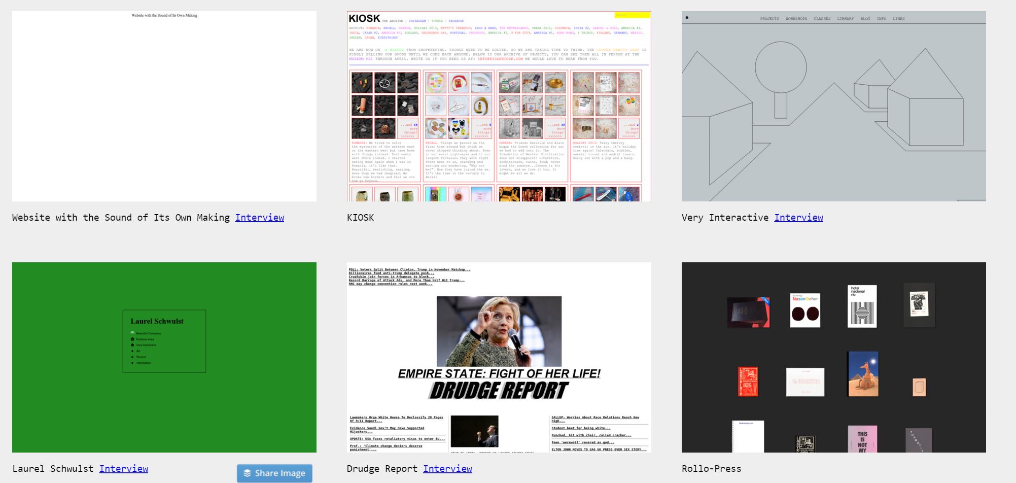
The return to a simpler, uglier web

Pascal Deville loves "beautiful atrocities"-websites that could be described as intentionally brutalist were they not mostly just ugh. Fast Company interviewed him on his love of rough design, strangely compelling as it is in the age of bloated, broken, but very pretty websites.
"I wouldn't call it a protest but a shout-out for more humanity in today's web design," Deville says. He views his site as a bastion for a segment of Internet culture of people who built scrappy websites themselves as opposed to using services with pre-canned templates like Squarespace. "Terms like UX and user friendly don't have a lot of soul or guts and treat everything like a product. They also killed a lot of the web culture, which seems to find a voice on Brutalistwebsites.com."
More from The Washington Post.
Intriguingly, Deville has found in his Q&As with coders and designers that few set out to mimic this newly popular aesthetic; instead, they all arrived at the same point out of a drive to create something original.
"[Brutalism] is interesting to me " because it doesn't necessarily have a defined set of aesthetic signifiers," said Jake Tobin, the designer behind trulybald.com. "What defines those signifiers is decided by the platform it's built on."