Popular design guides are responsible for plague of grey type
by Cory Doctorow from on (#1YN44)

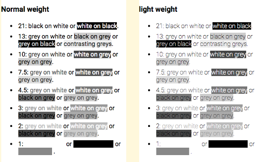
A series of recent, influential design books and articles have convinced the web's designers to go for grey-on-white type, despite the fact that many people can't read low-contrast type (and it's even worse on mobile devices, which are often read in very bright sun, on screens that have been dimmed to save battery) (more")