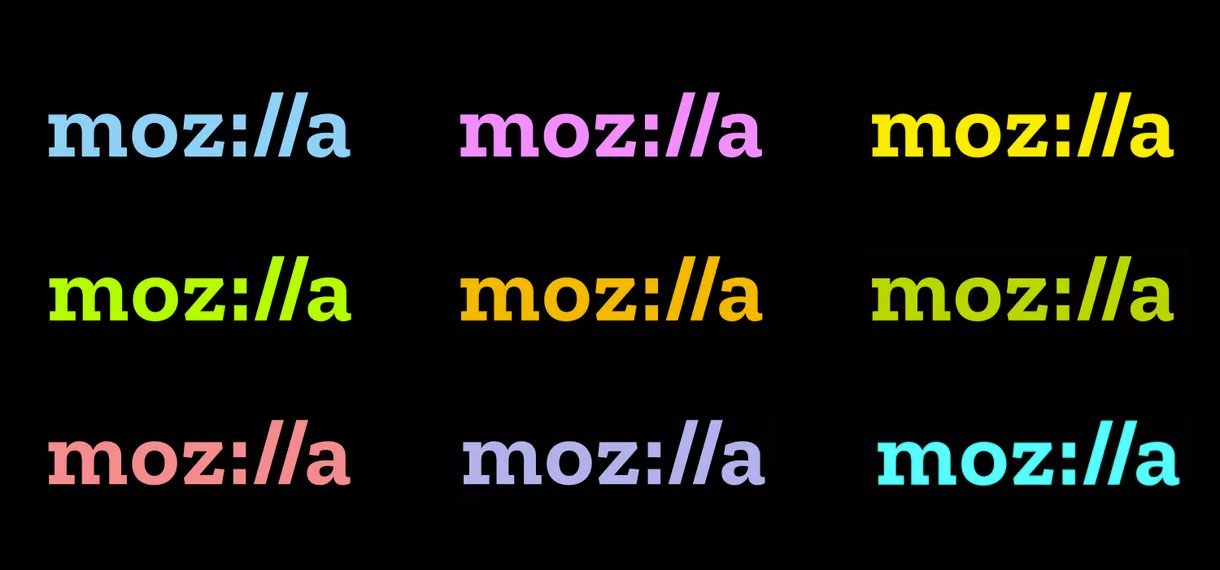
Mozilla rebrands
by Rob Beschizza from on (#29DGB)

Mozilla announced its new i1/4i1/4^2i1/4i1/4(R)i1/4 i1/4(C)i1/4i1/4i1/4(R)i1/4i1/4(C)i1/4i1/4^1 today. There it is above. Reception has not been kind. But is it ever? Its nerdliness (:// indeed!) is being held responsible for the inelegance of the logotype, but it's the best thing about it.
I know it's easy to toss off "how I woulda done it" logo designs, but I think a little subtlety could have worked wonders. Something like the following, perhaps? Making the :// live within the flow of the type...
