This storytelling chart explains nothing about season 7 of Thrones

Plot graphs, grids of heroic attributes, flowcharts of dramatic action - chances are you've seen plenty that explain every story ever told. Often presented as a kind of literary pill for critics and storytellers, they're really just toys, thrown into the hinterland between what worked for one artist and what can be sold to another. But it's a lot of nerdy fun to make them, so I thought I'd share one of mine today.
I made it to try and better understand a story I was having trouble writing, but (if you'll forgive the epic presumption) I think it works well to explain why the last season of Thrones, beyond its breakneck pace and sketchy motives, felt like a completely different show. Here goes:

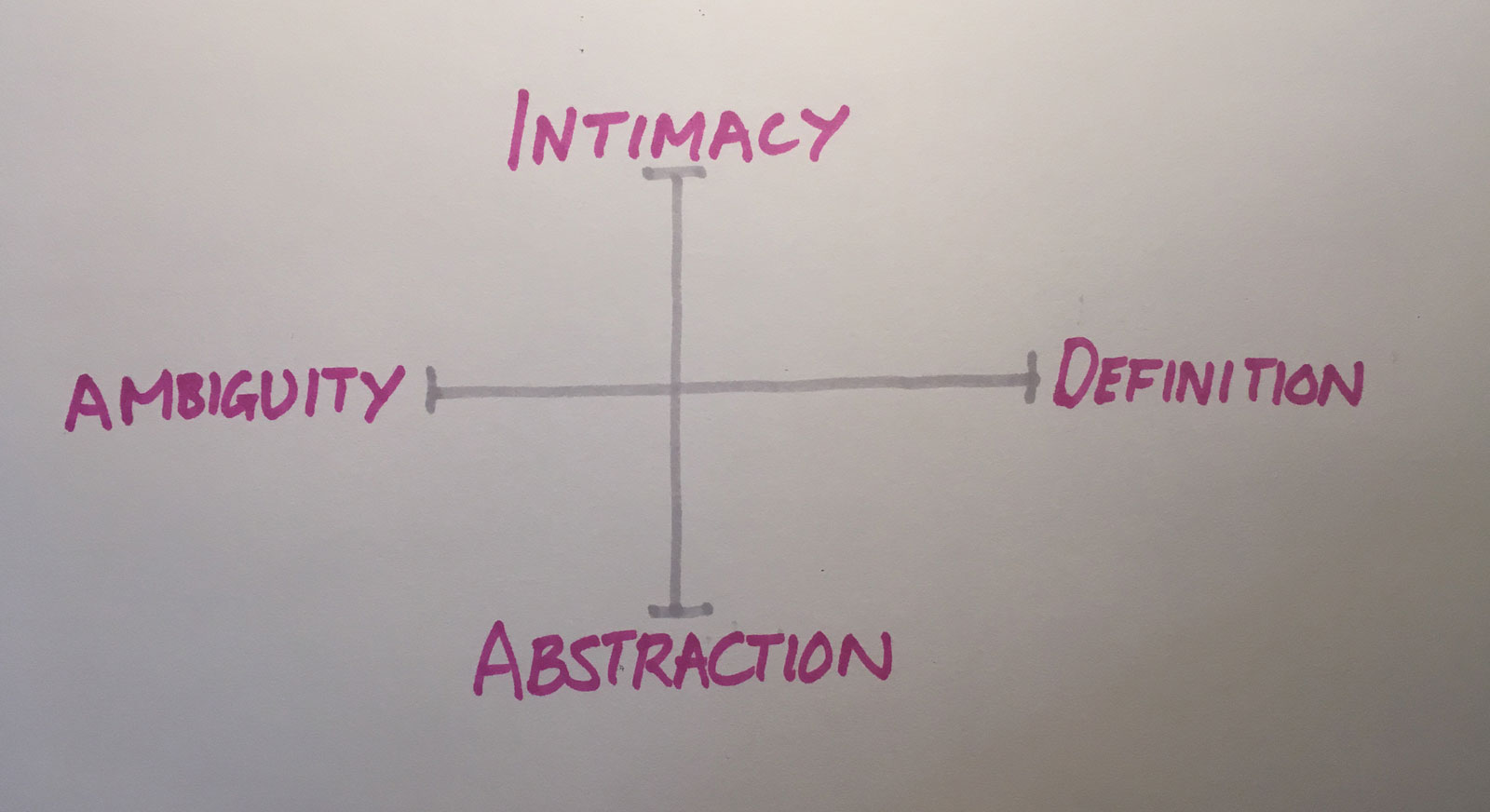
There are two axes to this toy: "Nuance" on the horizontal and "Scope" on the vertical.
"Ambiguity" denotes loads of nuance, tales where everything is subtle and shaded and much is demanded of the audience. At the other end is "Definition," where mysteries and motives wilt under sun and sword and closure is imposed.
On the scope axis, we have "Intimacy" - the emotional tapestries of family and friendship, the world's whispered reminders of its own past, hiraeth and home. At the other end looms "Abstraction," where lines are clearly drawn, where ideas and sides do battle, and grievances reflect universal dogma even as the personal disappears from view.
To play the game, take any story and decide where it tends to rest on the chart. For example, a fun Hollywood space opera is gonna run hard on resolution and abstraction. A Kazuo Ishiguro novel, though, might rest in the opposite corner, ambiguous and intimate.
Then ask yourself: from that default position, where does the story leap in its best and worst moments?
My expectation was that surprises would be convincing when they're marked by sudden movement along one axis, but carefully avoiding movement on the other. That "scope" and "nuance" could not shift at the same time if my story was to convince the reader.
Playing with the toy, though, I found that the opposite was more often true: movement along one axis (from abstraction to intimacy, say, or from ambiguity to resolution) forced movement on the other axis to pack a punch.
Isolating surprises to nuance or scope wasn't what made them work, but rather consistency in which direction the reader was taken.
When mysteries are resolved, for example, does the story tend to become more intimate or more abstract? When we gain insights into characters, does the world become more ambiguous or more defined?
My stories, at least, are more convincing when the answers remains consistent.
Returning to Thrones, then, as far as this toy goes, I think its an unusually intimate and ambiguous work of fantasy. It kicks the reader hard, though, with the brutality of its leaps into resolution (deaths!) and abstraction (maps!).
Thrones, until season 7, would pair resolution with intimacy to give power to final moments. But in the last season, it paired it instead with abstraction -- this way, deaths seem less personally meaningful, but raise the stakes for a presumably epic conclusion.
And while the show used to season its leaps into abstraction with ambiguity and complexity, it now uses its biggest themes to impose resolution -- because holy dragon crap, there's only so many episodes left to get this thing done.
Granted, this is perhaps the nerdiest explanation of why season 7 fell flat for dyed-in-the-wool fans while delighting casual viewers. As I said, just a toy!
The reality of storytelling, what gets under our skin or simply up our nose, is more obscure, a haywire hack that yet has selfish motives. It's as if complex stories become puzzles, attaining inexorable purpose and even a kind of spooky sentience. Sometimes, they just start using their own characters to solve themselves as fast as possible -- especially when there's a tight deadline and a loose budget.