Results of the artwork contest 2017 – Places 13 to 25
It's finally time to present the submissions placed between the positions 13 and 25 of the Sandra and Woo and Gaia artwork contest 2017. I would like to thank all artists who have submitted a drawing or other piece of art. For each submission, I will give a short explanation what I liked most about it. But I will also mention what I didn't like about it, preventing the submission from making it into the top 10.
Please show your support by visiting the artists' websites and writing a comment in the comment section of this blog post!
-
Ars and his family look really cute. But the drawing quality just isn't there yet for a spot in the top 10.
[Artist's comment: The second [drawing] is of Ars, his wife, and their son having their photo taken by the man who eventually kills Ars in the Red Hall (A scouting mission on his part).
-

Place 24 goes to Chef Cheiro (website)
Chef Cheiro's drawing also features quite cute characters. But it's lacking that "special something" needed for a better place in the ranking.
[Artist's comment: The title is Sandra The Explorer. It's a parody of Dora the Explorer.
-

Place 23 goes to Parker Hoey (website)
Woo as a giant mount is clearly the highlight of this drawing. I'm not as fond of the human characters' heads, though.
-

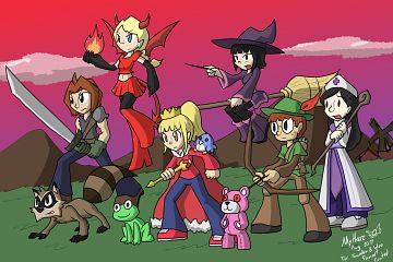
Place 22 goes to Mythkaz Mosqueda
The outfits suit the characters well. I particularly like Larisa's dress, with Luna's and Yuna's close behind. But the drawing style is still a bit rough around the edges.
[Artist's comment: I tried to go with an RPG style, giving some of the characters a class I feel would fit them:
Cloud - Mercenary/Warrior. I mean, he is good with swords!
Woo - Beast. Not good with animal's classes"
Larisa - Succubus/Demon. Would have liked to give her a more sensual outfit, but better don't risk it. Still, she pretty much is one at this point.
Sandra - Royal/Summoner. Making reference to the Northian empire, those dolls are some of her guards?
Yuna - Witch. I wanted to give something that would show she is smart, but as well-fitting with the classic RPG.
Landon - Originally was going to give him a gun, but again, it might not be too fitting with the rest. So I went with bow and arrow. Not sure how good he is aiming.
Luna - I see her quite shy and caring, hence why I gave her the healer role.
-

Place 21 goes to Darkcan (website)
The lighting and color composition is great. But it's a bit hard to recognize Viviana. The oversized shoulder armor also looks fairly impractical.
[Artist's comment: The original idea was Viviana going to the Baltor's family mansion of the start of the story but then I wanted to add the rainbow dagger, mostly because I wanted to add a bit more of light on that part if the scene. So I would just say that is one of the missions Viviana "The Queen of thieves" which is the title I wanted to give to the piece.
-

Place 20 goes to Alistair Poole (website)
This is a quite nice crossover comic by webcartoonist Alistair Poole of Storysmith. But I think Sandra's line in the last panel could have been funnier. (Note: Larisa's name should be spelled with only one "s".)
[Artist's comment: The first [picture] is a little comic I drew up after imagining what Larisa would do on a movie set if given access to a flamethrower.
-

Place 19 goes to idim Bedrossian
Click on the following links for additional screenshots from idim's 3D model of Larisa and Landon having a picnic on the sun: [1], [2], [3], [4], [5]. You can have a look at the original 3D model at Sketchfab.
I'm glad that at least one person submitted something related to Larisa's desired picnic on the sun. The quality of the 3D models is also fine. But the idea of Larisa drinking Landon's liquid remains is just too disturbing for the top 10. In comparison, idim's 3D model of Sandra and Woo was placed at #7 in 2015.
-
I'm quite fond of the space theme and the diamond disgorging exhaust pipe. But there were so many submissions of similar quality this year (see below) that details like Sandra's subpar head prevented Aile's submission from reaching a better position like #13 in 2014, #9 in 2015 and #14 in 2016.
-

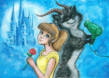
Place 17 goes to Lilli Kempf (website)
I love the beautiful colors and the professional drawing style of Lilli's painting. However, Woo's long and slender body looks weird. Giving him a muscular beast-like body would have worked much better. Lilli's humerous drawing of Woo and Sid reached #19 last year.
[Artist's comment: The picture shows Sandra and Woo cosplaying as the Beauty and the Beast. ["] Woo uses the hairdryer to give himself a shaggier and rougher look.
-

Place 16 goes to Fhrean Eighth
The shading of this drawing featuring private eye Sandy South and her sidekick Qoo is truly superb. But their poses seem rather arbitrary with Sandy's stretched arm and Qoo holding an apple. In this case, something more conventional would have worked better. However, Fhrean can find solace in the fact that his second submission featuring Sandra and Woo made it into the top 10! Fhrean's two submissions in 2015 reached #26 and #11.
-

Place 15 goes to Angelica Audal (website)
Angelica shows her professional drawing skills with this fine drawing. But the subject or layout would have needed to be a bit more innovative to make it into the top 10.
[Artist's comment: This drawing is actually based on the Comic #26, Rain. I just see Woo as the younger mischievous brother of Sandra who hates getting wet and loves being spoiled. And not to mention, they need to do some groceries because SOMEONE has been eating a lot.
-
That's a really cute group photo of the main characters from Gaia. Erin also provided an alternative version with a frame. But I think the frame's style clashes with the rest of the artwork.
Erin has now four submissions placed between 11 and 25 in the last four artwork contests! #19 in 2014, #21 in 2015, #23 in 2016 and now #14. I hope she isn't too sad for repeatedly missing the top 10 in such a manner.
-
carti submitted this elaborate drawing featuring an Inspector Gadget crossover. (Note: Larisa's name should be spelled with only one "s".)


