Results of the artwork contest 2017 – Top 12
It's time! Time for the top 12 of the Sandra and Woo and Gaia artwork contest 2017! The contests of the last years were often dominated by submissions related to Sandra and Woo. For example, Woo was present in 9 of 10 submissions of the top 10 in 2015. However, this year, the top 3 are all related to Gaia!
The submissions are ordered from place 12 to 1. As you can see, we've received some elaborate and innovative pieces of art this year again. I found it particularly difficult to determine the positions of this year's entries. Therefore, our next year's contest will probably involve some kind of voting to make things a little easier for me. Please show your support by visiting the artists' websites and/or by writing a comment in the comment section of this blog post!
@ all winners: Please send me your PayPal account details by email!
-
Kenny's marvelous Minecraft model of the Academy of Cania was the winner of the artwork contest 2015. This year, he modelled Eldor's Tower in the Sky. It looks particularly good at night with the glowing blue and red blocks. I made a lot of additional screenshot from various perspectives: [2], [3], [4], [5], [6], [7], [8], [9], [10], [11], [12].
If you want to check out the model in Minecraft yourself, you can download this ZIP file (8 MB) that contains the world model. Then unpack the ZIP file in your Minecraft save folder that is usually located at C:\Users\\AppData\Roaming\Minecraft\saves. You need Minecraft 1.10.2 or newer. I had to fly around a bit until I found the tower, though.
[Artist's comment: My Cania Academy build was (and is) my favorite Minecraft build I've ever done. I knew I couldn't do better, so that scared me out of even trying. This year I did something a little simpler, but I'm really happy with the results.]
-
I spent quite some time thinking about whether I should put Sharon's fine drawing of Lilith into the top 10 or not. I really like the look of the magic effect. But I also think that it would have looked even better on a black background. Sharon also reached number #11 with a drawing of Lilith in the artwork contest 2016.
-

Place 10 goes to Oliver Barber
Oliver has now made it into the top 10 three times in a row! He reached #3 in 2015 with a drawing of Yuna and Woo and #2 in 2016 with a drawing of Sandra and Woo.
[Artist's comment: I loved the sabre tooth squirrel arc and I've wanted to do something with it for ages. ["] I've always wanted to draw Ye Thuza, as she's such a badass. I also wanted to display her dynamic duo with Yuna so I incorporated a bunch of things from different arcs here (maybe too much). I hope you can read all the text!]
-

Place 9 goes to Katelyn Robertson
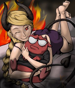
Larisa has turned into one fine succubus in Katelyn's drawing. I don't get why Kevin from Sarah Burrini's German webcomic Das Leben ist kein Ponyhof is making such a displeased face. Who doesn't want to be in his position?
-

Place 8 goes to KamenraPLUS (website)
SUGAR
Jump onto your racing wyrm!
Say SUGAR RUSH! SUGAR RUSH!
SUGAR
Jump onto your racing wyrm!
Say SUGAR RUSH! SUGAR RUSH!
KamenraPLUS has really improved tremendously since he submitted this drawing of Sandra and Woo for our artwork contest 2014.
-
Fhrean's super cute drawing of Sandra and Woo shows that one doesn't have to draw something as detailed as KamenraPLUS' drawing to make it into the top 10 if the execution is that good. Fhrean more than deserves a spot in the top 10 after submitting two other drawings that almost made it into the top 10 this year on #16 and two years ago on #11.
-

Place 6 goes to Gatekid3 (website)
After missing the top 10 by a considerable margin in 2015 and 2016, Gatekid3 made a leap this year with this perfectly looped animated GIF of Sandy South and Qoo. The background of the scene is clearly taken from our adventure game Sandra and Woo in the Cursed Adventure. There is also the original version in a size of 200 x 200 pixel which looks too small in my opinion. This submission would have reached #3 with a more elaborate animation of Sandra.
[Artist's comment: Eat Boogers and Die!]
-

Place 5 goes to Kiriumi (website)
What really makes this picture are the cute little "pencil" drawings on the post-it notes. I also like the layout and the good choice of colors. Only Sandra could have had her eyes open in at least one photo.
[Artist's comment: This drawing represents a little cork board, with a set of pictures and drawings made by Woo and Sandra.]
-
This is a color-corrected version since I thought the original version had a too strong tint of yellow. This touching drawing is Fredy's latest successful attempt to make it into the top 10. He reached #3 in 2015 with a drawing of Woo and his family and #7 in 2016 with a drawing of Yuna. Fredy and Oliver Barber are now the two most profilic contenders of our artwork contest with three pieces in the top 10. But neither of them has made it to #1 so far. Maybe next year"
[Artist's comment: The illustration is about Sandra, her dad and Woo at her mother's grave. [It's about] how badly she misses her mom, and there are her father and Woo trying to comfort her.]
-
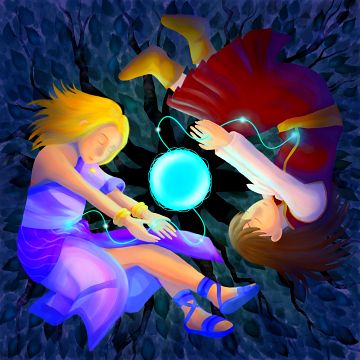
This innovative drawing by Aisea is a fine example of good ol' Swiss workmanship. I love the interesting drawing style and the shining colors. But the excellent background, with the roots of the Great Tree of Greendew in the center, is what made me place this drawing on position #3 instead of #6 or #7. It just works perfectly together with the two figures in the foreground.
[Artist's comment: The threads from the Bluestream are placed like an umbilical cord.]
-

Place 2 goes to Martin Kikkas (website)
What you can see here is a composite drawing consisting of parts from a first version with a better looking head and a second version with a better looking magical artifact. In my opinion, this is cleary the best drawing that we received this year. The lighting is outstanding and one of the details that I like in particular are the glass shards lying on the floor.
Martin also submitted a bunch of nice sketches on paper of alternative subjects, including a digital sketch showing the kiss.
-
I was thinking for a long time if I should place Martin's atmospheric drawing of Viviana at #1 or Audrey's amazing Ars statue. In the end, I decided to put Audrey's statue at #1 because it's the first professional looking statue of a character of Sandra and Woo or Gaia and therefore deserves a bonus for originality. The statue was created with lots of attention to detail as you can see in the following photos: [2], [3], [4], [5], [6], [7], [8], [9], [10], [11], [12], [13], [14], [15].
However, I think the photos didn't turn out as well as the statue. The first batch of photos that Audrey sent was pretty bad, the second batch you can see above is okay overall. But I'm kinda missing a really good photograph made with a professional camera that shows Ars in all his glory. Maybe Audrey will eventually be able to persuade a hobby photographer to give it another try.
[Artist's comment: I choose to focus on Gaia this time so here's a sculpture of Ars the Imp: I liked his character design and personality, it's a pity he had to die so soon" So I wanted to honor the hero as we saw him on his first appearance, without forgetting the all-seeing-eye he carries during the exams.
Funny enough, I worked with Fimo Air Natural, which is a German air dry clay (Staedtler), with 95% of natural product. That's fits Gaia's motto almost perfectly! With the pedestal (upcycled cardboard), he stands at 27 cm, 12.5 cm without it.]


