A Roosevelt junior redesigned the streets around his high school, and his plan is better than SDOT’s

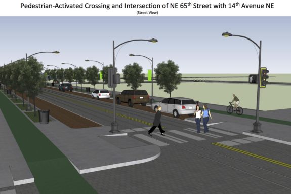
Concept image of a dramatically-improved crosswalk on NE 65th Street by Joe Mangan.
Just about every school day when Joe Mangan and his fellow Roosevelt High School students walk to area businesses during their lunch breaks, they have to squeeze together on sidewalks so skinny they can barely walk side-by-side and talk to each other. And when they get to major intersections, they have to squish together at corners far too small for the number of students walking to grab a bite. Meanwhile, traffic rushes by just off the curb on an unusually dangerous stretch of NE 65th Street.
But Mangan knows it doesn't need to be this way.
"I was noticing that friends and other students trying to walk to lunch don't have enough space to wait at corners," Mangan said. "I decided I would take things into my own hands."
So he took the initiative to put together his own proposal for what a truly safe and multimodal NE 65th Street could look like complete with concept 3D graphics he created using Sketchup. He sent his 12-page report (PDF) to SDOT, some neighborhood safe streets groups and Seattle Bike Blog.
His work blew me away.
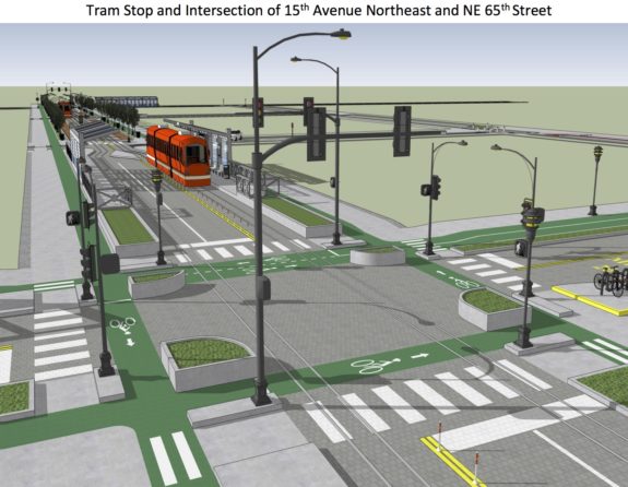
The ideas he presents are bold, thoughtful and based on real-world examples from around the world. And his graphics are professional-quality. He depicts a streetcar because he was inspired by trams in cities like Amsterdam, but you can imagine them instead as improved stops for existing (or improved) buses.
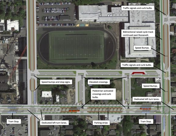
But he didn't just focus on NE 65th Street. He also reimagined other streets around his school. Here's the overview:
 After many years of neighborhood advocacy and leadership from Councilmember Rob Johnson, SDOT is currently developing designs for a NE 65th St remake that includes protected bike lanes. Mangan's design is far better not just because it has more bells and whistles (and, to be fair, a likely higher pricetag), but because he is focusing on fixing problems he sees daily on the ground.
"The street is just unnaturally wide," he said of the current street. "Every day there's always someone who has to walk in front of the group or behind because there's not enough space to walk side-by-side.
"With my design, I narrowed it to a center turn lane and two lanes at each intersection. This gives more space at corners for people walking with their friends."
This might seem obvious, perhaps, but SDOT's current design actually makes sidewalks skinnier in places in order to prioritize space for people driving to pass buses at bus stops. Mangan, on the other hand, imagines a street that prioritizes walking, biking and transit.
He also looked at ways to increase the number of places where people can cross the street and improve safety at each crosswalk.
"I added curb bulbs to add more waiting space and also to shorten crossing," he said. "Curb bulbs make it easier for drivers to see [people walking] and easier for crossing pedestrians to see cars."
 Mangan preserves general travel lanes in each direction and dedicated turn lanes at major intersections, but his idea is to focus on how we want neighborhood transportation to work in the future after Roosevelt Station opens.
"Increasing pedestrian and bike connections to the station would kind of offset the reduction in car lanes," he said. "Because many people driving are trying to get to the highway to go downtown, if you give people other options to get to the light rail you would reduce the number of cars on the road."
Standing ovation.
This is exactly what the redesign of NE 65th Street should be doing, and where the latest design out of SDOT fails. I hope the design team takes a lot of time to study Mangan's ideas and incorporate many of them into the final street design.
So how exactly did a high school junior learn so much about street design?
"I'm just interested in city planning in general," he said. "It's a combination of engineering, design and politics, all three of which I have been interested in."
Mangan said he watches videos online and seeks out podcasts about city planning.
"I watch Jeff Speck," he said, making him perhaps the youngest fan of the East Coast urban planner.
And how exactly did he get to good at Sketchup?
"I used it in second grade," he said, because it was installed on school computers. And he's been designing houses and streets for fun ever since.
"I'm also using it to design a detached accessory dwelling unit behind our house right now."
Sorry, planning firms and city department heads, Mangan has a few more years of school left before you can hire him full time.