Times Newer Roman, A Wider Version of the Font to Help Students Fulfill Page Requirements Faster

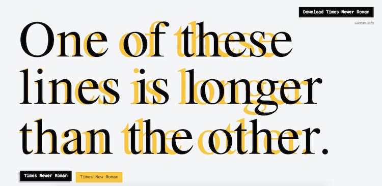
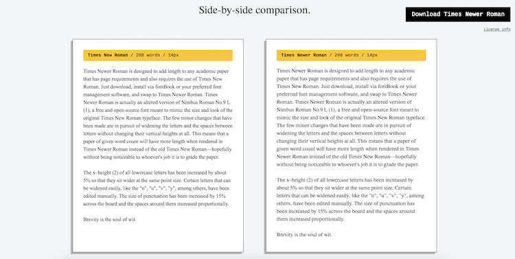
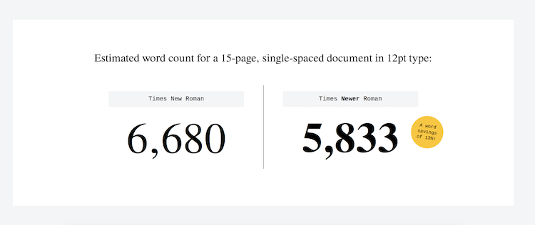
The wonderfully creative interactive design shop mscf has made it easier for students to meet arbitrary page length requirements while still using a traditional neutral font like Times New Roman. This alternate version of the same font, aptly titled Times Newer Roman, is 5-10% wider, thereby taking up more space on the page.
Introducing Times Newer Roman, a font that kinda looks like Times New Roman, except each character is 5-10% wider. Fulfill lengthy page requirements with hacked margins, adjusted punctuation sizing, and now, Times Newer Roman!
Times Newer Roman looks just like the font we all know, but it's wider to help students fill pages. Brilliant. ?https://t.co/iNf1dj8c3c pic.twitter.com/otrRF9btNZ
- Ryan Hoover (@rrhoover) September 19, 2018
via Ryan Hoover
Related Laughing Squid Posts- Brand New Roman, A Hilarious Font Made Up Entirely of Highly Recognizable, Popular Corporate Logos
- Say It In Llama With Llama Font
- A Powerfully Surreal VFX Short Film About a Fast Growing Ivy That Takes Over New York City
The post Times Newer Roman, A Wider Version of the Font to Help Students Fulfill Page Requirements Faster appeared first on Laughing Squid.


