How IKEA’s Store Design Encourages Customers to Purchase Much More Than They Originally Planned

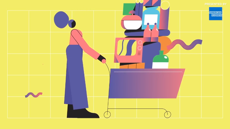
In the fourth episode of the Vox series The Goods, host Carlos Walters talks about the "Gruen Effect" which is the psychology behind using store design to encourage customer impulse buys, a concept fully embraced by the furniture giant IKEA. The company's strategy includes a circular path that goes past fully decorated rooms, specific lighting, small low cost items located near the register and a handy restaurant within the store.
Related Laughing Squid PostsOn average, customers only visit about a third of any retailer's floor area. IKEA's layout forces customers to cover more ground. IKEA was always designed as a place where you can see, touch, and try, no? So they can spend hours if they want to. But there's also consumers that know exactly what they want and just want to have it quick. So it's tailored to both. " Which means retailers like Ikea will only get better at nudging you to spend time in more parts of the store.
- 'IKEA Man', Mashup Illustrations of the Simple Character in IKEA's Instruction Manuals & Popular Cartoon Characters
- What Does IKEA Say About The Human Condition? by PBS Ikea Channel
- What Does IKEA Actually Say About The Human Condition? by PBS Idea Channel
The post How IKEA's Store Design Encourages Customers to Purchase Much More Than They Originally Planned appeared first on Laughing Squid.