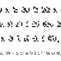
Dotsies: a dot-based font for those of us tired of normal letters

Dotsies is a typeface that abandons the latin alphabet completely in favor of dots. Not pixelated letterforms, like a pixel font: seeemingly random agglomerations of noise. It looks like something designed to be seen by machines, like QR codes, but which would remain human-readable to those in the know. [via Jeff Atwood]
How much better is it?
It is significantly more horizontally condensed than normal fonts, letting about twice as much fall within the area of your field of vision that perceives fine detail. As to overall space efficiency in practice, the jury is still out.This sounds hard
It's easier than you think. There are only 26 letters. Numbers and punctuation aren't altered.
The linked demo page is set up to let you accomodate yourself to dotsies by scrolling down the page. ZALGO!!
Previously: Tzump_(Wikipedia article from the future)