Here's an Interactive Map That Shows How Climate Change Will Affect Your Town in 60 Years
Climate change is projected to warm Earth anywhere from 3C to 5C by 2100, but it can be difficult for people to picture what exactly that means for their local communities.
That's why scientists developed an interactive map that predicts the climates of 540 North American urban areas-currently populated by 250 million residents-in 2080.
When you select a city on the map, it links to a region that currently has a similar climate to what is expected for a chosen city in 60 years. You can run pessimistic projections of a future in which we have done nothing to curb greenhouse gas emissions, or select a more hopeful option where emissions peak in 2040, and then recede.
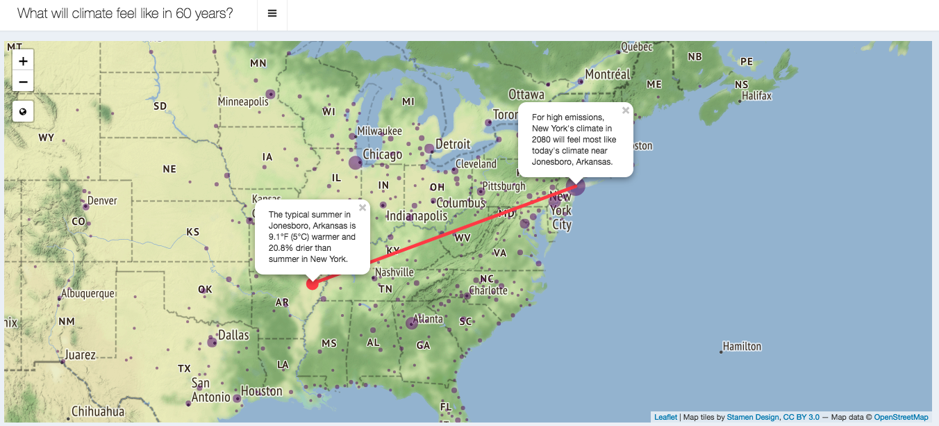
In the worst case scenarios, the map predicts that New York City will be a staggering 5C hotter by 2080, and 20 percent drier. This would make its climate similar to present-day Jonesboro, Arkansas.
 New York City's climate today, compared to its projected worst-case climate in 2080. Image: Matt Fitzpatrick/University of Maryland Center for Environmental Science
Future Los Angeles would be 4.6C hotter and 80 percent drier, making it a match with Las Palmas, Mexico. Edmonton, Alberta would warm 3.4C and become 15.8 percent wetter, like the current climate of Mendota Heights, Minnesota.
The optimistic projections emphasize the major long-term advantages of capping emissions. In these scenarios, New York City matches with Annapolis, Maryland, and Los Angeles is practically unchanged. Edmonton matches with Alexandria, Minnesota, which is slightly colder on average than Edmonton, despite its location further south on the map.
While any significant climate shift is troubling, the future in which humans decrease emissions is far less frightening.
Read More:This Interactive Tool Lets People See How Climate Change Will Screw Up Their Towns
This climate-analog map is the brainchild of Matt Fitzpatrick, an ecologist at the University of Maryland Center for Environmental Science and the lead author of a study about the project published Tuesday in Nature Communications. The team generated the map by compiling existing climate change datasets like WorldClim into the interactive format, with the aim of directly engaging the public in climate change research.
"A major challenge in articulating human dimensions of climate change lies in translating global climate forecasts into impact assessments that are intuitive to the public," Fitzgerald and his colleagues wrote in the study.
"Beyond assessing exposure and communicating aspects of climate change itself," they added, "climate-analog mapping also can inform how climate change could impact agricultural and natural systems upon which humans depend."
Get six of our favorite Motherboard stories every dayby signing up for our newsletter.